26+ prompts. Copy-ready GPT Image 2.5 prompts, each with the image it produced and a link to where it came from. Text-to-image, precise edits, infographics, UI mockups, sprite sheets and product shots.
GPT Image 2.5 is the image model OpenAI shipped on 9 September 2026, in two API variants: Flare, which matches GPT Image 2 on quality and editing at roughly half the latency, and Sunburst, which trades time for precision on demanding work. Both render text cleanly, generate natively at 1K, 2K and 4K, accept a mask for inpainting, and can return a transparent background. The headline change is controllable editing: you name what must not move, and it does not move. This page collects prompts that people actually ran, with the resulting image and a link to the source. On apimodels.app both variants are live priced by resolution and quality across fifteen cells — $0.008–$0.18 at 1K, $0.012–$0.35 at 2K, $0.02–$0.58 at 4K — billed only on success.
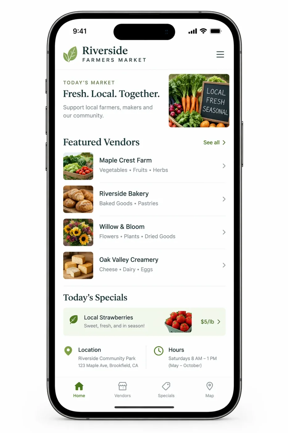
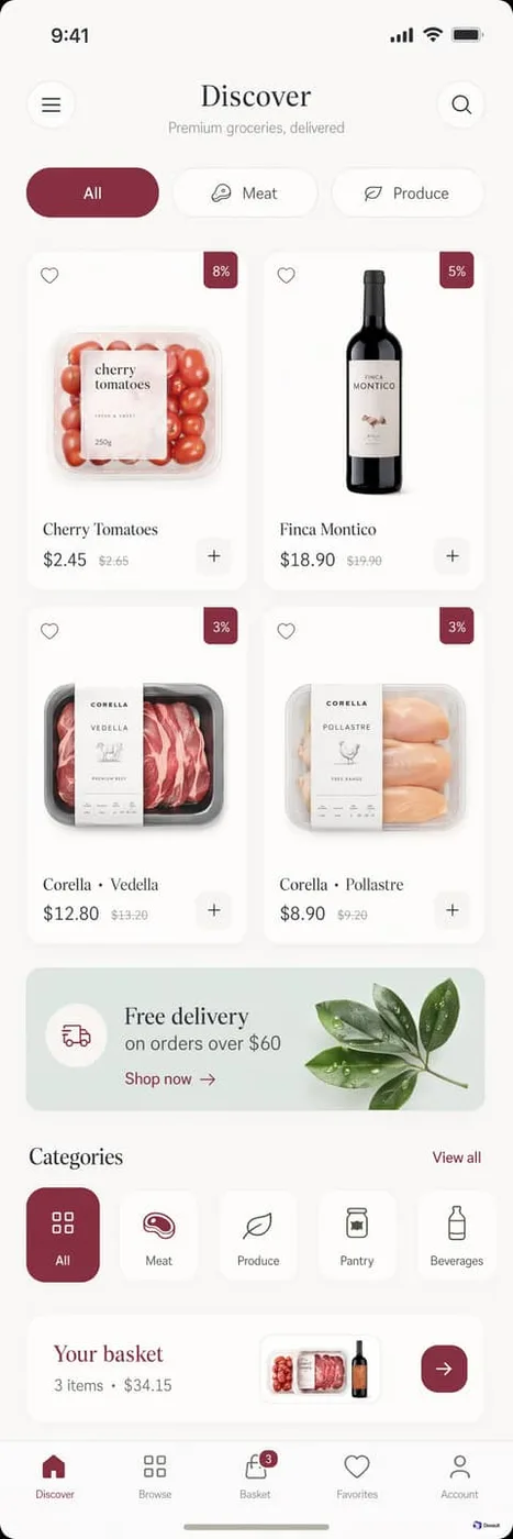
Create a realistic mobile app UI mockup for a local farmers market.
Show today’s market with a simple header, a short list of vendors with small photos and categories, a small “Today’s specials” section, and basic information for location and hours.
Design it to be practical, and easy to use. White background, subtle natural accent colors, clear typography, and minimal decoration.
It should look like a real, well-designed, beautiful app for a small local market.
Place the UI mockup in an iPhone frame.
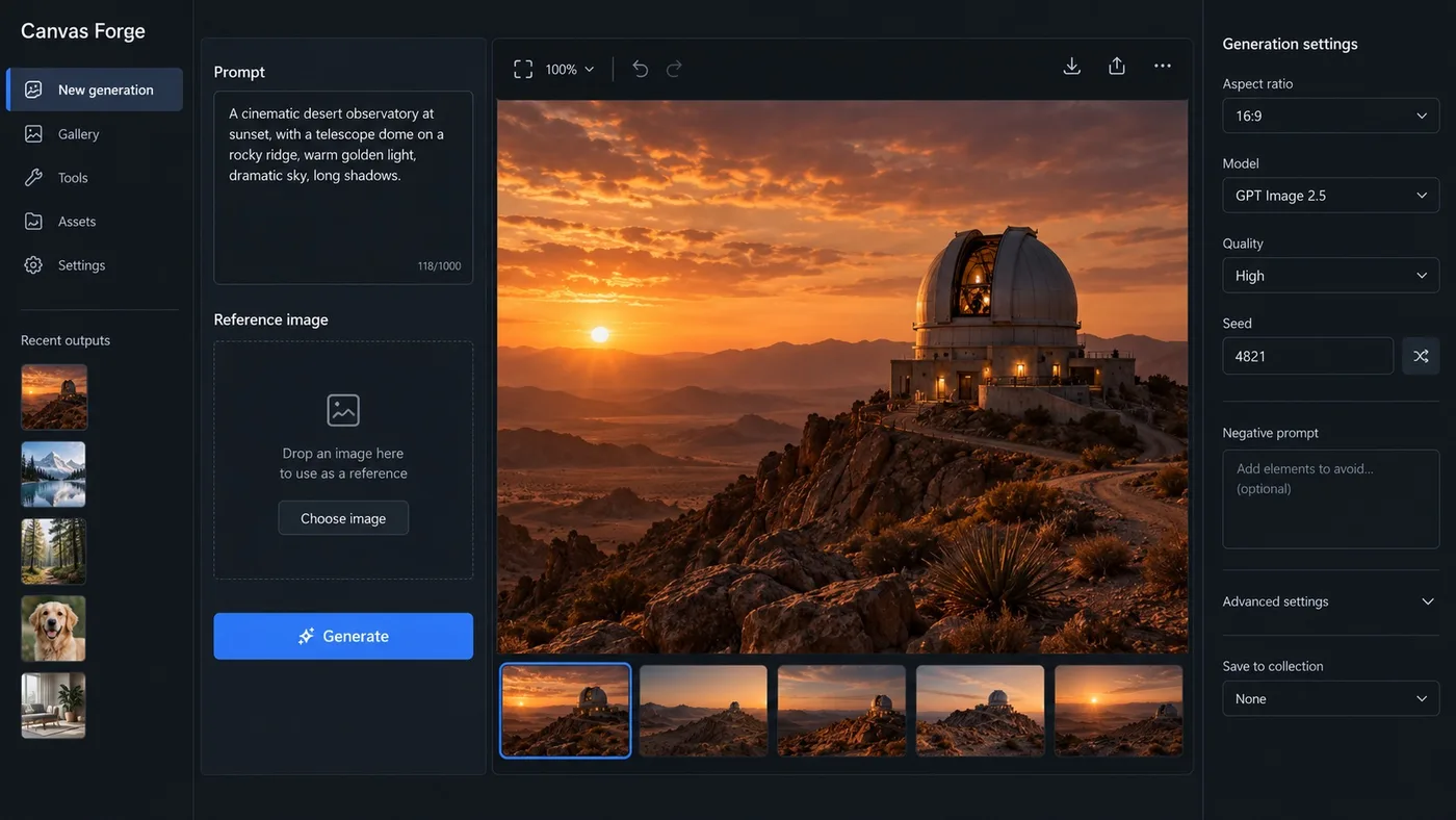
Create one high-fidelity desktop web app screenshot for a fictional AI image-generation workbench called Canvas Forge. This is a single polished 16:9 product UI screen, not a collage or presentation.
Dark editorial interface with a left navigation rail, a central 3-column image-generation workspace, and a right inspector panel.
Exact readable text: Canvas Forge, New generation, Prompt, Reference image, Generate, Aspect ratio, 16:9, Model, GPT Image 2.5, Quality, High, Seed, 4821, Recent outputs.
Show one large generated image preview of a warm cinematic desert observatory at sunset in the center.
Use concise realistic labels, consistent spacing, clear hierarchy, accessible contrast, subtle borders, no gradients, no fake logos, no gibberish, no extra windows.
The screenshot should feel like a mature production creative tool with believable controls and useful empty states. Render every specified label exactly and keep all UI text short and legible.
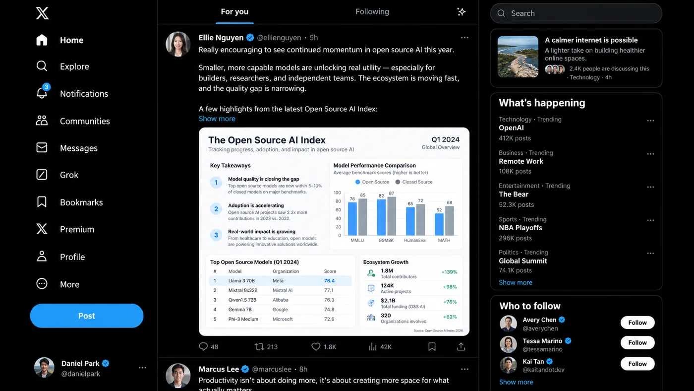
@创建图片 Create a highly realistic desktop screenshot of the X / Twitter web app in dark mode.
The goal is to accurately reproduce the component system, layout, spacing, typography hierarchy, information density, and visual structure of the modern X desktop interface.
The actual post content, usernames, trending topics, engagement numbers, recommended accounts, timestamps, and article topics may be randomly generated, as long as they feel realistic, internally consistent, and appropriate for a real social-media feed.
Do NOT focus on reproducing any specific real-world post.
Prioritize UI fidelity and layout accuracy.
CANVAS
16:9 landscape desktop screenshot.
Approximately 1600×900 or similar widescreen desktop viewport.
No browser chrome.
No device frame.
No perspective.
Flat front-facing screenshot.
OVERALL LAYOUT
Use the classic three-column X desktop layout:
1. fixed navigation sidebar on the left
2. main timeline/feed in the center
3. discovery / trends sidebar on the right
Use thin vertical separator lines between columns.
The overall background is pure black or nearly black.
LEFT SIDEBAR
Create a vertically stacked navigation system.
At the top:
X logo.
Below it, large navigation items with simple monochrome icons and text labels.
Include components similar to:
Home
Explore
Notifications
Follow / Communities
Chat / Messages
AI / Grok
Bookmarks / History
Premium
Profile
More
One item should appear selected using brighter white text and slightly stronger visual weight.
Navigation items should have:
large icon on the left
label aligned consistently
generous vertical spacing
simple flat interaction design
Add a large pill-shaped primary action button near the bottom.
At the bottom-left, show a compact account profile component:
circular avatar
display name
@username
three-dot menu
CENTER FEED
Create a top tab/navigation bar.
Include two feed tabs such as:
“For you”
“Following”
The selected tab should use bright white bold text and a short blue underline indicator.
Add a small action icon aligned to the far right.
Below the tab bar, show a realistic timeline post.
POST COMPONENT
The post should contain:
circular avatar
display name
optional verified badge
@username
timestamp
three-dot overflow menu
Below that, include several lines of realistic social-media text.
The text may discuss a random plausible topic such as:
AI
technology
software
startups
design
business
science
culture
productivity
current internet discussions
Generate natural-looking but fictional content.
Use realistic line wrapping, spacing, paragraph breaks, and truncation.
Optionally add a blue “Show more” link.
EMBEDDED MEDIA
Below the post text, include a large embedded image card.
The image can be:
a research infographic
a chart
a technology report
a news graphic
a product screenshot
a comparison table
an editorial card
a dashboard screenshot
The embedded image should have rounded corners and occupy most of the post width.
Its internal content may be randomly generated, but it should look professionally designed and information-rich.
For example:
clean white or light-gray report background
small headings
data tables
two-column information layout
bullet lists
labels
subtle separators
one highlighted row or annotation
dense but readable editorial typography
The specific words and numbers do not matter.
Prioritize believable visual structure.
Add realistic interaction metrics beneath or around the post:
reply icon + number
repost icon + number
like icon + number
views
bookmark
share
Generate random realistic values such as:
48
213
1.8K
42K
etc.
RIGHT SIDEBAR
At the top, create a rounded search field with:
magnifying glass icon
placeholder text such as “Search”
Below it, create several stacked rounded cards.
CARD 1
A compact current-topic / article / discussion module.
Include:
headline
small avatar cluster or thumbnail
timestamp / category / post count metadata
Content can be random.
CARD 2
A “What’s happening” / trending module.
Use a large bold section heading.
Create 4–5 trending rows.
Each trending item should contain:
small muted category label
bold topic/title
optional post count
three-dot menu aligned right
Generate random but plausible topics.
Do not repeat exact real-world trends.
Add a blue “Show more” action at the bottom.
CARD 3
A “Who to follow” module.
Create approximately 3 user recommendation rows.
Each row contains:
circular avatar
bold display name
optional blue verification badge
muted @handle
white pill-shaped “Follow” button aligned right
Generate fictional user identities.
VISUAL SYSTEM
Closely match the visual language of X dark mode:
pure black background
near-white primary text
medium gray secondary text
thin dark-gray borders
bright blue selected-state and link accents
white pill buttons
minimal flat iconography
Use a clean sans-serif font similar to:
SF Pro
Helvetica Neue
Arial
Inter
Typography should have strong hierarchy:
large bold section titles
medium-weight account names
regular post text
small muted metadata
Maintain realistic X-like spacing:
consistent 16–20 px padding
clean baseline alignment
accurate line-height
balanced column proportions
subtle separators
RIGHT COLUMN CARDS
Use large rounded rectangles with thin dark-gray borders.
Avoid shadows or glassmorphism.
UI QUALITY
The result should feel like an actual production social-media website, not a concept design.
Prioritize:
pixel-accurate spacing
consistent component sizing
clean icon alignment
realistic content density
sharp typography
proper text wrapping
natural UI imperfections
authentic screenshot composition
Content can be randomized.
Component architecture and layout must remain highly consistent.
No artistic reinterpretation.
No dramatic lighting.
No gradients except extremely subtle interface variations.
No 3D.
No glassmorphism.
No mockup presentation frame.
No floating cards outside the UI.
No decorative background.
The final image should look indistinguishable from a genuine desktop screenshot of a modern X-style social media feed.
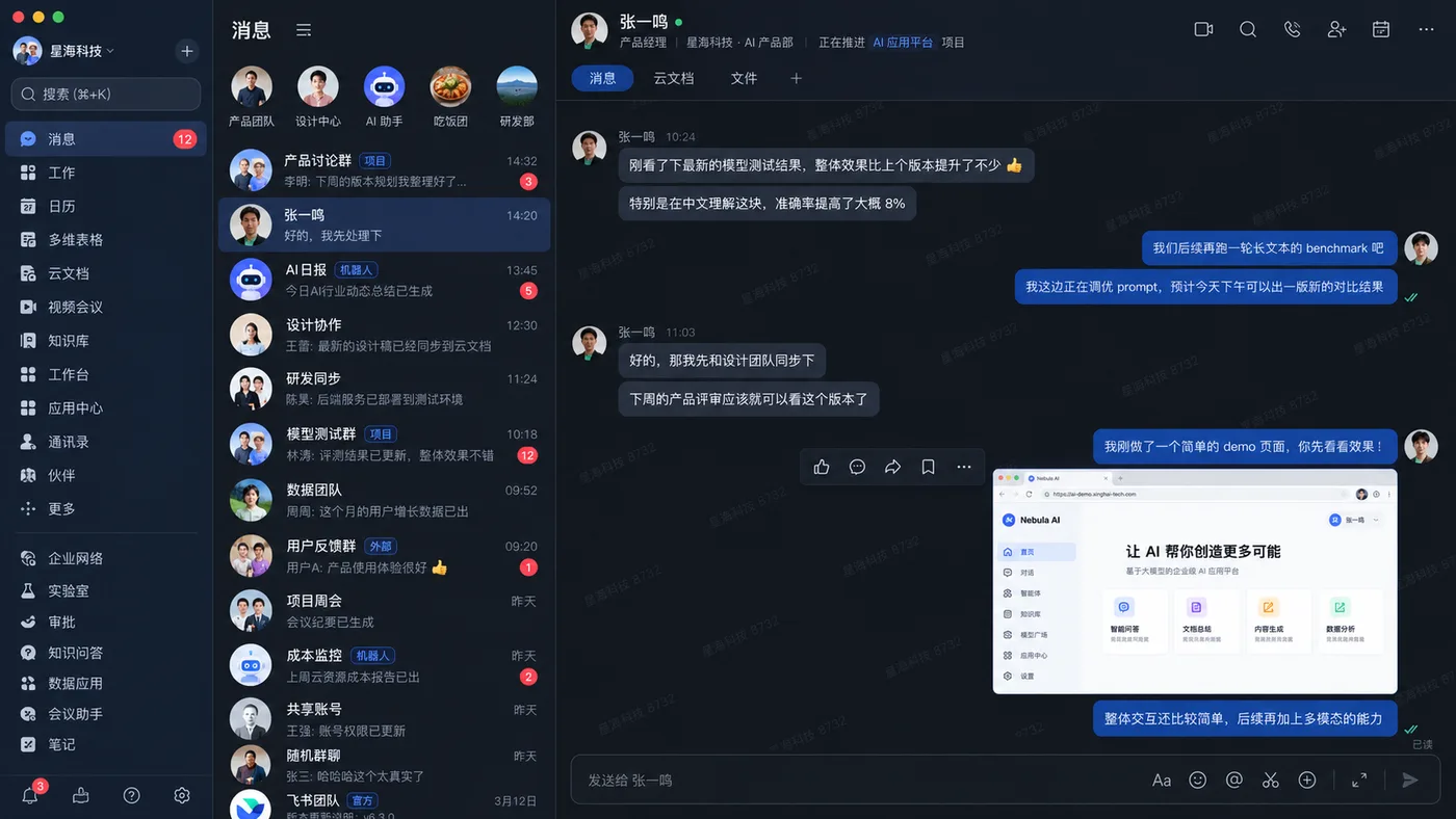
@创建图片 Create a highly realistic desktop screenshot of a Chinese enterprise collaboration and messaging app in dark mode, strongly inspired by the modern Feishu / Lark desktop interface.
Treat this as a UI reconstruction task, not an illustration or concept design. Prioritize component fidelity, information density, spacing, alignment, typography hierarchy, and authentic desktop-app composition.
Use a 16:9 landscape desktop screenshot with the full application window visible, macOS traffic-light controls, a narrow global navigation sidebar, a conversation list column, and a large active chat workspace. Use a dark navy and charcoal palette with muted blue selected states, deep-blue outgoing bubbles, gray incoming bubbles, red unread badges, and cyan or green status indicators.
Include Chinese navigation labels, realistic workplace conversations, a selected message thread, compact action icons, a tab bar for 消息 / 云文档 / 文件, a bottom message composer, and one large browser or internal-product screenshot attachment. Keep the hierarchy, three-column layout, spacing rhythm, message alignment, and information density stable. Render Chinese UI text cleanly and legibly.
No browser chrome, device mockup, perspective, glassmorphism, 3D, decorative illustration, oversized marketing typography, random logos, gibberish, or clutter. The final result must feel like a genuine production enterprise messaging application screenshot.
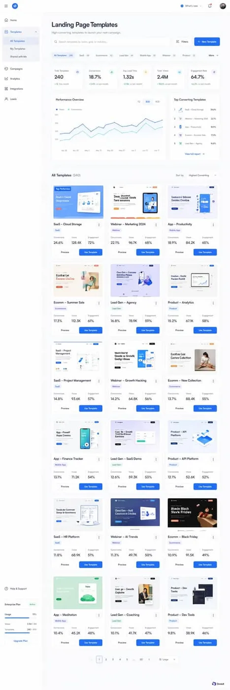
Design a light-mode web interface screen: crisp cobalt workspace balancing enterprise performance metrics with card-based template discovery.
LAYOUT
Structured fixed-width vertical sidebar navigation (approximately 240px wide) pinned to the left, paired with a dynamic fluid-width content canvas. The main pane begins with a global utility bar, descends into an executive header and search toolbar, flows into an analytics summary layer (5 metric cards above a split 2:1 chart and leaderboard section), and concludes with a responsive 3-column template gallery grid.
PALETTE (use these exact hex values)
- #F8F9FC — App Background: Global application page background surrounding sidebar and main content area
- #FFFFFF — Card Surface: Background for dashboard metric tiles, performance charts, and template cards
- #FFFFFF — Sidebar Surface: Vertical navigation container background separating controls from page content
- #1E6BFF — Cobalt Blue: Primary interactive color for action buttons, active navigation states, and primary trend lines
- #EBF2FE — Soft Blue Tint: Background for active pill filters, badge tags, and selected sidebar items
- #42C3EE — Cyan Accent: Secondary comparison line on charts and conversion rate badge accents
- #10B981 — Positive Green: Positive delta indicators, conversion trend percentages, and success status tags
- #0F172A — Text Primary: High-contrast headings, main metric values, and template titles
- #64748B — Text Secondary: Subheadings, axis labels, inactive navigation links, and microcopy descriptions
- #EEF2F6 — Card Border: Delicate containment line enclosing cards, input fields, and tab clusters
TYPOGRAPHY
Typeface Inter (or Plus Jakarta Sans,SF Pro Display,Roboto), weights 400/500/600/700. Sizes 11px caption, 12px body-sm, 14px body, 16px body-lg, 18px subheading, 20px heading, 24px heading-lg, 28px display. Tracking -0.02em at headings, 0 at body. Inter (or modern neo-grotesque alternatives like Plus Jakarta Sans) gives the dashboard an ultra-clean, technical precision without sacrificing readability. Tight tracking on large display metrics communicates data authority, while comfortable line heights on labels prevent eye fatigue in dense multi-metric cards. Free open-source alternatives like Inter from Google Fonts perfectly reproduce this aesthetic.
GEOMETRY & SPACING
Corner radii — cards 14px, links 6px, inputs 10px, buttons 8px. Spacing on a 8px unit, 20px gaps, 32px between sections, 1360px container, comfortable density.
DEPTH
Depth is handled predominantly through soft planar layering: a pale #F8F9FC background hosting pure white (#FFFFFF) panels bordered with crisp 1px strokes (#EEF2F6). True shadows are minimal, reserved for selected segmented tabs (0 1px 2px rgba(0,0,0,0.06)) and occasional subtle card hover states (0 8px 16px rgba(15,23,42,0.04)).
IMAGERY
Thumbnail imagery showcases scaled-down, pristine marketing landing pages with rounded hero sections, clean typography, and vibrant UI illustrations. Previews are enclosed in light containers mimicking actual viewport frames with delicate 1px borders. Never use uncurated, photographic stock art without an enclosing browser or mobile frame.
SIGNATURE DETAIL — the thing that makes this design itself
The dual-button action footer docked directly below a three-column micro-metrics summary inside each template card. This pairing of deep operational statistics with direct 'Preview' and 'Use Template' CTAs transforms standard gallery cards into actionable performance assets. Misusing it involves separating the metrics from the thumbnail or hiding the primary CTA inside a dropdown menu.
MUST
- Use solid white (#FFFFFF) for every data card against the cool #F8F9FC canvas background.
- Limit intense blue (#1E6BFF) to primary interactive buttons, active indicators, and hero line paths.
- Enclose thumbnail website screenshots in rounded 8px interior frames within template cards.
- Pair numeric labels with compact secondary metadata arranged in structured 3-column micro grids.
AVOID
- Do not use dark gray or black backgrounds for metric cards or chart panels.
- Do not drop thumbnail borders or shadows entirely, causing them to blend into the white card.
- Avoid colored backgrounds for the main canvas that stray outside cool, pale blue-tinted grays.
- Never use sharp 0px corners on input fields, buttons, or card surfaces.
OUTPUT
Render as a clean, pixel-crisp UI design at roughly 1280:3840. Flat vector rendering, real legible text, no browser chrome, no device mockup frame, no watermark, no lorem ipsum placeholder blocks.
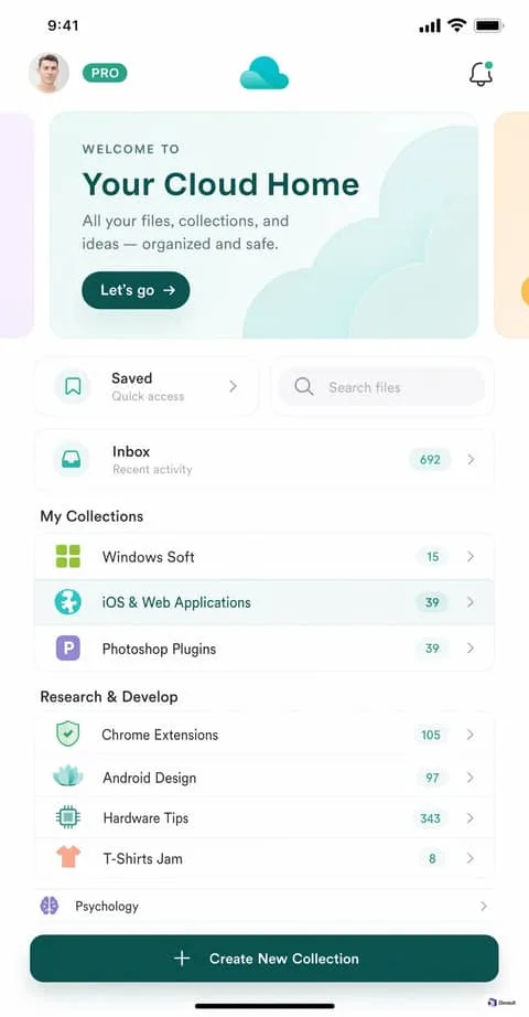
Design a light-mode mobile app interface screen: pillowy cloudscapes and organic pastel surfaces guiding calm personal storage.
LAYOUT
The mobile layout follows a top-down single-column hierarchy starting with a sticky-feel status and navigation header. Immediately beneath sits a horizontal swipeable hero card carousel showing peeking sibling cards. A two-column split row hosts quick action and search shortcuts, followed by vertical grouped collection cards separated by bold section titles.
PALETTE (use these exact hex values)
- #FFFFFF — Canvas White: Primary mobile viewport background and base level
- #F8FAFB — Surface Mist: Subtle fill for embedded search inputs and inactive surfaces
- #EEF2F3 — Border Subtle: Hairline card outlines, row dividers, and input strokes
- #0D4744 — Deep Teal: Hero display text, prominent pill CTA button, and high-emphasis labels
- #219D82 — Mint Accent: App logo highlight, active tags, and 'PRO' badge fill
- linear-gradient(135deg, #F0FAF7 0%, #E2F5EE 50%, #D8F0F3 100%) — Card Hero Gradient: Background wash for the primary welcome carousel card
- #1E2A2A — Text Charcoal: Row item headings, section titles, and primary action text
- #768B8A — Text Slate: Subtitles, placeholder text, chevron arrows, and metadata
- #EDF8F5 — Badge Mint Tint: Soft pill container fill behind counter numbers
TYPOGRAPHY
Typeface Plus Jakarta Sans (or Outfit, SF Pro Rounded, Inter), weights 400/500/600/700. Sizes 10px caption, 11px body-sm, 13px body, 14px body-lg, 15px subheading, 17px heading, 24px display. Tracking -0.01em at headlines, 0.08em at uppercase captions. The typographic tone is airy, friendly, and structured, best embodied by rounded geometric sans typefaces like Plus Jakarta Sans or SF Pro Rounded. Generous lowercase proportions paired with letterspaced micro-caps ('WELCOME TO') keep utility feeling relaxed and modern. System fonts like SF Pro with rounded attributes provide seamless zero-cost implementation.
GEOMETRY & SPACING
Corner radii — cards 24px, links 8px, inputs 18px, buttons 999px. Spacing on a 4px unit, 12px gaps, 24px between sections, 390px container, comfortable density.
DEPTH
Depth is created without harsh drop shadows. Instead, surfaces rely on 1px crisp borders (#EEF2F3) set against stark white (#FFFFFF) and delicate background pastel gradients. A very soft, diffuse ambient blur (0px 8px 24px rgba(13, 71, 68, 0.04)) is permitted strictly under active floating cards.
IMAGERY
Visual assets consist of simplified 3D-shaded cloud volumes and stylized vector pictograms. Cloud assets use clean semi-translucent overlapping curvilinear lobes in seafoam green and white. Photorealistic photography is restricted entirely to circular user profile avatars.
SIGNATURE DETAIL — the thing that makes this design itself
The mint-washed cloudscape hero card featuring an overlapping curved vector cloud silhouette paired with a deep teal pill button. This establishes the calm 'cloud sanctuary' motif immediately on launch. Misusing it means replacing the organic vector curves with generic stock photography or harsh linear gradients.
MUST
- Wrap related collection rows inside a single bordered card with 20px corner radius.
- Use pill-shaped 999px radii exclusively for action buttons, pro tags, and count badges.
- Maintain high contrast on headings by pairing Deep Teal (#0D4744) with pure white backgrounds.
- Enclose row icons inside squircle containers tinted to match the icon's primary hue.
AVOID
- Never apply harsh black (#000000) for typography; use #0D4744 or #1E2A2A instead.
- Never use sharp 90-degree corners on buttons, cards, or search inputs.
- Avoid heavy drop shadows; depth is conveyed via faint 1px borders and soft pastel fills.
- Do not make count badges bright red or amber; use the soothing mint pill #EDF8F5.
OUTPUT
Render as a clean, pixel-crisp UI design at roughly 2000:3840. Flat vector rendering, real legible text, no browser chrome, no device mockup frame, no watermark, no lorem ipsum placeholder blocks.
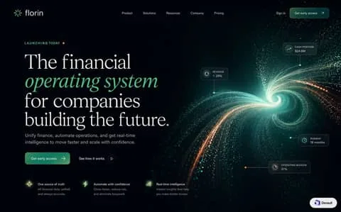
Design a dark-mode website section: luminescent deep-space fin-tech precision balancing editorial typography against kinetic particle intelligence.
LAYOUT
The page follows an asymmetric split with 55% dedicated to typographic storytelling on the left and 45% to particle visual telemetry on the right. Vertical flow begins with a floating global nav bar, drops to a live status indicator, followed by the compact 4-line display headline. Two inline CTA buttons anchor the midsection, resolving into three horizontal micro-feature pillars along the lower third.
PALETTE (use these exact hex values)
- #03080A — Obsidian Deep Void: Foundational canvas background absorbing light to give prominence to bioluminescent particle effects
- #081B1E — Teal Frost Tint: Semi-transparent backdrop for HUD cards and floating telemetry nodes
- #4EE29B — Bioluminescent Mint: Primary action button fill, headline italic emphasis, and active data glow points
- #E07A38 — Solar Copper: Status indicator dot, secondary filament stream, and contrasting data points
- #F3F7F6 — Primary Milk White: Display headlines, primary numbers in floating cards, and brand wordmark
- #7E999B — Muted Cyan Slate: Body copy, navigation links, metadata badges, and feature descriptions
TYPOGRAPHY
Typeface Newsreader Display (or Instrument Serif, GT Super, Playfair Display), weights 400. Sizes 11px caption, 12px body-sm, 14px body, 16px body-lg, 20px subheading, 68px display. Tracking -0.03em. The typographic identity bridges classical heritage finance with hyper-modern computational power. The display serif feels authoritative and established, while the sudden pivot to mint italic introduces dynamism and agility. The supporting sans-serif delivers pristine technical legibility, functioning like cockpit instrumentation alongside an editorial centerpiece.
GEOMETRY & SPACING
Corner radii — cards 10px, links 4px, inputs 8px, buttons 10px. Spacing on a 4px unit, 24px gaps, 96px between sections, 1360px container, comfortable density.
DEPTH
Depth is created purely through luminous optical layering rather than drop shadows. Translucent UI cards sit on level 1 with backdrop-filter blur and 1px luminescent rims, floating physically above the kinetic filament vortex. The base canvas sits in deep spatial regression, illuminated only where particles cast soft radial ambient glows.
IMAGERY
The visual anchor is a high-resolution procedural particle vortex swirling inward like an informational event horizon. The filaments transition dynamically from warm copper sparks to high-density mint cyan threads, symbolizing organized financial intelligence. Flat vector illustrations, stock photography, or standard 2D SaaS charts would completely violate this aesthetic.
SIGNATURE DETAIL — the thing that makes this design itself
The defining hallmark is the bioluminescent semantic headline paired with anchored HUD data pins. Specifically, rendering the core value proposition in italicized radiant mint (#4EE29B) within a classical serif stack, mirrored visually by floating translucent metric cards pinned to a particle nebula. Misusing this by turning the whole headline green or detaching the metric pins turns a bespoke system into a generic dark SaaS template.
MUST
- Use Newsreader italic strictly for highlighting transformative technical phrases in mint (#4EE29B).
- Keep telemetry HUD cards translucent with backdrop-filter blur to blend with particle graphics.
- Maintain 1px hairline connectors with glowing terminal nodes when linking metrics to artwork.
- Pair the dominant bioluminescent mint with subtle copper-orange sparks for natural temperature contrast.
AVOID
- Do not use opaque solid grey or white card backgrounds for the floating HUD metrics.
- Never render the entire headline in italic or in green; isolate only the key descriptor.
- Do not introduce sharp 0px corners; maintain a uniform 8px to 10px rounding on interactive elements.
- Avoid standard high-saturation blues or purples which clash with the bespoke teal-copper palette.
OUTPUT
Render as a clean, pixel-crisp UI design at roughly 1440:896. Flat vector rendering, real legible text, no browser chrome, no device mockup frame, no watermark, no lorem ipsum placeholder blocks.
Design a dark-mode website section: deep cosmos clinical precision meets ambient bioluminescent particle waves in a monolithic glass console.
LAYOUT
The viewport is organized into spacious horizontal bands within a disciplined 1240px container. In the hero, a split 55/45 grid pairs an asymmetrical left-aligned message block with a floating clinical data terminal on the right. Below, a massive branded typographic marquee acts as a transitional threshold, plunging seamlessly into a grounded, comprehensive six-column footer container.
PALETTE (use these exact hex values)
- #040711 — Void Deep: Global canvas background, providing total contrast for glowing particle streams and card structures.
- #0a0f1d — Card Trench: Background fill for elevated glassmorphic data widgets and the master footer container.
- #4F46E5 — Electric Indigo: Base tone for primary CTA buttons and the gradient illuminated footer watermark.
- #3B82F6 — Bioluminescent Blue: Bright gradient highlight on call-to-action buttons, active badges, and particle sparks.
- #A78BFA — Soft Lilac: Gradient tail seen in headline glows, wordmark transitions, and ambient backlights.
- #F8FAFC — Pure Clinical: Main headings, high-priority data metrics, and high-emphasis interface elements.
- #8B9BB4 — Starlight Muted: Sub-headings, table descriptors, navigation links, and standard body descriptions.
- #1E293B — Hairline Frost: Subtle borders framing glass cards, input fields, social chips, and table divider lines.
TYPOGRAPHY
Typeface Plus Jakarta Sans (or Inter, SF Pro Display, Manrope), weights 400/500/600/700/800. Sizes 12px caption, 13px body-sm, 14px body, 16px body-lg, 20px subheading, 32px heading, 54px heading-lg, 110px display. Tracking -0.03em at display, -0.01em at body, 0.02em at captions. The typographic tone is authoritative, hyper-modern, and mathematically exact. Plus Jakarta Sans provides crisp geometric terminals and open counters that preserve clinical legibility even at 12px data points. Its tight letter spacing at large weights lends an institutional, deep-tech posture suited for enterprise AI infrastructure.
GEOMETRY & SPACING
Corner radii — cards 20px, links 4px, inputs 8px, buttons 10px. Spacing on a 8px unit, 24px gaps, 96px between sections, 1280px container, comfortable density.
DEPTH
Depth is created through optical transparency and atmospheric lighting rather than realistic physical drop shadows. Dark glass cards (rgba(10,15,29,0.85)) float directly above an organic field of glowing particle vectors and oversized display typography. Strong outer glows (0 8px 24px) are reserved strictly for high-tier CTAs to make them appear self-illuminated against the dark plane.
IMAGERY
Imagery consists exclusively of generative point-cloud particle fields forming undulating ribbons of light in cyan, royal blue, and magenta. The aesthetic evokes flow cytometry, neural networks, or computational fluid dynamics in deep space. Stock photos of doctors, physical hardware, or clinical clip-art are strictly off-brand.
SIGNATURE DETAIL — the thing that makes this design itself
The submerged oversized wordmark layered directly behind the top perimeter of the footer card. This architectural collision between a 110px gradient display title and a frosted, interactive console creates immediate visual permanence that anchors the bottom of the experience. It is misused if made fully opaque or pulled forward into the card's active layer.
MUST
- Use deep midnight blue (#040711) rather than pure neutral black (#000000) for all base backdrops.
- Enclose dense data groupings within frosted cards with 1px border (#1E293B) and 20px corner radii.
- Layer oversized brand typography behind foreground containers to inject deep atmospheric perspective.
- Style primary buttons with radiant multi-stop gradients (#3B82F6 to #4F46E5) and matching colored outer glows.
AVOID
- Do not use high-opacity opaque gray borders; keep card outlines down to translucent hairlines (rgba(255,255,255,0.08)).
- Never replace particle cloud imagery with flat geometric vector shapes or generic stock photography.
- Avoid fully rounded pill buttons for inputs; reserve pills strictly for primary CTAs and status chips.
- Do not make the submerged brand display pure solid white; keep it tinted with the indigo gradient.
OUTPUT
Render as a clean, pixel-crisp UI design at roughly 1792:1024. Flat vector rendering, real legible text, no browser chrome, no device mockup frame, no watermark, no lorem ipsum placeholder blocks.
Design a light-mode website section: clinical b2b developer tooling balanced by soft violet glows, schematic architectural diagrams, and structured data proof points.
LAYOUT
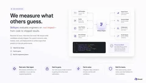
The design follows a top-down, split-then-grid cadence. The top section presents an asymmetrical 40/60 two-column split: narrative copy, eyebrow, and bulleted checklist on the left, counterbalanced by the expansive architecture board on the right. Below this hero section, a full-width rule leads into a clean, 4-column horizontal feature strip with vertical hair-line dividers separating each benefit equally.
PALETTE (use these exact hex values)
- #ffffff — Base Canvas: Global background providing high-key legibility for typography and diagram elements
- #f8fafc — Subtle Panel: Background fill for the master schematic container and auxiliary card surfaces
- #161b26 — Code Terminal Slate: Inverted dark container for rendering JSON candidate signals and telemetry output
- #e2e8f0 — Border Muted: Subtle 1px perimeter outlines on nodes, diagram cards, and column dividers
- #5850ec — Core Indigo: Primary brand accent used on glowing central logos, connector dots, and highlight text
- #f5f3ff — Lavender Tint: Subtle tint for eyebrow badge pills, icon container circles, and trust badges
- #111827 — Text Primary: Display headlines, primary card titles, and high-emphasis labels
- #64748b — Text Secondary: Body descriptions, connector annotations, and checklist list items
TYPOGRAPHY
Typeface Inter (or Plus Jakarta Sans, SF Pro Display), weights 400/500/600/700. Sizes 11px caption, 12px body-sm, 14px body, 16px subheading, 18px body-lg, 20px heading, 44px display. Tracking -0.03em display, -0.01em body. The typographic tone is objective, precise, and authoritative. Set in a clean geometric sans-serif (Inter or similar), the letterforms possess neutral proportions that let numbers and technical labels shine. Tight negative tracking in large headlines adds a confident modern editorial edge, while monospace JetBrains Mono delivers authentic developer fidelity in data payloads.
GEOMETRY & SPACING
Corner radii — cards 24px, links 4px, inputs 8px, buttons 10px. Spacing on a 4px unit, 32px gaps, 80px between sections, 1240px container, comfortable density.
DEPTH
Depth is created using wide-aperture, low-opacity ambient shadows rather than harsh stepped layers. The main feature canvas floats subtly above the page using a soft spread (0 24px 48px -12px rgba(0,0,0,0.06)). The central engine card utilizes a concentrated, tinted violet diffusion (0 10px 25px rgba(88,80,236,0.2)) to signify computational processing.
IMAGERY
No human photography or decorative 3D assets are used. The visual language relies purely on schematic system diagrams, programmatic code editors, and simplified line-art iconography housed within circular or squircled badges. Everything is styled to mimic an interactive developer architecture interface.
SIGNATURE DETAIL — the thing that makes this design itself
The standout signature move is the 'Data Pipeline into Proof Terminal' board: incoming data sources route orthogonally through dashed lines into a glowing violet engine, which terminates immediately below into a live, dark JSON code card. It visually translates abstract product capability into tangible, verified developer output.
MUST
- Use soft grey borders (#e2e8f0) to define structural nodes without overwhelming contrast.
- Keep connector paths as thin, muted dashed lines with clean 90-degree orthogonal bends.
- Isolate the deep slate terminal block solely for technical output or code examples.
- Highlight specific high-impact words in the introductory paragraph using the brand indigo.
AVOID
- Do not use saturated backgrounds; canvas must remain near pure-white or faint cool grey.
- Do not render icons in solid fill colors; maintain consistent 1.5px stroke weight.
- Never substitute rounded pill badges with sharp, rectangular tags.
- Avoid continuous solid arrows for architectural connections; use dashed subtle dot paths.
OUTPUT
Render as a clean, pixel-crisp UI design at roughly 1792:1024. Flat vector rendering, real legible text, no browser chrome, no device mockup frame, no watermark, no lorem ipsum placeholder blocks.
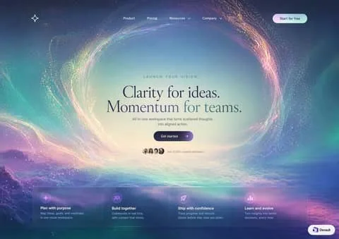
Design a dark-mode abstract background artwork: an ethereal particle vortex framing a serene morning sky with frosted glass navigation and quiet editorial type.
LAYOUT
Vertically centered hero composition anchored by a global navbar at the top and a floating frosted dock at the bottom. The central focal zone is an unobstructed oval aperture that holds eyebrow, serif display headline, supporting paragraph, primary CTA, and social proof in tight vertical alignment. The bottom dock sits anchored above the lower edge, spanning 1160px across four balanced feature quadrants.
PALETTE (use these exact hex values)
- #15132d — Cosmic Void Indigo: Outer canvas background, edge nebulas, and deep space corners.
- #c2e5e7 — Luminous Sky Core: Illuminated center of the vortex against which the main headline rests.
- #182c38 — Deep Ocean Navy: Display headlines and primary value proposition text inside the bright portal.
- #43616d — Slate Teal Muted: Eyebrow tag and subheadline inside the central light aperture.
- #ffffff — Starlight White: Top nav links, bottom dock headings, and glowing icons.
- linear-gradient(135deg, #2b2347 0%, #462c5b 100%) — Violet Nocturne Gradient: Primary central action button ('Get started') floating below subcopy.
- linear-gradient(135deg, #f2d5e5 0%, #c4f0ea 100%) — Iridescent Dawn Gradient: Top right 'Start for free' navbar CTA button fill.
TYPOGRAPHY
Typeface Instrument Serif (or Cormorant Garamond, Fraunces, New York), weights 400. Sizes 11px caption, 12px body-sm, 14px body, 16px body-lg, 17px heading, 56px display. Tracking -0.015em. Lyrical, contemplative, and premium. The pairing of a delicate, classic serif (Instrument Serif) inside the bright clearing with crisp modern geometric grotesque (Plus Jakarta Sans) conveys visionary intelligence without sacrificing clarity. For production environments where Instrument Serif is unavailable, Cormorant Garamond or Fraunces (Regular, Normal optical size) offer identical weight and emotional warmth.
GEOMETRY & SPACING
Corner radii — cards 24px, links 4px, inputs 999px, buttons 999px. Spacing on a 8px unit, 24px gaps, 96px between sections, 1200px container, airy density.
DEPTH
Depth is created organically through atmospheric layering rather than drop shadows. The background image recedes from dense dark nebula clouds to an infinite glowing sky aperture, while UI components hover via translucent glassmorphism (8% white wash, 1px specular rim highlight, and 24px backdrop blur).
IMAGERY
Photorealistic cinematic digital illustration depicting a swirling ring of celestial stardust, auroral cyan streams, and golden planetary dust framing a calm morning cloudscape. Graphic icons and cartoonish assets are strictly off-brand; all visual richness originates from organic light trails and mist.
SIGNATURE DETAIL — the thing that makes this design itself
The luminous circular vortex portal that naturally inverses content contrast: text is dark slate inside the sunny eye of the storm, while outer interface controls remain glowing starlight white against deep space.
MUST
- Position all primary dark typography directly inside the lighter sky portal center.
- Use full pill radii (999px) for all standalone action buttons.
- Keep navigation links flat and transparent without background container pill encapsulation.
- Maintain heavy blur (20-30px) on the bottom card so cosmic clouds filter smoothly through.
AVOID
- Never place pure white text directly in the bright center sky region.
- Do not give the bottom feature dock solid, opaque backgrounds.
- Avoid square or sharp corners anywhere; everything follows soft rounded conventions.
- Do not use heavy, bold sans-serif typefaces for the central hero message.
OUTPUT
Render as a clean, pixel-crisp UI design at roughly 3424:2416. Flat vector rendering, real legible text, no browser chrome, no device mockup frame, no watermark, no lorem ipsum placeholder blocks.
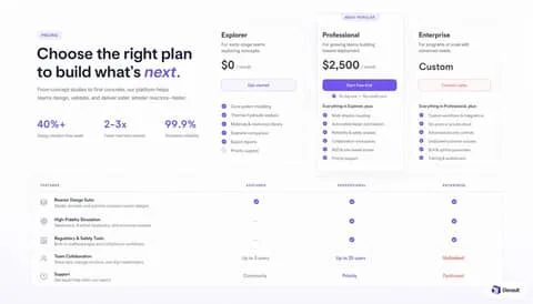
Design a light-mode website section: airtight precision engineering softened by lilac radiants, high-contrast metrics, and surgical tabular comparison.
LAYOUT
The upper section utilizes an asymmetric 2-column layout across a 1200px container: the left column holds the pricing header, descriptive body copy, and a 3-part quantitative proof rail, while the right column hosts three tightly packed pricing tiers. The middle tier is elevated vertically. Below, spanning the full container width, sits the feature comparison matrix which directly mirrors the column alignment of the pricing rack above.
PALETTE (use these exact hex values)
- #FBFBFE — Canvas Background: ambient full-viewport background tint providing warmth beneath pure white cards
- #FFFFFF — Surface Pure White: elevated card surfaces, matrix background, and nested interactive elements
- #5B43F7 — Iris Brand Primary: primary CTA button fill, highlighted hero keyword, active checkmarks, and key metrics
- #EDE9FE — Iris Tint Subtle: pricing category badge background and secondary pill backdrops
- #111827 — Text Primary: display headings, plan titles, numeric prices, and matrix row names
- #64748B — Text Secondary: subheadings, period labels, feature descriptions, and inactive states
- #EAEBEE — Border Subtle: delicate 1px dividing lines, card perimeters, and horizontal matrix rules
- #D95D4A — Coral Enterprise Accent: enterprise tier text emphasis and high-touch support label callouts
- #FADCD6 — Coral Border Subtle: outline border for the enterprise contact CTA button
TYPOGRAPHY
Typeface Inter (or Plus Jakarta Sans, SF Pro Display, Helvetica Neue), weights 400/500/600/700. Sizes 11px caption, 13px body-sm, 14px body, 15px body-lg, 20px subheading, 28px heading, 36px heading-lg, 44px display. Tracking -0.03em at display, -0.01em at body, 0.05em at overline. The typography relies on a clean, modern neo-grotesque sans-serif (matching Inter or Plus Jakarta Sans) tuned for dense enterprise and deep-tech SaaS. It communicates mathematical rigor and enterprise reliability through tight tracking on display sizes and highly legible numerals for financial and statistical figures.
GEOMETRY & SPACING
Corner radii — cards 20px, links 4px, inputs 8px, buttons 10px. Spacing on a 4px unit, 20px gaps, 64px between sections, 1200px container, comfortable density.
DEPTH
Depth is handled strictly through surface contrast and a single purposeful focal shadow. The base canvas is tinted, allowing standard cards to sit flat with fine 1px outlines (#EAEBEE). Only the featured 'Professional' card lifts off the grid using a wide, highly diffused shadow tinted with iris pigment (rgba(91, 67, 247, 0.12)), signaling prominence without heavy borders.
IMAGERY
No photographic imagery or photorealistic 3D renders are used. Visual iconography is strictly limited to 18px monoline technical icons (layered planes, gears, shielded documents, avatar outlines) enclosed in muted slate outlines. Feature confirmation uses filled circular check discs in brand iris.
SIGNATURE DETAIL — the thing that makes this design itself
The signature element is the floating, violet-shadowed center card crowned by an inset 'MOST POPULAR' pill badge that straddles the top border, paired directly with the warm coral text accents in the enterprise column below. This combination breaks standard monolithic monochromatic grids by using dual-accent chromatic hierarchy.
MUST
- Keep the canvas tinted with pale lavender-gray (#FBFBFE) so white containers remain visually distinct.
- Reserve the saturated purple (#5B43F7) almost entirely for key metrics, primary CTAs, and active checks.
- Use generous 20px radii on primary surface cards, stepping down to 10px on buttons.
- Present feature matrix headers in uppercase 11px slate typography with positive letter spacing.
AVOID
- Do not use harsh pure black borders; keep borders at 1px solid #EAEBEE.
- Do not saturate all three tier buttons; only the center card receives the solid iris fill.
- Never apply high-opacity black shadows; use violet-tinted low-opacity drop shadows instead.
- Do not clutter matrix rows with alternate striped background colors; keep row backgrounds white with hairline dividers.
OUTPUT
Render as a clean, pixel-crisp UI design at roughly 1792:1024. Flat vector rendering, real legible text, no browser chrome, no device mockup frame, no watermark, no lorem ipsum placeholder blocks.
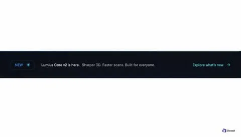
Design a dark-mode website section: crisp electric cyan accents slicing through deep cosmic slate for high-priority product drops.
LAYOUT
The horizontal rhythm follows a standard reading path: badge indicator on the far left, core statement in the center-left, vertical spacer line, and conversion link on the right. Vertically, all components share a centered baseline inside a 52px-tall frame.
PALETTE (use these exact hex values)
- #070b14 — Obsidian Slate: Primary full-bleed background for the announcement banner strip
- #0e2a38 — Cyan Glow Edge: Top border hairline accent suggesting faint neon illumination
- #22d3ee — Electric Cyan: Used for the pill tag text, sparkle icon, and trailing CTA text and arrow
- #081b26 — Cyan Tint Surface: Subtle tinted backdrop fill for the pill notification badge
- #164e63 — Badge Stroke: Defining hairline border for the 'NEW' pill tag
- #ffffff — Primary Text: High-emphasis product name and milestone status declaration
- #94a3b8 — Secondary Text: De-emphasised feature list summary copy
- #1e293b — Divider Line: Vertical separator distinguishing announcement statement from interactive CTA
TYPOGRAPHY
Typeface Inter (or Geist, SF Pro Display, Plus Jakarta Sans), weights 400/500/600. Sizes 11px caption, 13px body-sm, 14px body. Tracking -0.01em for copy, 0.05em for badge. The typographic tone is engineered, precise, and tech-forward, matching contemporary developer tools and modern SaaS frameworks. A neutral neo-grotesque like Inter provides clinical readability at 11-14px sizes without drawing attention to its own letterforms.
GEOMETRY & SPACING
Corner radii — cards 0px, links 2px, inputs 6px, buttons 999px. Spacing on a 4px unit, 16px gaps, 56px between sections, 1280px container, tight density.
DEPTH
Elevation is completely planar with zero ambient drop shadows. Depth is communicated strictly via value contrast: a pitch dark ground, a faintly tinted badge container, and a 1px highlight stroke along the upper border.
IMAGERY
Iconography is strictly vector and monochromatic, exemplified by the single 8-pointed sparkle glyph (12px) embedded inside the status badge. Photorealistic imagery or complex multi-color illustrations are strictly avoided in this bar paradigm.
SIGNATURE DETAIL — the thing that makes this design itself
The dual-anchor layout: an illuminated cyan pill tag on the left balancing an arrow-led cyan text link on the right, bridging clean white-and-slate editorial copy across a dark void.
MUST
- Keep the primary feature announcement in pure white and auxiliary details in muted slate.
- Use electric cyan (#22d3ee) solely for state tags, icons, and interactive links.
- Maintain the capsule badge border-radius strictly at 999px for an organic pill silhouette.
- Separate message copy from the call-to-action with a 24px-tall muted hairline vertical rule.
AVOID
- Never use bright cyan for body text sentences; it diminishes CTA conversion contrast.
- Do not allow the bar to wrap into multiple lines on desktop viewports.
- Avoid solid, saturated pill fills which overpower the headline typography.
- Do not remove the vertical rule divider between text statement and trailing action link.
OUTPUT
Render as a clean, pixel-crisp UI design at roughly 1792:1024. Flat vector rendering, real legible text, no browser chrome, no device mockup frame, no watermark, no lorem ipsum placeholder blocks.
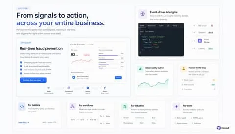
Design a light-mode website section: crisp bento telemetry mapping machine cognition to live product operations with surgical blue precision.
LAYOUT
The grid follows an asymmetric bento rhythm anchored by a dominant 2-column top half. The upper-left quadrant hosts the display copy alongside a wide spotlight card featuring real-time fraud telemetry and pipeline nodes. The upper-right quadrant stacks an event-driven AI code block over two split metric cards, while the bottom section locks four equal-width capability columns together.
PALETTE (use these exact hex values)
- #F8FAFC — Canvas Background: Global backdrop providing subtle contrast beneath pure white card surfaces.
- #FFFFFF — Card Surface: Modular bento container fill across all feature blocks and nested dashboard components.
- #181F2C — Terminal Canvas: High-contrast background reserved exclusively for the developer code and payload preview.
- #E2E8F0 — Card Border: Hairline 1px perimeter on all cards, mini-mockups, and divider lines.
- #2563EB — Brand Blue: Hero headline emphasis, primary CTA buttons, active checklist checks, and focus elements.
- #EFF6FF — Soft Blue Tint: Background fill for uppercase category pills and active state callouts.
- #0F172A — Heading Slate: Primary headings, bento card titles, and prominent numeric metric labels.
- #64748B — Muted Slate: Supporting descriptive copy, subtitle labels, and inactive meta tags.
- #EF4444 — Risk Alert Coral: High-risk indicators, alert sparklines, and status badges.
- #0D9488 — Telemetry Teal: Observability metric sparklines and system health indicators.
TYPOGRAPHY
Typeface Inter (or Geist, SF Pro Text, Plus Jakarta Sans), weights 400/500/600/700. Sizes 11px caption, 13px body-sm, 14px body, 16px body-lg, 18px subheading, 24px heading, 42px display. Tracking -0.025em at headlines, 0.05em at caps badges. The voice is confident, technical, and frictionless, driven by Inter's dense neutral grotesque letterforms. High headline contrast is achieved by tinting the terminal half of the display phrase in electric #2563EB. The pairing with a monospace font reinforces developer-grade credibility and operational speed.
GEOMETRY & SPACING
Corner radii — cards 16px, links 4px, inputs 8px, buttons 8px. Spacing on a 4px unit, 20px gaps, 80px between sections, 1360px container, comfortable density.
DEPTH
Depth is handled strictly through surface layering rather than intense shadows. The #F8FAFC ground supports level-1 #FFFFFF cards bounded by 1px #E2E8F0 borders and an ambient shadow of `0 1px 3px rgba(15, 23, 42, 0.04)`. Nested preview cards (like the live fraud dial) sit inside recessed ground wells with matched hairline borders.
IMAGERY
There is zero photographic imagery or abstract 3D artwork. Imagery is replaced entirely by functional, scaled-down user interfaces: live risk scores, JSON event payloads, decision matrices, node-to-node connectors, and SVG sparkline charts. Everything simulates an actual operating software state.
SIGNATURE DETAIL — the thing that makes this design itself
The design's signature element is the embedded 'live telemetry micro-widget' inside every bento tile—specifically showing realistic data states like '92/100 High risk' paired with real SVG sparklines and node diagrams. Misusing this pattern occurs when designers treat the mockups as vague placeholder shapes instead of accurately scaled, readable software workflows.
MUST
- Wrap complex capabilities into tangible, high-fidelity micro-UIs rather than relying on abstract marketing illustrations.
- Use solid #2563EB selectively to draw the eye to core messages, primary buttons, and critical flow paths.
- Enforce a 1px #E2E8F0 border on all white surface cards to cleanly separate them from the #F8FAFC canvas.
- Keep icon containers at 36x36px with 8px radii using very pale tints of their respective accent colors.
AVOID
- Do not introduce 3D renderings, isometric illustrations, or generic stock photography.
- Do not use heavy drop shadows; cards should rely on thin borders and near-invisible ambient blur.
- Do not scatter brand blue across every icon; reserve it for primary hierarchy and use domain tints elsewhere.
- Do not let micro-dashboards exceed 13px font size; they must look like realistic shrunk telemetry.
OUTPUT
Render as a clean, pixel-crisp UI design at roughly 1792:1024. Flat vector rendering, real legible text, no browser chrome, no device mockup frame, no watermark, no lorem ipsum placeholder blocks.
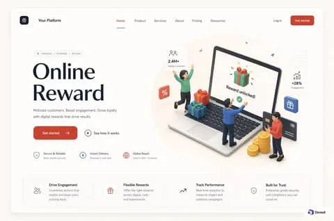
Design a light-mode web interface screen: tactile clay 3d figures meet warm terracotta accents in an airy, structured enterprise loyalty canvas.
LAYOUT
The header spans the full container width with balanced logo-left, navigation-center, and dual-CTA-right distribution. Below, the hero splits into an asymmetrical 45/55 layout where typography and trust metrics dominate the left, and an expansive 3D scene claims the right. The page terminates cleanly in an integrated four-column value proposition banner spanning the base.
PALETTE (use these exact hex values)
- #C4452C — Terracotta Crimson: Primary action button background, active navigation indicator line, and brand focal highlights.
- #181D26 — Deep Ink: Primary headline typography, brand logo icon container, and bold metric values.
- #6E7582 — Muted Slate: Body paragraphs, unselected top navigation links, and tertiary metric descriptors.
- #FFFFFF — Pure Canvas: Primary elevated card surface, floating stat badges, and app body background.
- #F7EFE8 — Warm Spotlight: Soft circular backplate highlighting the hero 3D hardware composition.
- #EBE8E2 — Subtle Cream Border: Hairline perimeter borders on floating stat cards, pill tags, and feature bar container.
- #F9F8F6 — Outer Frame Neutral: Outer boundary background surrounding the main application container.
TYPOGRAPHY
Typeface Plus Jakarta Sans (or Outfit, Inter, DM Sans), weights 400/500/600/700. Sizes 11px caption, 12px body-sm, 14px body, 15px body-lg, 16px subheading, 20px heading, 64px display. Tracking -0.02em at display, 0.01em at body. The typography is welcoming, modern, and confident. Plus Jakarta Sans offers geometric balance without appearing rigid, bringing humanistic curvature that harmonizes with the rounded 3D clay art. Free Google Fonts substitute Inter or Outfit will preserve this friendly clarity if licensed fonts are unavailable.
GEOMETRY & SPACING
Corner radii — cards 14px, links 4px, inputs 10px, buttons 10px. Spacing on a 8px unit, 24px gaps, 64px between sections, 1280px container, comfortable density.
DEPTH
Depth is handled through ambient, diffused drop shadows beneath elevated white cards (0px 8px 24px rgba(0,0,0,0.04)) rather than sharp directional lighting. The tactile 3D clay characters and laptop bring physical volume, casting soft contact shadows onto the central spotlight disk.
IMAGERY
Hero imagery relies on rendered matte clay 3D figures interacting playfully with isometric digital screens, stacked gold tokens, and gift packages. Realistic stock photos or flat corporate vectors would clash severely with this friendly, tactile aesthetic.
SIGNATURE DETAIL — the thing that makes this design itself
The signature element is the combination of an oversized matte 3D clay interaction scene floating over a subtle warm beige oval backdrop, flanked by delicate white stat chips and warm terracotta interactive accents. Misusing it involves substituting the soft clay figures with flat vector clip-art or harsh hyper-saturated gradients.
MUST
- Use warm terracotta #C4452C strictly for primary actions, active indicators, and high-value conversion elements.
- Enclose secondary feature indicators in smooth 1px bordered cards with #EBE8E2 outlines.
- Preserve deep letter-spacing tightening (-0.02em) on the 64px display headline to maintain density.
- Ground 3D floating visual assets with soft tinted radial backdrops like #F7EFE8.
AVOID
- Do not introduce sharp 0px corners; every card and button requires between 10px and 999px curvature.
- Avoid high-contrast pitch-black text; keep base headlines around #181D26 to protect warmth.
- Do not clutter hero illustration space with multiple saturated colored backdrops.
- Never make secondary action buttons filled; use icon-backed ghost or text-only variants.
OUTPUT
Render as a clean, pixel-crisp UI design at roughly 3520:2336. Flat vector rendering, real legible text, no browser chrome, no device mockup frame, no watermark, no lorem ipsum placeholder blocks.
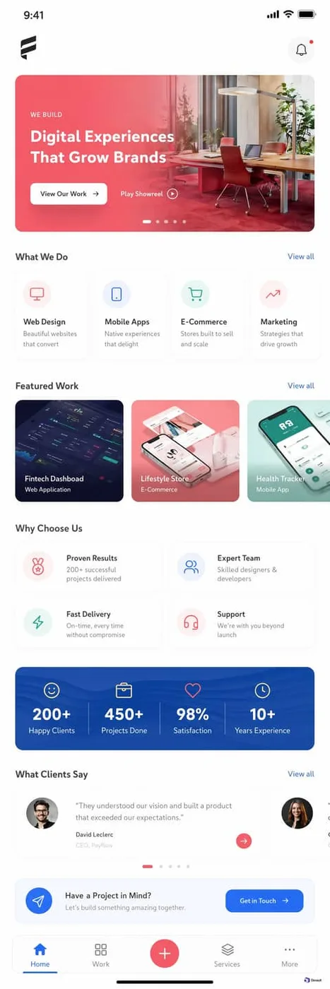
Design a light-mode mobile app interface screen: tactile agency showcase blending warm sunset duotones with crisp geometric card layouts.
LAYOUT
The mobile layout follows a top-down single-column hierarchy consisting of horizontal swipe lanes. It begins with a compact top bar, moves immediately into a hero showcase card, followed by stacked sections each introduced by an identical title-and-'View all' row. Content within sections ('What We Do', 'Featured Work') is formatted as edge-to-edge horizontally scrolling carousels with 14px gutters.
PALETTE (use these exact hex values)
- #FFFFFF — Base Background: Screen background canvas providing bright, distraction-free negative space
- #FAFBFC — Card Surface Soft: Background fill for lightweight service cards and utility buttons
- #1E232C — Primary Text: Section headers, card titles, and high-emphasis labels
- #717A8A — Muted Text: Card descriptions, subheadings, and secondary metadata
- #E84E59 — Hero Coral: Primary brand color, hero background overlay, and active badge indicator
- #1A6EF5 — Link Blue: All 'View all' inline action links across section headers
- #EDF0F5 — Border Hairline: Subtle card outlines separating white cards from white canvas
- #FDECEF — Icon Tint Pink: Circular icon background for web design and analytics categories
- #EBF3FE — Icon Tint Blue: Circular icon background for mobile app category cards
- #E6F7F3 — Icon Tint Mint: Circular icon background for e-commerce category cards
TYPOGRAPHY
Typeface Plus Jakarta Sans (or Inter, Poppins, DM Sans), weights 400/500/600/700. Sizes 11px caption, 12px body-sm, 13px body, 14px body-lg, 15px subheading, 17px heading, 20px heading-lg, 24px display. Tracking -0.01em on headings, 0 on body, 0.08em on uppercase tags. The typographic tone is crisp, authoritative, and contemporary tech-agency. Employing a geometric neo-grotesque like Plus Jakarta Sans or Inter gives the interface architectural precision, with tight negative letter-spacing (-0.02em) on bold headings balancing generous x-height legibility on 11px to 13px captions. Open-source substitutes like Inter and DM Sans provide a near-identical aesthetic.
GEOMETRY & SPACING
Corner radii — cards 18px, links 4px, inputs 12px, buttons 10px. Spacing on a 4px unit, 14px gaps, 28px between sections, 390px container, comfortable density.
DEPTH
Depth is rendered primarily through crisp surface boundaries rather than heavy drop shadows. The hero banner and case study cards achieve separation through saturated photographic color and gradient fills, while service cards sit gently on the canvas using hairline borders (#EDF0F5) paired with an imperceptible 0 2px 8px rgba(0,0,0,0.02) shadow.
IMAGERY
Photography combines crisp, aspirational studio architectural spaces with high-fidelity digital UI mockups. Images in hero banners utilize semi-transparent color washes (coral/red duotone), while case study thumbnails display angled 3D device renderings and app UI screenshots on cohesive tinted backdrops. Avoid generic stock photos or unbranded lifestyle imagery.
SIGNATURE DETAIL — the thing that makes this design itself
The signature element is the warm coral-to-rose duotone hero card that gracefully blends a high-contrast architectural workspace with bold white typographic messaging and a pill pagination tracker. Misusing this element by substituting cold, desaturated imagery or cluttering the white action button destroys the distinct warm studio atmosphere.
MUST
- Use generous 16px to 20px border-radius values on all cards and image thumbnails.
- Rely on solid white buttons with dark text when overlaying rich coral gradient backgrounds.
- Tint icon backgrounds with delicate 10-15% opacity pastel circles matching their icon hue.
- Keep 'View all' section links strictly in primary accent blue #1A6EF5.
AVOID
- Do not use dark or opaque borders on cards; use hairline #EDF0F5 outlines only.
- Never substitute the vibrant coral-pink hero gradient with neutral greys or cool blues.
- Do not center-align text inside the Service Category cards; left-align content consistently.
- Avoid sharp 0px or 4px square corners anywhere in the mobile viewport.
OUTPUT
Render as a clean, pixel-crisp UI design at roughly 1280:3840. Flat vector rendering, real legible text, no browser chrome, no device mockup frame, no watermark, no lorem ipsum placeholder blocks.
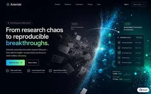
Design a dark-mode website section: an astronomical shift from fragmented monochrome debris into luminous, cybernetic research clarity.
LAYOUT
The header sits flush across the top grid with symmetric link distribution. The hero employs an asymmetrical 50/50 two-column layout: left column contains the text hierarchy, CTA buttons, and triple value-prop validation row; right column features the rich visual transformation culminating in floating product status widgets.
PALETTE (use these exact hex values)
- #04070d — Cosmic Void: Dominant deep space canvas background underpinning the entire page section
- #0c1524 — Glass Slate: Translucent background for floating pipeline and telemetry dashboard cards
- #22d3ee — Electric Cyan: Luminescent glow, particle streams, active status nodes, and primary gradient stop
- #4ade80 — Aurora Mint: Success badges, secondary gradient stop for headline and primary action button
- linear-gradient(90deg, #38bdf8 0%, #4ade80 100%) — Primary Gradient: High-conversion CTA background fill and display heading highlight span
- #ffffff — Pure White: Primary headings, active task names, and prominent interface labels
- #94a3b8 — Starlight Gray: Supporting descriptive copy, subtitle paragraphs, and inactive navigation links
- #1e293b — Subtle Border: Subtle outlines around pills, buttons, and glassmorphic card containers
TYPOGRAPHY
Typeface Plus Jakarta Sans (or Inter, DM Sans), weights 400/500/600/700. Sizes 11px caption, 13px body-sm, 16px body, 20px subheading, 28px heading, 56px display. Tracking -0.02em at display, 0 at body. Plus Jakarta Sans delivers a technical yet approachable neo-grotesque demeanor, balancing scientific precision with SaaS accessibility. The tight display tracking gives the headline an authoritative, engineered stance, while generous body line heights maintain effortless scannability on pitch-black surfaces.
GEOMETRY & SPACING
Corner radii — cards 14px, links 4px, inputs 999px, buttons 999px. Spacing on a 4px unit, 20px gaps, 96px between sections, 1320px container, comfortable density.
DEPTH
Depth is created through luminescent back-glows and atmospheric contrast rather than traditional directional drop shadows. Floating HUD surfaces sit on rgba(12, 21, 36, 0.85) glass with 1px translucent rims, appearing suspended over glowing volumetric particle fields.
IMAGERY
The imagery relies on a split spatial metaphor: floating 3D greyscale paper fragments and asteroids on the left, colliding into an orbital planetary horizon that disperses into glowing teal geometric cubes and particle bursts. Any literal photo of human beings, desks, or stock laboratory imagery would break the cosmic-cybernetic language.
SIGNATURE DETAIL — the thing that makes this design itself
The signature element is the horizontal Before-to-After cosmological threshold: scattered greyscale papers physically resolving across an arched vector trajectory into glowing cyan telemetry cards. Without this explicit visual metamorphosis from paper chaos to digital order, the design would revert to a generic dark SaaS hero.
MUST
- Use a vibrant cyan-to-mint gradient strictly for the focal headline noun and primary CTA.
- Enclose all action buttons and status tags in 999px pill geometries.
- Keep visual clutter on the left strictly monochrome to contrast with the vibrant right-side UI.
- Enforce a 1px border of rgba(255,255,255,0.1) on all dark floating cards.
AVOID
- Do not introduce warm hues like orange, yellow, or red into the core visual scheme.
- Do not use sharp 0px corners on interactive buttons or UI telemetry panels.
- Do not color the left-hand chaos debris; it must stay greyscale to represent manual friction.
- Do not make the dark background solid pure black #000000; retain subtle deep blue depth.
OUTPUT
Render as a clean, pixel-crisp UI design at roughly 1440:896. Flat vector rendering, real legible text, no browser chrome, no device mockup frame, no watermark, no lorem ipsum placeholder blocks.
Design a dark-mode website section: clinical precision meets warm planetary atmosphere in a deep nocturnal telemetry layout.
LAYOUT
The composition follows a strict top-to-bottom binary hierarchy. The top half is an airy, center-aligned conversion chamber focused around a two-line title, two-line subcopy, and parallel CTA actions. Below, an abrupt horizon transition enters a structured 6-column asymmetric grid: brand monolith on the left, four equidistant link columns, and a right-aligned conversion subscription block, capped by a persistent legal bar.
PALETTE (use these exact hex values)
- #0A1E24 — Deep Petrol Base: Primary footer canvas background color delivering high contrast for dense metadata and links
- #F4EFE6 — Atmospheric Core Cream: Center highlight of the vortex backdrop in the upper CTA section
- #0C242A — Display Navy Slate: Dominant headline color on light backgrounds and hero typography
- #106869 — Marine Highlight: Accented display word 'confidence' and primary solid CTA button background
- #E87A53 — Terracotta Accent: Newsletter submission button providing sharp energetic contrast against nocturnal petrol
- #8AA3A9 — Subdued Slate Gray: Secondary copy, footer link columns, labels, and copyright metadata
- #16343C — Muted Petrol Border: Dividers, social link separators, and input box strokes in the footer
- #FFFFFF — Solid White: Footer wordmark, primary button text, and newsletter arrow icon
TYPOGRAPHY
Typeface Plus Jakarta Sans (or Inter, DM Sans, General Sans), weights 400/500/600/700. Sizes 12px caption, 14px body-sm, 15px subheading, 16px body, 24px heading, 44px display, 60px heading-lg. Tracking -0.025em for display titles, 0 for body and links. Authoritative, crisp, and engineered. The choice of Plus Jakarta Sans (or Inter) provides a modern corporate infrastructure voice that balances technical rigour with high legibility at micro-scales (13px footer links). Substitution should favor grotesque typefaces with high x-heights and tight aperture tracking.
GEOMETRY & SPACING
Corner radii — cards 0px, links 999px, inputs 8px, buttons 8px. Spacing on a 4px unit, 28px gaps, 96px between sections, 1240px container, comfortable density.
DEPTH
No simulated drop shadows or ambient blurs are placed on component containers. Depth is instead established through visual environmental atmosphere: an omnidirectional, luminous vortex gradient behind the CTA contrasting sharply with the flat, absorbing density of the deep petrol footer plate.
IMAGERY
The only graphic asset is an ethereal, swirling radial vortex displaying micro-grain noise, warm parchment luminance at the core, and teal-shadowed edges. Photography, 3D renderings, and illustrative cartoons are strictly absent, enforcing an enterprise infrastructure tone.
SIGNATURE DETAIL — the thing that makes this design itself
The sudden vertical transition from a luminous, textured sand-to-teal atmospheric vortex CTA directly into a pitch-petrol (#0A1E24) directory footer, ignited by a solitary terracotta orange (#E87A53) micro-action button.
MUST
- Reserve the terracotta orange (#E87A53) exclusively for the newsletter submit trigger to guarantee visual hierarchy.
- Use tight negative tracking (-0.025em) exclusively on headings above 40px to preserve tight editorial solidity.
- Maintain high value contrast between the atmospheric CTA field and the pitch petrol footer baseline.
- Wrap utility indicators like minicor.com in full 999px pill geometry with 1px discrete borders.
AVOID
- Do not use generic gray or pure black for the footer; it must remain an oceanic deep petrol (#0A1E24).
- Never apply rounded pill borders (999px) to primary CTA buttons; buttons must remain clipped at 8px radius.
- Avoid multi-colored social icons; preserve monochromatic typography-based monograms with vertical rules.
- Do not introduce drop shadows on buttons or cards; depth is achieved solely through atmospheric background luminance.
OUTPUT
Render as a clean, pixel-crisp UI design at roughly 1792:1024. Flat vector rendering, real legible text, no browser chrome, no device mockup frame, no watermark, no lorem ipsum placeholder blocks.
Design a light-mode website section: crisp engineering clarity delivered through pastel-coded functional cards and disciplined typographic hierarchy.
LAYOUT
The section adopts a two-panel split grid within a 1280px bounded wrapper: a left-aligned 4-column anchor containing the core value proposition, key bullets, and manifesto badge; and an 8-column right-aligned 3x2 uniform card layout. Below this primary dual-wing configuration sits a single 100% width horizontal banner reinforcing operational tenets with 4-column internal distribution.
PALETTE (use these exact hex values)
- #FAFAFC — Canvas Background: Global application page background providing high-key contrast for card elevations
- #FFFFFF — Card Surface: Background for floating feature cards, callouts, and the bottom trust strip
- #E2E8F0 — Border Subtle: 1px structural outline on cards, badges, and horizontal dividers
- #0F172A — Primary Text: Primary headings, card titles, and high-emphasis labels
- #64748B — Muted Text: Body copy, descriptions, and supporting contextual metadata
- #2563EB — Research Blue: Eyebrow tag, research theme badges, and key headline accent lines
- #EFF6FF — Research Blue Light: Tinted background for research-themed icon squares and footer tag pills
- #059669 — Emerald Green: Eyebrow text and badge labels for data and security cards
- #ECFDF5 — Emerald Green Light: Tinted background for data/security icon squares and tag pills
- #D97706 — Amber Orange: Eyebrow text and badge labels for operations cards
TYPOGRAPHY
Typeface Inter (or Geist, SF Pro Text, Plus Jakarta Sans), weights 400/500/600/700. Sizes 11px caption, 13px body-sm, 14px body, 16px body-lg, 18px heading, 40px display. Tracking -0.03em at display, 0.08em at uppercase tags. The voice is analytical, authoritative, and direct. Rendered in a neo-grotesque sans-serif (Inter match), the high x-height and tight negative tracking on display sizes (-0.035em) produce a modern enterprise-grade technical clarity. Geist or SF Pro Text serve as drop-in equivalents without altering the cold engineering poise.
GEOMETRY & SPACING
Corner radii — cards 16px, links 4px, inputs 8px, buttons 8px. Spacing on a 4px unit, 20px gaps, 80px between sections, 1280px container, comfortable density.
DEPTH
Depth is handled almost entirely through flat boundary definition: pure white (#FFFFFF) surfaces set against an ultra-pale gray canvas (#FAFAFC), bounded by a hairline 1px border (#E2E8F0). Volumetric drop shadows are intentionally omitted or kept negligible (0 1px 2px rgba(0,0,0,0.03)) to preserve an architectural blueprint precision.
IMAGERY
No photographic imagery or abstract 3D shapes are present. Visual delight is achieved purely via minimalist linear icons (outline stroke ~1.75px) seated inside softly colored 44x44px rounded squares with 12px border radii. Realistic product mockups or photography would break the systematic engineering aesthetic.
SIGNATURE DETAIL — the thing that makes this design itself
The triple-tier color coding system: each card aligns its icon container tint, uppercase eyebrow text, and bottom pill badge to a singular semantic hue (Research Blue, Mint Emerald, or Amber Orange), unifying diverse AI workflows under strict visual syntax.
MUST
- Pair every feature card icon tint directly with its eyebrow and pill tag hue.
- Maintain strict 20px gaps between all cards in the 3x2 matrix.
- Use uppercase 11px typography with letter-spacing 0.08em for domain category eyebrows.
- Keep card backgrounds pure #FFFFFF against the pale #FAFAFC canvas for subtle separation.
AVOID
- Do not introduce drop shadows with opacity higher than 4% or blur exceeding 12px.
- Never mix the category tint colors within the same card.
- Do not color headline text; maintain solid #0F172A for all primary titles.
- Avoid solid filled icons; only use monoline technical outline glyphs.
OUTPUT
Render as a clean, pixel-crisp UI design at roughly 1792:1024. Flat vector rendering, real legible text, no browser chrome, no device mockup frame, no watermark, no lorem ipsum placeholder blocks.
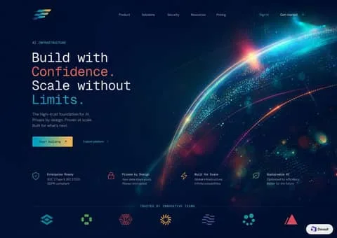
Design a dark-mode abstract background artwork: cosmic deep-space telemetry meeting high-assurance enterprise computing at planetary scale.
LAYOUT
Asymmetric two-column visual rhythm in the hero viewport transitioning to a structured 4-column grid. The left 50% holds the left-aligned headline typography, contextual subtitle, and dual CTA cluster, while the right 50% yields fully to the celestial particle bloom. Beneath, a balanced four-part value proposition runs edge-to-edge above an integrated logo divider.
PALETTE (use these exact hex values)
- #030714 — Abyssal Canvas: Primary background tone across the full viewport, absorbing ambient back-scatter
- #081226 — Sub-surface Navy: Slightly elevated structural tone underlying faint cards and divider boundaries
- #00f0ff — Hyper Cyan: Hero kinetic flare, primary CTA left gradient anchor, and emphasized keyword highlights
- #fb923c — Radiant Amber Coral: Hero headline accent word, primary CTA right gradient stop, and warm corona highlights
- #f8fafc — Photon White: Primary headings, dominant hero display lettering, and active navigation labels
- #94a3b8 — Starlight Muted: Hero description copy, feature body text, and inactive top-nav links
- #38bdf8 — Telemetry Cyan: Micro-labels, category eyebrows, and small navigational indicator icons
- #1e293b — Border Hairline: Dividers, grid demarcations, and boundary lines across the partner banner
TYPOGRAPHY
Typeface Plus Jakarta Sans (or Inter, General Sans, Aeonik), weights 400/500/600/700. Sizes 11px caption, 13px body-sm, 15px body, 17px body-lg, 18px subheading, 24px heading, 56px display. Tracking -0.03em at display, 0 at body. The voice is authoritative, deterministic, and futuristic. Crisp neo-grotesque sans-serif provides enterprise trust and readability, while uppercase monospace accents convey raw compute capability and infrastructure precision. If Plus Jakarta Sans is unavailable, Inter or General Sans provide seamless drop-in replacements.
GEOMETRY & SPACING
Corner radii — cards 8px, links 2px, inputs 6px, buttons 6px. Spacing on a 8px unit, 32px gaps, 80px between sections, 1360px container, comfortable density.
DEPTH
Depth is produced entirely via luminous hierarchy and optical bloom rather than drop shadows. High-z elements receive pure optical emission (#00f0ff, #fb923c) that bleeds into the deep space vacuum, while secondary components stay semi-transparent or hairline-etched against the dark substrate.
IMAGERY
The imagery is purely synthetic and astronomical: a macroscopic planet-scale curvature rendered with iridescent fiber-optic light streaks, glittering multi-spectrum point clouds, and chromatic aberration flares. Strictly avoid stock photography, literal hardware depictions, or non-abstract illustrations.
SIGNATURE DETAIL — the thing that makes this design itself
The sweeping celestial limb on the right canvas edge composed of fiber-optic stream lines, volumetric particle dust, and dual-tone chromatic flare. To implement properly, render it as an asymmetric right-aligned background element that flows underneath navigational anchors without obstructing text legibility.
MUST
- Retain the pure abyssal black background (#030714) to let glowing particle effects radiate cleanly without muddy contrast.
- Restrict color gradients solely to action buttons, hero headline highlights, and cosmic background illumination.
- Set category eyebrows in uppercase monospace with at least 0.15em letter-spacing for a telemetric, mission-critical tone.
- Keep icons minimal with uniform 1.5px stroke weight and direct color coding to match feature domains.
AVOID
- Never introduce opaque light-gray card backgrounds or solid structural white panels that pierce the deep space atmosphere.
- Do not use drop shadows; all visual depth must originate from directional lens flares and ambient back-glow.
- Avoid centering the hero headline copy; keep the narrative left-aligned against the celestial visual arc on the right.
- Do not round buttons beyond an 8px radius; fully rounded pills clash with the engineered industrial feel.
OUTPUT
Render as a clean, pixel-crisp UI design at roughly 3408:2416. Flat vector rendering, real legible text, no browser chrome, no device mockup frame, no watermark, no lorem ipsum placeholder blocks.
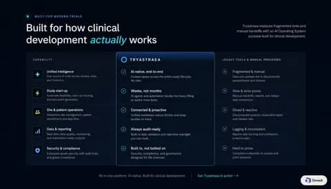
Design a dark-mode website section: dark-room clinical intelligence where elevated spotlight columns reveal modern precision against legacy friction.
LAYOUT
The layout is divided into an asymmetrical top hero split and a centered 3-column structured matrix. The hero pairs a commanding left-aligned H1 with a right-aligned three-line summary paragraph. Below, the comparison grid allocates roughly 30% to capabilities, 38% to the emphasized spotlight column, and 32% to legacy processes, anchored by a centered reassurance link bar at the base.
PALETTE (use these exact hex values)
- #020612 — Obsidian Deep: Deepest canvas background providing high-contrast backdrop for clinical comparison matrix
- #080e1e — Slate Void: Primary matrix container background with subtle slate undercurrent
- #0b1733 — Spotlight Core: Center column active fill representing the modern platform surface
- #38bdf8 — Electric Cyan: Hero emphasis text, glowing borders, active check icons, and eyebrow glyph
- linear-gradient(180deg, rgba(56, 189, 248, 0.35) 0%, rgba(56, 189, 248, 0) 100%) — Cyan Halo Gradient: Subtle top inner glow illuminating the recommended column header
- #ffffff — Pure White: Display headings, column titles, and affirmative feature titles
- #94a3b8 — Clinical Slate: Descriptive copy, legacy comparison labels, and body explanations
- #475569 — Muted Ash: Negative check glyphs, tracking category headers, and column dividers
- #1e293b — Container Stroke: Faint structural boundary enclosing the comparison table and capability icon badges
TYPOGRAPHY
Typeface Inter (or Geist, SF Pro Text, Plus Jakarta Sans), weights 400/500/600. Sizes 11px caption, 13px body-sm, 14px body, 16px subheading, 18px heading, 42px display. Tracking -0.02em at display, 0.08em at uppercase captions. The typographic tone is authoritative, analytical, and uncluttered. Rendered in Inter (or equivalent clean grotesque sans), the type mimics scientific precision instrumentation while remaining highly accessible. The italicized sky-blue emphasis word injects subtle humanity into an otherwise rigid enterprise taxonomy.
GEOMETRY & SPACING
Corner radii — cards 16px, links 4px, inputs 8px, buttons 999px. Spacing on a 8px unit, 24px gaps, 80px between sections, 1200px container, comfortable density.
DEPTH
Depth is strictly planar and luminescent rather than physical. No blurred drop shadows are cast downward; instead, the spotlight column advances toward the user through a radiant top-edge linear gradient (#38bdf8) and a slight elevation in background surface luminance from #080e1e to #0b1733.
IMAGERY
This design rejects figurative photography and decorative 3D illustrations in favor of precise vector iconography. Icons are strictly geometric, monochromatic, and housed in uniform 36px rounded dark tiles. Abstract or lifestyle imagery would destroy the clinical, audit-ready software atmosphere.
SIGNATURE DETAIL — the thing that makes this design itself
The elevated center column with an incandescent top border halo. By wrapping only the proprietary offering in a glowing cyan container while leaving adjacent columns flat and desaturated, the design physically segregates the 'future' from the 'legacy' without needing overt sales badges.
MUST
- Reserve the electric cyan highlight (#38bdf8) solely for the proprietary solution column and primary CTA.
- Maintain strict horizontal baseline alignment across all three columns for every capability row.
- Use uppercase tracking (letter-spacing: 0.1em) for table column headers to establish clear data categorization.
- Apply italic styling selectively to exactly one word in the main headline for emotional cadence.
AVOID
- Never introduce warm colors (reds, oranges, yellows) even for the negative legacy column indicators.
- Do not give the outer matrix card a heavy drop shadow; depth must be achieved through surface luminosity alone.
- Avoid solid background fills on buttons or pills within this section to maintain quiet clinical rigor.
- Never collapse the 24px vertical row gap; dense text degrades scanning in high-stakes clinical comparisons.
OUTPUT
Render as a clean, pixel-crisp UI design at roughly 1792:1024. Flat vector rendering, real legible text, no browser chrome, no device mockup frame, no watermark, no lorem ipsum placeholder blocks.
Design a dark-mode website section: deep obsidian canvas illuminated by sharp electric cyan glass layers and disciplined architectural logo matrices.
LAYOUT
The composition follows a strict top-down, left-to-right hierarchy. Above the fold, the layout splits into a 55/45 ratio: left-aligned editorial copy with conversion buttons, right-aligned illuminated 3D isometric artifact. Immediately below, anchored across full container width, sits the 6-column by 2-row logo matrix, terminating in a centered status pill footnote.
PALETTE (use these exact hex values)
- #06080e — Void Navy: Deepest canvas background across the entire viewport
- #0b0f19 — Midnight Card: Background fill for the 12 social proof logo tiles
- #162032 — Subtle Grid Stroke: Card borders and divider lines isolating enterprise proof elements
- #0284c7 — Electric Engine Blue: Primary call-to-action button fill and focal glow
- #38bdf8 — Cyan Glow: Eyebrow badge text, isometric icon neon, and hover flares
- #10b981 — Operational Green: Small pulsing live-status indicator beneath logo grid
- #f8fafc — Signal White: Main headline typography and active button label text
- #94a3b8 — Slate Muted: Subtitles, secondary navigation link, and logo vector tints
- #475569 — Dimmed Slate: Fine print footnote copy and inactive metadata
TYPOGRAPHY
Typeface Inter (or Geist Sans, Plus Jakarta Sans, SF Pro Display), weights 400/500/600/700. Sizes 11px caption, 13px body-sm, 15px body, 16px body-lg, 20px heading, 46px display. Tracking -0.025em on display, 0.08em on uppercase labels. The voice is analytical, precise, and authoritative. Using a tight neo-grotesque sans-serif with negative letter-spacing on headline weights communicates enterprise-grade software maturity. Inter or Geist Sans should be prioritized for their unyielding geometric neutralness and immaculate high-DPI rendering.
GEOMETRY & SPACING
Corner radii — cards 10px, links 4px, inputs 8px, buttons 8px. Spacing on a 8px unit, 16px gaps, 80px between sections, 1200px container, comfortable density.
DEPTH
Depth is communicated purely through optical illumination rather than drop shadows. Surface layers gain presence by increasing in luminosity from canvas navy (#06080e) to card navy (#0b0f19), bordered with faint 1px edge-strokes. True dimensional pop is achieved via translucent glass overlays and radial cyan neon glows behind isometric elements.
IMAGERY
Visual assets are strictly isometric, technical, and vector-abstracted with glassmorphic transparency and geometric mesh patterns. Hardware mockups and lifestyle photography are entirely excluded. Any illustration must appear as a blueprint-grade, glowing hardware or logic layer suspended in midnight space.
SIGNATURE DETAIL — the thing that makes this design itself
The dual-row 6x2 segmented logo grid framed in dark midnight slate tiles with razor-thin borders, positioned directly beneath hero copy. It transforms standard client logos into an integrated, modular security badge system. Misusing it involves introducing mismatched colored logos or uneven card paddings.
MUST
- Render all partner logos in uniform monochrome slate (#cbd5e1) to prevent visual chaos.
- Keep card borders razor-thin at 1px using deep navy tones (#162032) rather than grey.
- Use uppercase tracking (0.08em) exclusively on small sub-12px category labels.
- Limit electric cyan (#38bdf8) and blue (#0284c7) strictly to interactive points and focal art.
AVOID
- Never use full-color brand logos inside the social proof matrix.
- Do not use pure black (#000000); preserve the dark midnight navy cast (#06080e).
- Avoid thick button borders or heavy drop shadows beneath dark-mode cards.
- Do not exceed two rows of logos in the proof grid to avoid dominating the hero.
OUTPUT
Render as a clean, pixel-crisp UI design at roughly 1792:1024. Flat vector rendering, real legible text, no browser chrome, no device mockup frame, no watermark, no lorem ipsum placeholder blocks.
Design a light-mode website section: crisp institutional intelligence packaged in high-clarity bento modules with glowing tactical nodes.
LAYOUT
The section opens with an asymmetric top row pairing an editorial left-aligned headline with a compact 3-column metric card on the right. Below, a 2:1:1 bento grid positions the double-width dark hero card beside two single-width utility cards. The bottom row resolves in a symmetrical 3-column split, each card hosting specialized internal product previews.
PALETTE (use these exact hex values)
- #F8FAFC — Canvas Background: Root page background providing faint cool-gray separation beneath white cards.
- #FFFFFF — Surface Card Light: Primary background for all metric and secondary bento cards.
- #071026 — Surface Anchor Dark: High-contrast focal card for primary AI research agent interface.
- #E2E8F0 — Border Subtle: 1px perimeter strokes defining cards, divider lines, and inner panels.
- #1D68FE — Brand Blue: Primary interaction buttons, primary eyebrow text, and key callouts.
- #7C3AED — Accent Purple: Sparkline trends, memo badges, and memo action buttons.
- #0D9488 — Accent Teal: Market coverage line graphs and traceability badge accents.
- #0F172A — Text Primary: Headings, metric numbers, and high-emphasis interface text.
- #64748B — Text Muted: Body paragraphs, source citations, and secondary metadata.
TYPOGRAPHY
Typeface Inter (or Plus Jakarta Sans, SF Pro Display, Roboto), weights 400/500/600/700. Sizes 11px caption, 12px body-sm, 14px body, 16px subheading, 20px heading, 24px heading-lg, 38px display. Tracking -0.02em at display, 0.04em at caps. The typographic tone is objective, precise, and institutional. A crisp grotesque typeface delivers authoritative statement headlines in bold display cuts, while micro UI data remains impeccably legible through generous tracking on uppercase labels. If Inter is unavailable, Plus Jakarta Sans provides a comparably sharp technical cadence.
GEOMETRY & SPACING
Corner radii — cards 16px, links 4px, inputs 8px, buttons 8px. Spacing on a 8px unit, 20px gaps, 64px between sections, 1280px container, comfortable density.
DEPTH
Depth is flattened and architectural. Cards sit directly on the #F8FAFC canvas, defined strictly by 1px #E2E8F0 borders rather than diffuse drop shadows. Inset micro-previews within cards use subtle hairline dividers and slight surface tonality shifts to denote containment.
IMAGERY
No photographic imagery is permitted. Visuals consist entirely of high-fidelity, scaled-down product interfaces, vector graphs, data nodes, and structured tabular rows. Glowing radial halos are reserved strictly for the dark anchor card's central node graphic.
SIGNATURE DETAIL — the thing that makes this design itself
The solitary dark 'tactical node' card embedded within an otherwise pristine white bento grid. It creates an instant visual bullseye that grounds the architecture. Misuse occurs when designers create multiple dark cards or apply neon colors outside this central anchor, breaking the institutional editorial tone.
MUST
- Anchor the grid with exactly one dark card to establish immediate visual hierarchy.
- Use 16px border radii consistently across all parent bento container cards.
- Prefix bento titles with uppercase 11px badges colored according to feature domain.
- Embed realistic micro-UI simulations within cards rather than static marketing illustrations.
AVOID
- Do not invert multiple bento cards to dark mode; the contrast relies on a single anchor.
- Avoid heavy drop shadows; rely entirely on thin boundary strokes and faint canvas contrast.
- Do not use generic stock photography or abstract 3D shapes anywhere in the feature cards.
- Never drop card padding below 20px to prevent compacting the embedded micro-UIs.
OUTPUT
Render as a clean, pixel-crisp UI design at roughly 1792:1024. Flat vector rendering, real legible text, no browser chrome, no device mockup frame, no watermark, no lorem ipsum placeholder blocks.
Design a light-mode web interface screen: sun-baked terracotta accents meet razor-sharp data grids over an airy, sunlit canvas.
LAYOUT
The header sits at the top with a standard tripartite flow: logo left, central navigation links, and utility/CTA cluster right. The hero divides into an asymmetrical 42/58 split, placing the value proposition on the left and the oversized floating dashboard preview on the right. Directly below, an expansive horizontal white card houses four evenly spaced value-proposition feature blocks.
PALETTE (use these exact hex values)
- #FAFAFA — Canvas Background: Primary page background layer with faint warm grey ambient contours
- #FFFFFF — Surface Pure: Background for dashboard card containers, input selectors, and feature shelf
- #C85237 — Terracotta Rust: Primary conversion buttons, logo mark node, active navigation indicator, and upgrade links
- #FDF2F0 — Terracotta Wash: Background fill for kicker pill badge and active dashboard navigation item
- #111827 — Slate Obsidian: Main display headers, metric figures, card titles, and high-emphasis body text
- #6B7280 — Muted Slate: Supporting descriptive copy, inactive menu items, chart axis labels, and metadata
- #10B981 — Emerald Growth: Positive delta metric tags, completion checkmarks, and green feature badge backgrounds
- #E5E7EB — Card Border Subtle: Outlines around dashboard sub-cards, secondary action buttons, and feature containers
TYPOGRAPHY
Typeface Plus Jakarta Sans (or Inter, DM Sans, Urbanist), weights 400/500/600/700. Sizes 11px caption, 13px body-sm, 15px body, 18px body-lg, 24px heading, 32px heading-lg, 56px display. Tracking -0.03em for display, -0.01em for headings, 0 for body. The typography speaks with authoritative corporate clarity combined with modern tech precision. Using a geometric neo-grotesque like Plus Jakarta Sans or Inter at heavy weights for display creates punchy impact without losing editorial restraint. High contrast between dense, tight display headlines and spaced, airy body copy gives the page a reliable enterprise feel.
GEOMETRY & SPACING
Corner radii — cards 16px, links 4px, inputs 8px, buttons 10px. Spacing on a 4px unit, 20px gaps, 64px between sections, 1280px container, comfortable density.
DEPTH
Depth is strictly restrained to modern ambient diffusion. The base canvas sits at zero elevation, overlaid by subtle hairline contour vectors, while the primary dashboard card floats with an airy, long-spread shadow: 0 20px 40px -15px rgba(0, 0, 0, 0.07). Sub-components inside the card rely on 1px borders (#F3F4F6) rather than elevation.
IMAGERY
This design contains zero photographic imagery, relying entirely on product abstraction and clean functional vectors. The dashboard preview acts as the hero image, rendered with crisp geometric data visualizations (spline curves, segmented donut charts, and mini status tables). Feature items use flat 40px tinted circular badges housing dual-tone line icons.
SIGNATURE DETAIL — the thing that makes this design itself
The standout signature is the warm rust terracotta primary tone (#C85237) applied to an otherwise razor-sharp, cool-neutral financial SaaS interface. Most SaaS platforms default to blue or emerald; here, rust provides warm editorial humanism without compromising analytic precision. Misusing it means splashing terracotta across large graphic backgrounds rather than reserving it for laser-focused action nodes.
MUST
- Reserve the terracotta rust (#C85237) strictly for focal conversions, current navigation tab, and key accent tags.
- Use generous whitespace around headline copy, keeping display line-height tight at 1.08.
- Set internal dashboard sub-cards to 8px-10px border radius while outer containers use 16px-20px.
- Style secondary and tertiary controls with 1px hairline borders in #E5E7EB on pure white backgrounds.
AVOID
- Never use generic royal blue as the primary brand button; the identity relies completely on rust terracotta.
- Do not use dark, heavy drop shadows; keep elevation soft with under 8% black opacity.
- Avoid fully rounded 9999px pills for standard interactive CTA buttons; use 10px rounded rectangles instead.
- Never clutter the left hero text container with more than one primary CTA button.
OUTPUT
Render as a clean, pixel-crisp UI design at roughly 3520:2336. Flat vector rendering, real legible text, no browser chrome, no device mockup frame, no watermark, no lorem ipsum placeholder blocks.
Design a light-mode mobile app interface screen: an editorial gourmet market balancing warm bone surfaces with deep wine accents and pristine studio photography.
LAYOUT
The mobile screen flows vertically: a 54px header with centered serif Discover title flanked by circular menu and search icon buttons; followed by a horizontally scrollable row of 48px pill category chips. Below sits a balanced 2-column grid separated by 16px gutters, each card presenting a generous 1:1.3 aspect ratio showcase.
PALETTE (use these exact hex values)
- #FBF9F7 — Bone Alabaster: Global application canvas background conveying an organic, high-end paper texture feel.
- #FFFFFF — Pure White: Background for product cards, navigation circle buttons, and inactive category pills.
- #85273C — Vintage Bordeaux: Selected category pill state, discount ribbon badges, and heart action stroke.
- #1D1D1F — Charcoal Black: Primary heading typography, product titles, and active numeric price labels.
- #76767A — Muted Slate: Subtitle under Discover header and strikethrough original pricing.
- #EBE8E4 — Neutral Border: Outlines around inactive category pills and circular top bar utility buttons.
- #F5F3F0 — Soft Tint: Fill color for secondary square add-to-cart stepper buttons on cards.
TYPOGRAPHY
Typeface Canela (or Playfair Display, Roslindale, Freight Text), weights 400/500/600. Sizes 11px caption, 13px body-sm, 14px body, 15px subheading, 16px heading, 18px heading-lg, 26px display. Tracking -0.015em. The voice is that of an upscale European providore or boutique sommelier. The serif title ('Discover', product names) introduces refined heritage and artisanal craft, while the neutral modern sans for numbers and labels keeps checkout and discovery pragmatic and fast. Substitutes should prioritize high contrast strokes like Roslindale or Playfair.
GEOMETRY & SPACING
Corner radii — cards 24px, links 999px, inputs 24px, buttons 12px. Spacing on a 4px unit, 16px gaps, 24px between sections, 390px container, airy density.
DEPTH
Depth is handled with exceptional softness. Most elements sit directly on the warm #FBF9F7 ground; product cards use a barely perceptible elevation (box-shadow: 0 4px 16px rgba(0, 0, 0, 0.02)) to remain clean and tactile rather than heavily lifted.
IMAGERY
Packaged items and wine bottles are captured as hyper-clean studio packshots floating against transparent or imperceptible white backgrounds. Lighting is soft, high-key diffused with faint physical contact shadows at the base of bottles and trays; lifestyle or cluttered photo backgrounds are entirely excluded.
SIGNATURE DETAIL — the thing that makes this design itself
The distinctive top-right wine-colored (#85273C) discount tab that seamlessly conforms to the card's 24px rounded corner, paired with delicate wine-colored heart lineart and editorial serif titles.
MUST
- Use warm bone white (#FBF9F7) rather than harsh blue-tinted cool grays for canvas backgrounds.
- Pair high-contrast editorial serif headings with crisp geometric sans price labels.
- Keep product photography cleanly masked or studio-isolated with natural soft ground contact shadows.
- Use 24px border radius consistently on all product tile cards.
AVOID
- Do not introduce harsh drop shadows; keep elevation soft with blur radii >= 12px and opacity <= 4%.
- Never use generic fluorescent sale badges; always conform to the dark wine rectangular corner tab.
- Do not use full-width heavy colored banners that disrupt the editorial light aesthetic.
- Avoid using serif typography for small UI metadata like percentages and prices.
OUTPUT
Render as a clean, pixel-crisp UI design at roughly 1280:3840. Flat vector rendering, real legible text, no browser chrome, no device mockup frame, no watermark, no lorem ipsum placeholder blocks.
1Say what must not change. This is the one habit that separates 2.5 from every earlier model. "Keep the pose, lighting, camera angle and background exactly as they are; change only the jacket" gets you a changed jacket. Leave the lock out and the model re-imagines the whole frame.
2Change one variable at a time. Edits compound badly. Move the lamp, look, then relight — three prompts, three checkpoints. Asking for the move and the relight and a new colour grade in one go is how you lose the face.
3Put exact text in quotation marks. Typography is where 2.5 pulled ahead. Write the words you want rendered inside quotes, spell out the case, and name the type treatment: `the words "FIELD & FLOUR" in a bold condensed sans, centred`. Describing the text instead of quoting it gets you approximate letters.
4Assign every reference a job. With more than one input, say which is which: image 1 is the person, image 2 is the garment, image 3 is the location. Unassigned references get blended, and the blend is never the one you wanted.
5Photoreal comes from camera language. Lens length, distance, light source, time of day, film stock, depth of field. "50mm at eye level, soft coastal daylight, shallow depth of field, fine grain" reads as a photograph; "photorealistic, 8k, ultra detailed" reads as a render.
6For layouts, describe structure before content. Infographics, slides, UI and posters land far better when the prompt gives the grid first — how many panels, what sits where, what the margins do — and only then fills in the words and images.
7Write negatives as concrete objects. "No watermark, no extra fingers, no duplicated logo, no orange colour cast" beats "avoid AI artifacts". Name the artefact you keep getting and it usually goes away.
8Pick the tier on purpose. On apimodels.app every quality tier is priced differently (1K runs $0.008 to $0.18, a 22x spread), so the tier is both a detail and a cost decision. Low is for layout checks and thumbnails — fastest and cheapest. Medium is the sane default for most finished work. High is for skin, fabric, dense type and anything you will print. Ask for 4K only when the detail is really there to resolve — an upscale of a 1K idea looks like an upscale, and 4K is the one axis that does cost more.
Prompt formula
What must not change + subject + scene, light and lens + exact text in quotes + material and surface detail + layout or aspect ratio + concrete negatives
Example: Keep the model, her pose, the studio lighting and the seamless grey backdrop exactly as they are. Replace only the tote she is holding with a natural-canvas one, and print the words "FIELD & FLOUR" across it in a bold condensed sans, dark brown, centred and following the fold of the fabric. Match the existing shadow direction and the slight warmth of the key light. Keep the canvas weave visible. No new props, no logo anywhere else, no change to her hands. 4:5.
Frequently asked questions
What is GPT Image 2.5, and what is the difference between Flare and Sunburst?
GPT Image 2.5 is the image model OpenAI released on 9 September 2026. The API exposes two variants. Flare holds GPT Image 2 quality and editing ability while cutting latency by roughly half — it is the one to reach for by default. Sunburst spends longer per image and returns more precision, which shows up in skin, fabric, dense typography and complicated product surfaces. Both take a mask for inpainting, can return a transparent background, and generate natively at 1K, 2K and 4K rather than upscaling a smaller render.
Are these prompts free to use?
Yes. Every prompt on this page is free to copy and run wherever you have access to GPT Image 2.5 — no login, no payment, no attribution required by us.
Where did these prompts come from?
Three places, and each card says which. Some are the worked examples from OpenAI's own image prompting guide. Some were collected into public GitHub repositories, and we credit both the prompt author and the person who did the collecting. The rest are from creators' own posts on X, credited and linked back. Copyright stays with whoever wrote the prompt; we only curated and paired each one with the image its source published. If you wrote one of these and want it removed or the credit corrected, email us.
Are the images on this page generated by GPT Image 2.5?
They are the images the source published alongside the prompt, not images we re-generated. Where a source only showed a design target or a side-by-side against an older model, the card says so rather than passing it off as that prompt's output. Eight prompts have no image because their source never published one, and we left those blank instead of substituting something else.
Where can I run GPT Image 2.5?
On apimodels.app, as gpt-image-2.5-flare and gpt-image-2.5-sunburst, live since 9 September 2026. Pricing runs on two axes, resolution and quality — $0.008–$0.18 at 1K, $0.012–$0.35 at 2K, $0.02–$0.58 at 4K (low to max) — so the tier you pick is both a detail and a cost decision. Charged only on success, with the same key covering GPT Image 2, Nano Banana, Seedream, Seedance, Kling, VEO and 110+ other models. Leave the quality parameter off and Flare defaults to medium, Sunburst to high.
Do these prompts still work on GPT Image 2 or other image models?
Mostly, with one caveat. Composition, lighting, typography and style instructions transfer fine — that part of the craft is model-agnostic. What does not transfer is the strict edit locking: telling an older model to change only the jacket and leave everything else untouched gets you a partly re-imagined frame. If you are running these on something other than 2.5, expect to iterate more on the editing prompts and about the same on the text-to-image ones.
Run these prompts on apimodels.app
GPT Image 2.5 is live here alongside 120+ other image, video, audio and language models — one API, one key, pay as you go, with $0.10 of trial credit on sign-up.
The whole library is downloadable as JSON and CSV, one page per category with the full prompt text. Every entry credits the person who wrote it and links to the source; where a prompt reached us through someone else's collection, the collector is credited too. Prompt text belongs to its authors — the MIT licence covers the curation only. Open an issue to add a prompt or correct a credit.