OpenAI 于 2026 年 9 月 9 日发布 GPT Image 2.5,在 API 上是两个模型:gpt-image-2.5-flare 和 gpt-image-2.5-sunburst。它们不是「便宜档和贵档」,能力也没有差别 —— 同一分辨率下连价格都一样,而且 low 到 max 五档画质也同价。你要选的只有一件事:一张图愿意花多少时间。下面依次是逐项对照表、26 组同题实拍对照,以及一张按活儿分的选型表。
gpt-image-2.5-flare
走量用的快档 · 默认 medium
gpt-image-2.5-sunburst
放大看的精度档 · 默认 high
一句话规则:默认用 Flare,只有当某一张会被人凑近了看时才换 Sunburst。同一分辨率下两档价格完全一样,五档画质也同价,所以你在选的是速度与精度,不是预算。
先说相同的部分,因为清单上大部分都在这一栏。两档都能做指哪改哪的局部编辑、都能让同一个角色或产品在多轮编辑里不走形、都收蒙版、都输出带真实 alpha 的原生透明底 PNG、1K / 2K / 4K 都是原生生成,六种画幅也一样。OpenAI 官方文档给两者列出的尺寸与画质选项是同一套。
价格也一样,而这是几乎所有对比文都写错的地方。OpenAI 对两个模型按同一套 token 单价计费 —— 文本输入 $5/百万、图片输入 $8/百万、图片输出 $30/百万 —— 和 GPT Image 2 用的还是同一套。你在别处看到的价差不是单价差,而是默认画质档:Flare 默认 medium、Sunburst 默认 high,同一尺寸下 high 大约是 medium 的四倍。显式传 quality,两个模型算出来就是同一个数。
所以差别是时间。我们自己跑了 20 条提示词、两档各一张、全部同尺寸同画质,中位耗时是 Flare 24.8 秒、Sunburst 40.0 秒,约 1.6 倍(不是常见说法里的 2 倍)。下面 26 组对照就是从这些实跑里来的,每一组的判断都是逐张看过之后写的。
| gpt-image-2.5-flare | gpt-image-2.5-sunburst | |
|---|---|---|
| 定位 | 走量的快档,默认档 | 精度档 |
| 默认画质 | medium | high |
| 实测耗时中位数(20 条提示词) | 24.8 秒 | 40.0 秒 |
| 局部编辑 | 支持 | 支持 |
| 多轮一致性 | 支持 | 支持 |
| 蒙版输入 | 支持 | 支持 |
| 原生透明底 PNG | 支持 | 支持 |
| 原生 1K / 2K / 4K | 支持 | 支持 |
| 画幅 | 1:1 3:4 4:3 9:16 16:9 21:9 | 相同 |
| 1K 每张 | $0.02 | $0.02 |
| 2K 每张 | $0.035 | $0.035 |
| 4K 每张 | $0.07 | $0.07 |
| 画质影响价格吗 | 不影响 —— low 到 max 五档同价 | 不影响 —— 相同 |
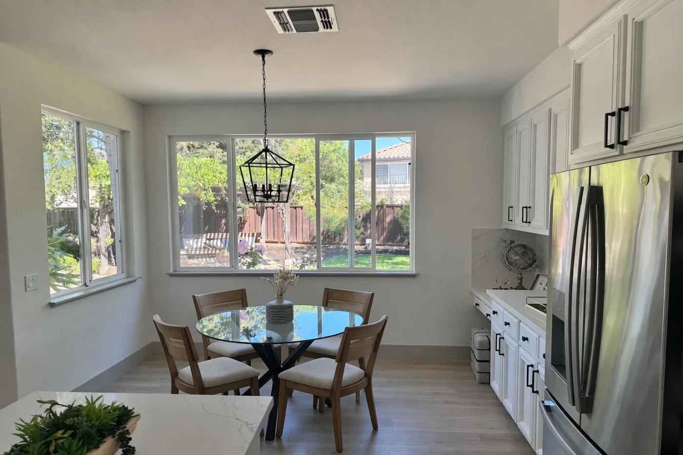
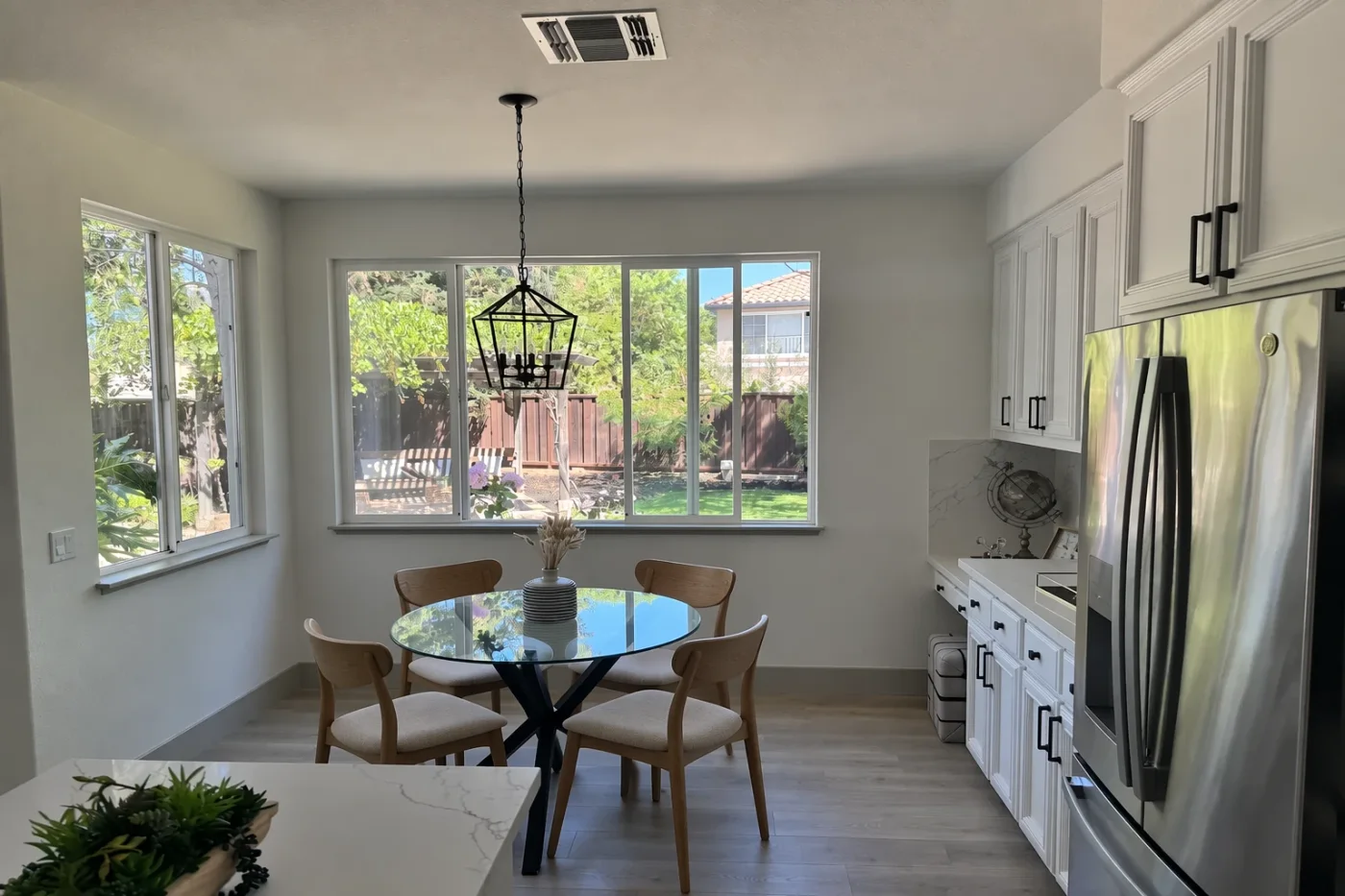
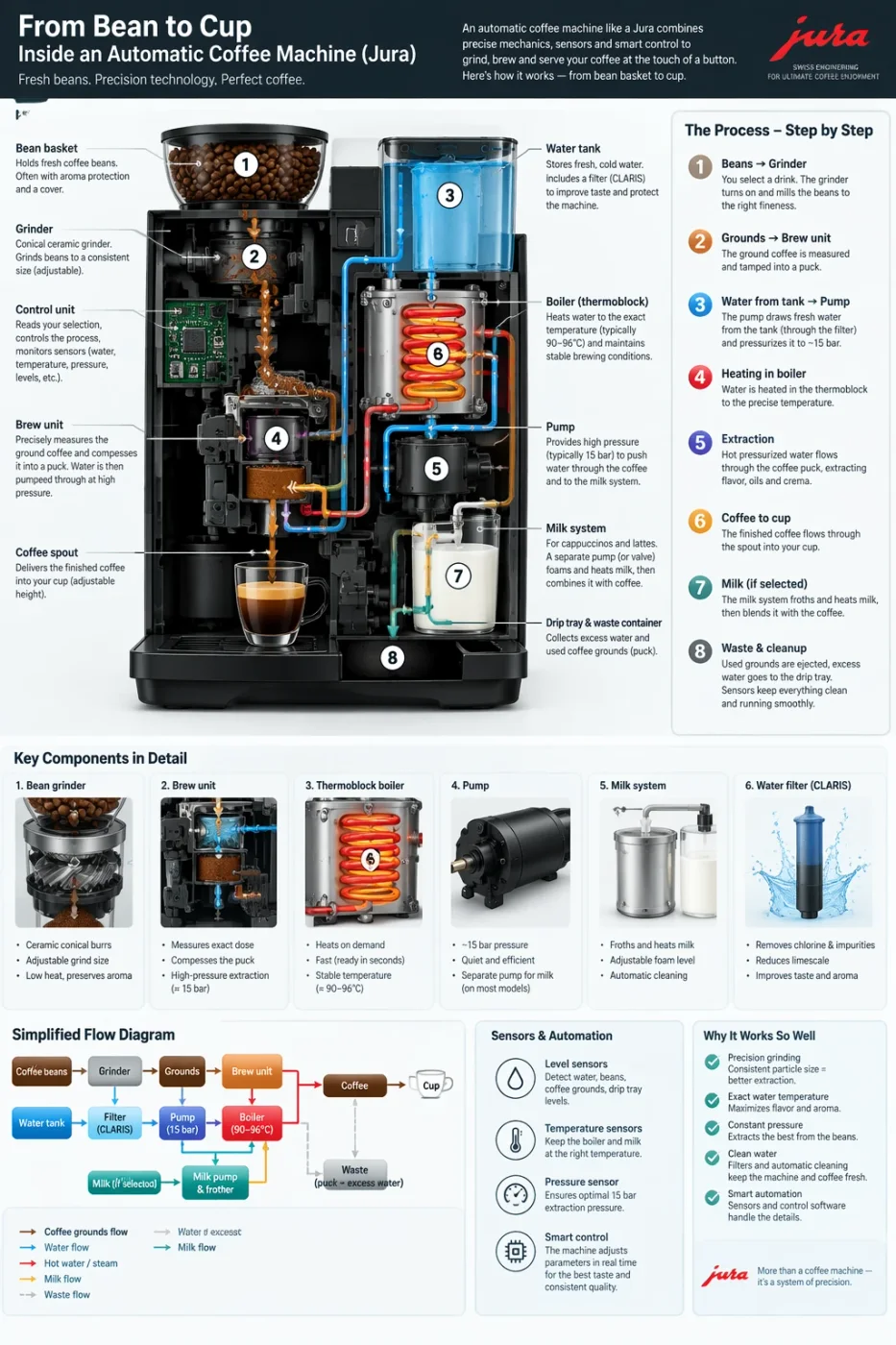
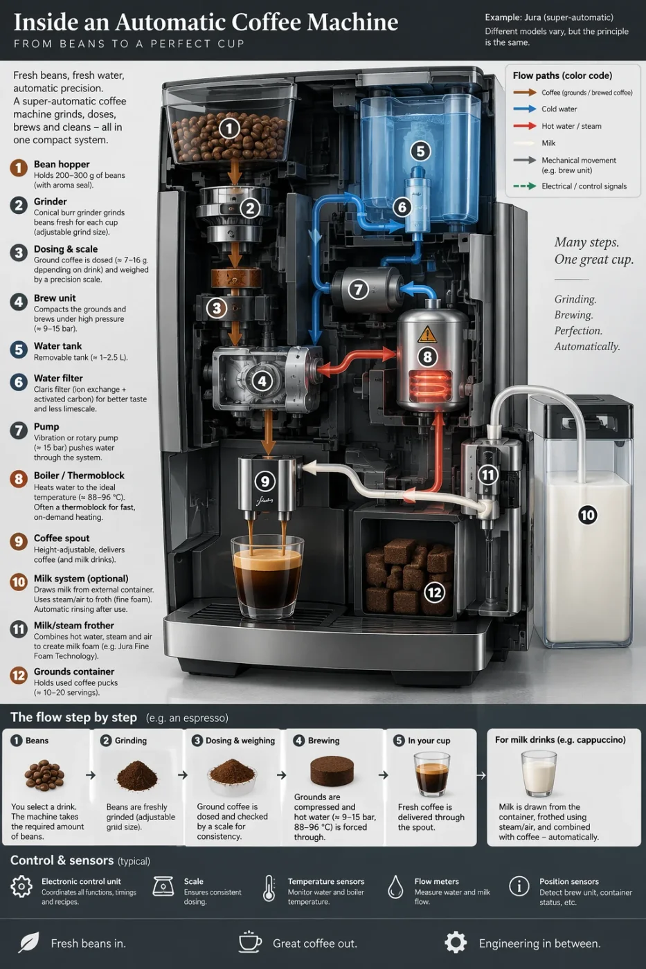
这六组来自 OpenAI 官方的图像提示词指南,同一条提示词各出一张,两张图都是官方发布的。左 Flare,右 Sunburst;点图看大图,展开可看提示词原文。
两版几乎一模一样,也都和原图一样 —— 局部编辑用 Flare 就够。
机位、光线、橱柜、冰箱、吊灯、窗外景全部没动,只有椅子变成木质。椅型有细微差别,但没有哪一版更「对」。多花一倍时间换来的是另一把椅子,不是更好的椅子。
In this room photo, replace ONLY the white chairs with chairs made of wood. Preserve camera angle, room lighting, floor shadows, and surrounding objects. Keep all other aspects of the image unchanged. Photorealistic contact shadows and fabric texture.
两档都逐字可读,差的是设计取向不是清晰度。
Flare 排了更多分区(剖面图 + 步骤列表 + 部件照片条 + 流程图),Sunburst 给了照片级机器渲染和更干净的颜色图例。密集排版能不能读清楚,是 2.5 相对上一代最大的进步,两档都过关。
Create a detailed Infographic of the functioning and flow of an automatic coffee machine like a Jura. From bean basket, to grinding, to scale, water tank, boiler, etc. I'd like to understand technically and visually the flow.
数字两版全对;Sunburst 的版式更完成,拿去用少改几处。
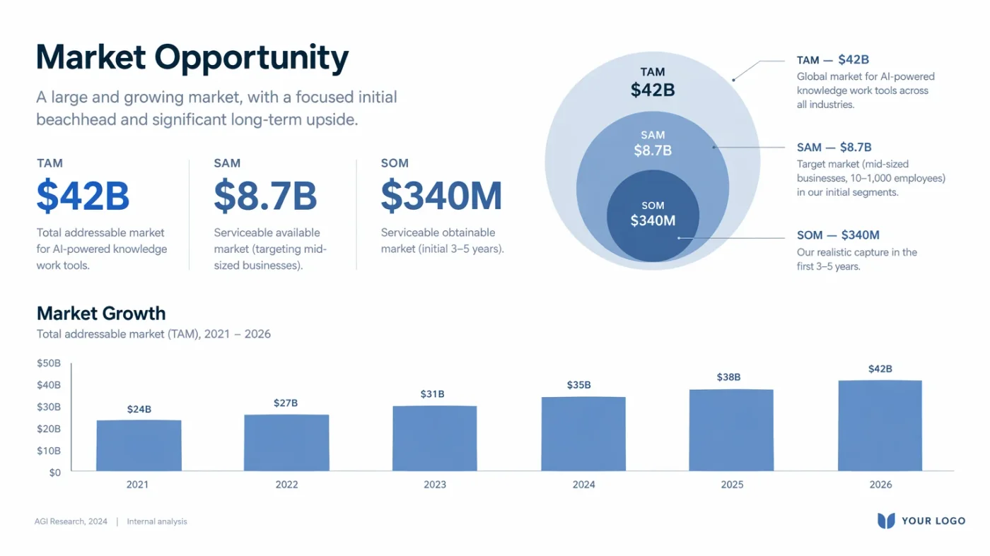
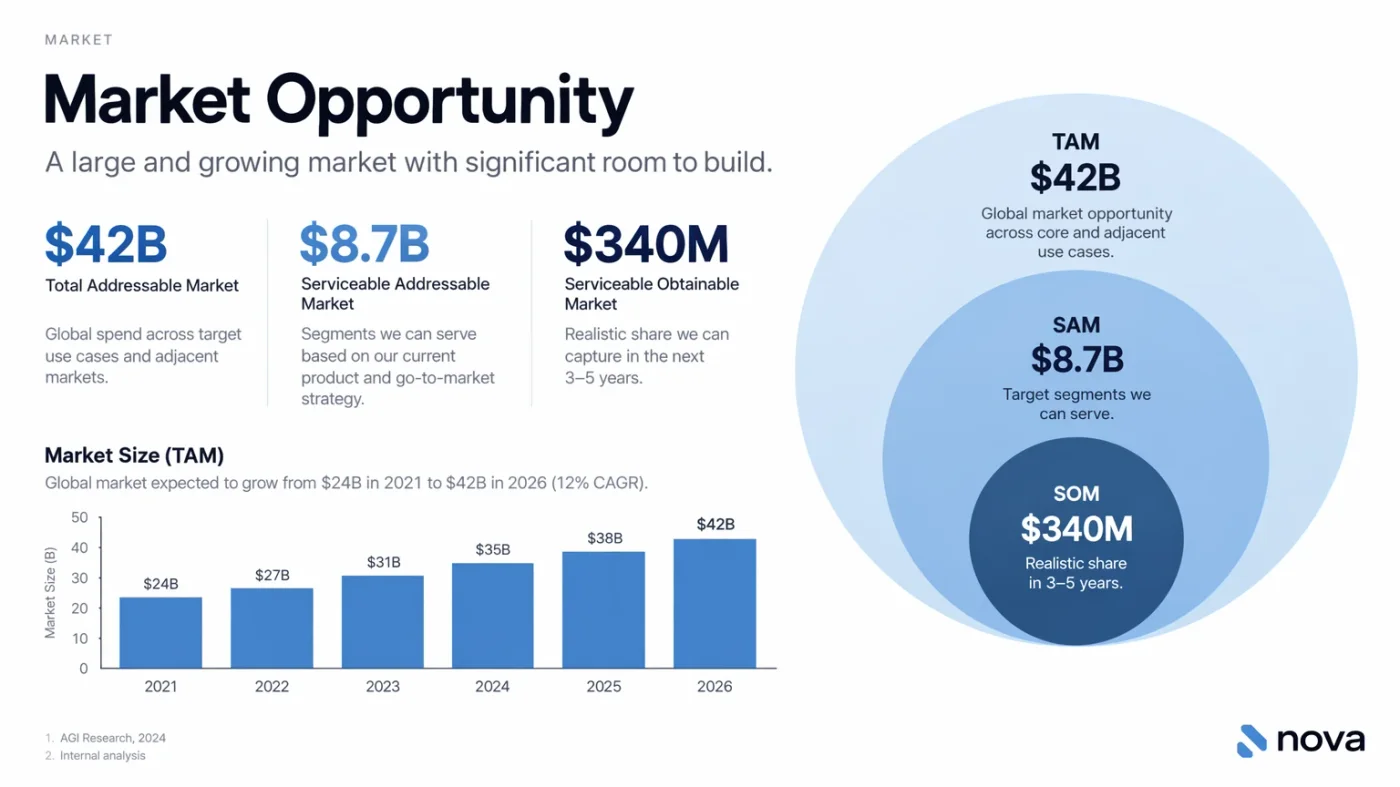
TAM $42B / SAM $8.7B / SOM $340M,柱状图 24 → 42,两版都对。Sunburst 的纵轴带标注、脚注有编号、右下是一个真的字标而不是「YOUR LOGO」占位。
Create one pitch-deck slide titled **"Market Opportunity"** that feels like a real Series A fundraising slide from a YC-backed startup. Use a clean white background, modern sans-serif typography like Inter, and a crisp, minimal layout. The slide should include: * A TAM/SAM/SOM concentric-circle diagram in muted blues and grays * Specific, believable market sizing numbers: * **TAM:** $42B * **SAM:** $8.7B * **SOM:** $340M * A clean bar chart below showing market growth from **2021 to 2026**, with a subtle upward trend * Small footnotes: **"AGI Research, 2024"** and **"Internal analysis"** * A company logo placeholder in the bottom-right corner The design should look like it belongs in a deck that actually raised money: highly readable text, clear data hierarchy, polished spacing, and professional startup-style visual language. Avoid clip art, stock photography, gradients, shadows, decorative elements, or anything that feels generic or overdesigned.
都能交付。Sunburst 信息密度更高,Flare 更接近规范稿。
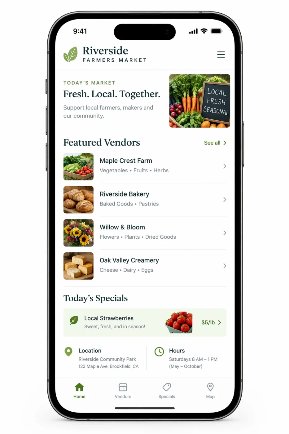
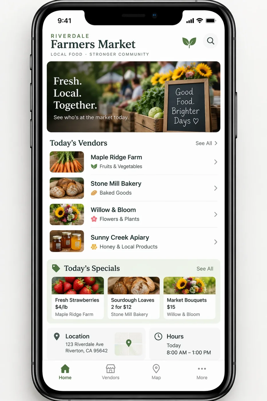
状态栏、列表结构、底部标签栏两版都对。Sunburst 多给了首屏大图、带价格的特惠卡片行和地图缩略图;Flare 更克制。选哪个取决于你要的是效果图还是结构图。
Create a realistic mobile app UI mockup for a local farmers market. Show today’s market with a simple header, a short list of vendors with small photos and categories, a small “Today’s specials” section, and basic information for location and hours. Design it to be practical, and easy to use. White background, subtle natural accent colors, clear typography, and minimal decoration. It should look like a real, well-designed, beautiful app for a small local market. Place the UI mockup in an iPhone frame.
文字都对。Flare 画得更热闹,Sunburst 更用力在材质做旧上。
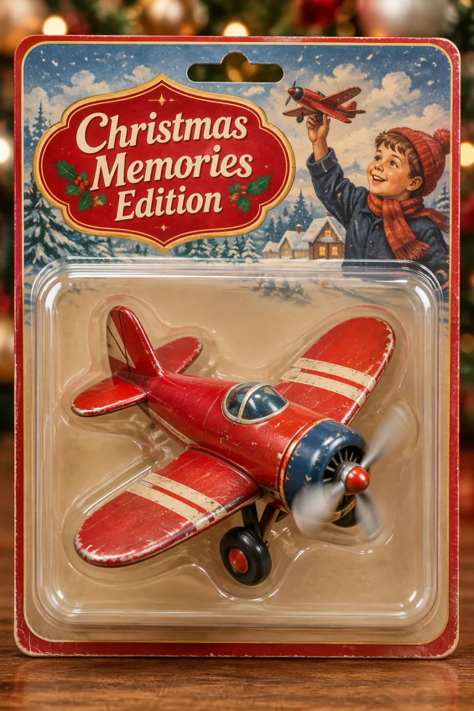
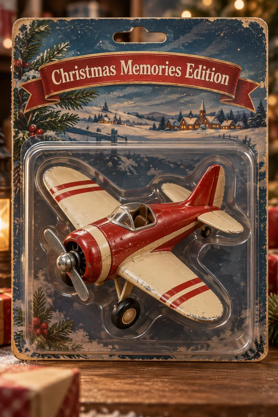
「Christmas Memories Edition」两版拼写都正确。Flare 的卡面有小孩、异形徽章、螺旋桨运动模糊;Sunburst 强调卡纸做旧、机身掉漆和吸塑边缘厚度。包装要被放大看的话,Sunburst 更耐看。
Create a collectible action figure of a vintage-style toy propeller airplane with rounded wings, a front-mounted spinning propeller, slightly worn paint edges, classic childhood proportions, designed as a nostalgic holiday collectible, in blister packaging. Concept: A nostalgic holiday collectible inspired by the simple toy airplanes children used to play with during winter holidays. Evokes warmth, imagination, and childhood wonder. Style: Premium toy photography, realistic plastic and painted metal textures, studio lighting, shallow depth of field, sharp label printing, high-end retail presentation. Constraints: - Original design only - No trademarks - No watermarks - No logos Include ONLY this packaging text (verbatim): "Christmas Memories Edition"
手机上分不出,100% 放大才有差 —— 这正是要不要上 Sunburst 的判据。
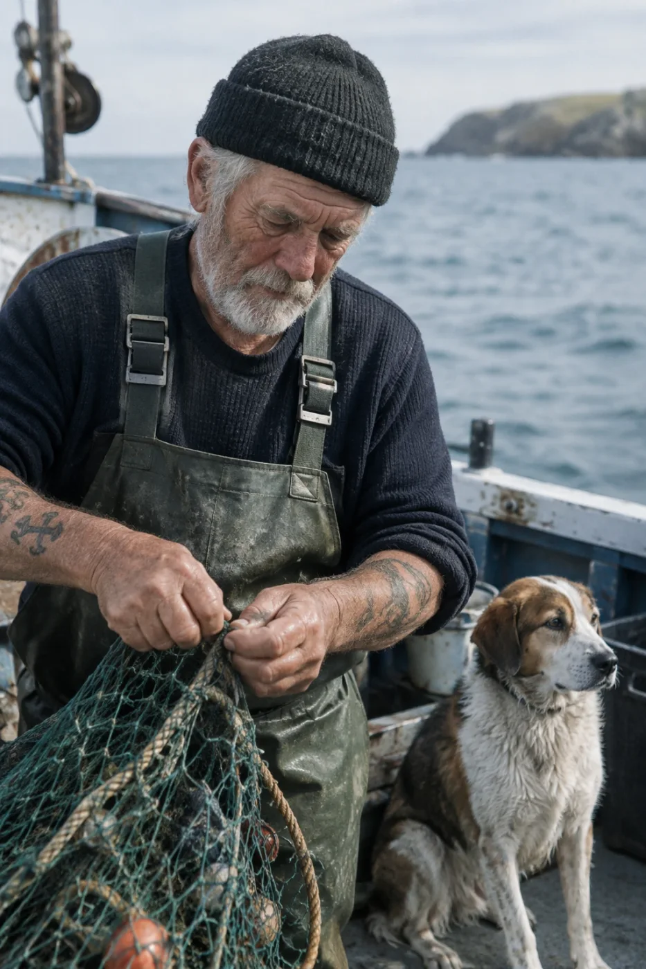
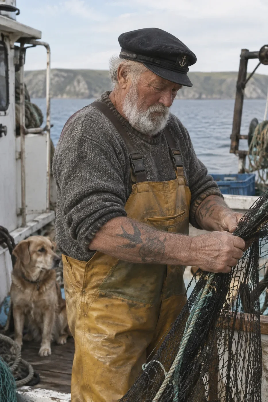
Sunburst 把毛衣针织纹理和渔网网眼分得更开,帽徽这类小物件也画了出来;Flare 构图更宽,脸部同样干净。两版都是可用成品。
Create a photorealistic candid photograph of an elderly sailor standing on a small fishing boat. He has weathered skin with visible wrinkles, pores, and sun texture, and a few faded traditional sailor tattoos on his arms. He is calmly adjusting a net while his dog sits nearby on the deck. Shot like a 35mm film photograph, medium close-up at eye level, using a 50mm lens. Soft coastal daylight, shallow depth of field, subtle film grain, natural color balance. The image should feel honest and unposed, with real skin texture, worn materials, and everyday detail. No glamorization, no heavy retouching.
品牌活儿最怕两件事:字标拼错,以及同一个标志在不同版本里长得不一样。这六组专门压这两点 —— 字标、锁定、规范表、色值卡、双语、以及印上实体。两档同尺寸同画质各跑一张。
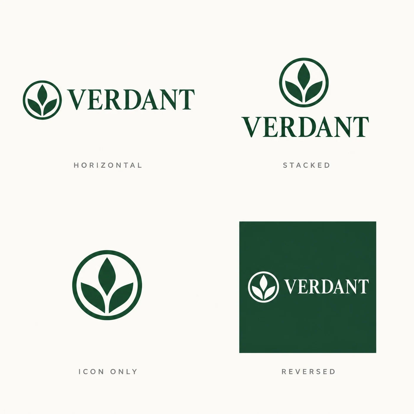
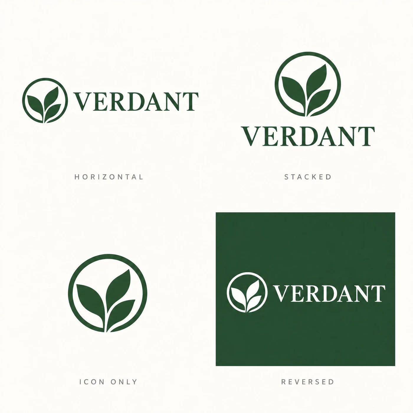
反直觉的一组 —— Flare 四格里的图标完全一致,Sunburst 有漂移。
两版的四个标签(HORIZONTAL / STACKED / ICON ONLY / REVERSED)和 VERDANT 字标都对。但 Sunburst 的圆环粗细与叶片排布在格与格之间有变化,而品牌规范表要的恰恰是一致。做识别系统这类活,别默认精度档就更稳。
A brand identity sheet on a clean off-white background, four labelled lockups arranged in a two by two grid with generous even margins. Top left, labelled "HORIZONTAL": a circular leaf mark followed by the word "VERDANT" in a serif. Top right, labelled "STACKED": the same mark centred above the same word. Bottom left, labelled "ICON ONLY": the mark alone. Bottom right, labelled "REVERSED": the horizontal lockup in white on a dark green square. Every label is set in small wide-tracked grey caps directly under its lockup. The mark and the wordmark must be identical in all four cells. No other text.
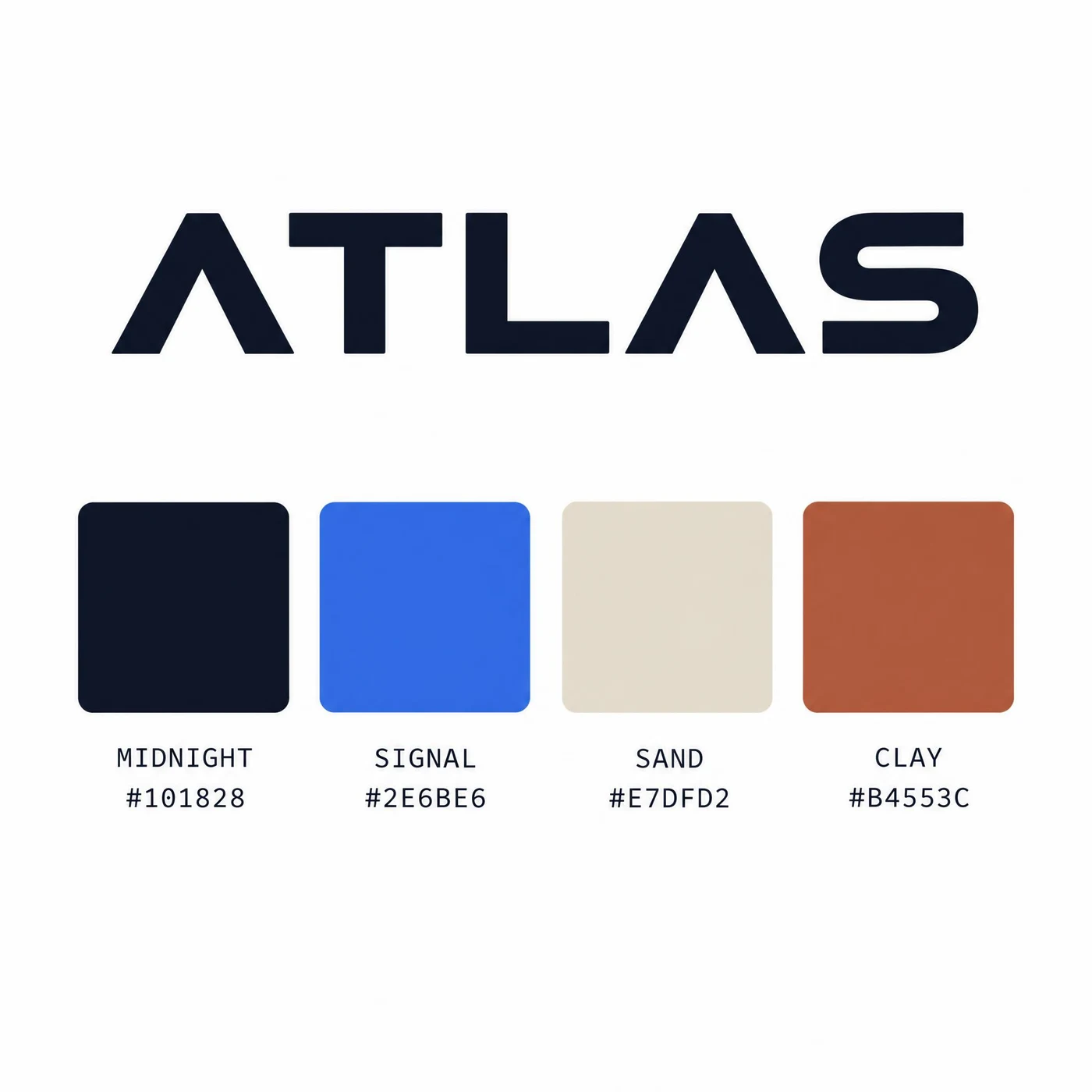
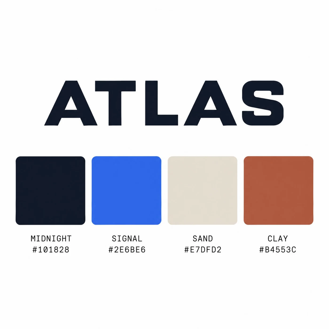
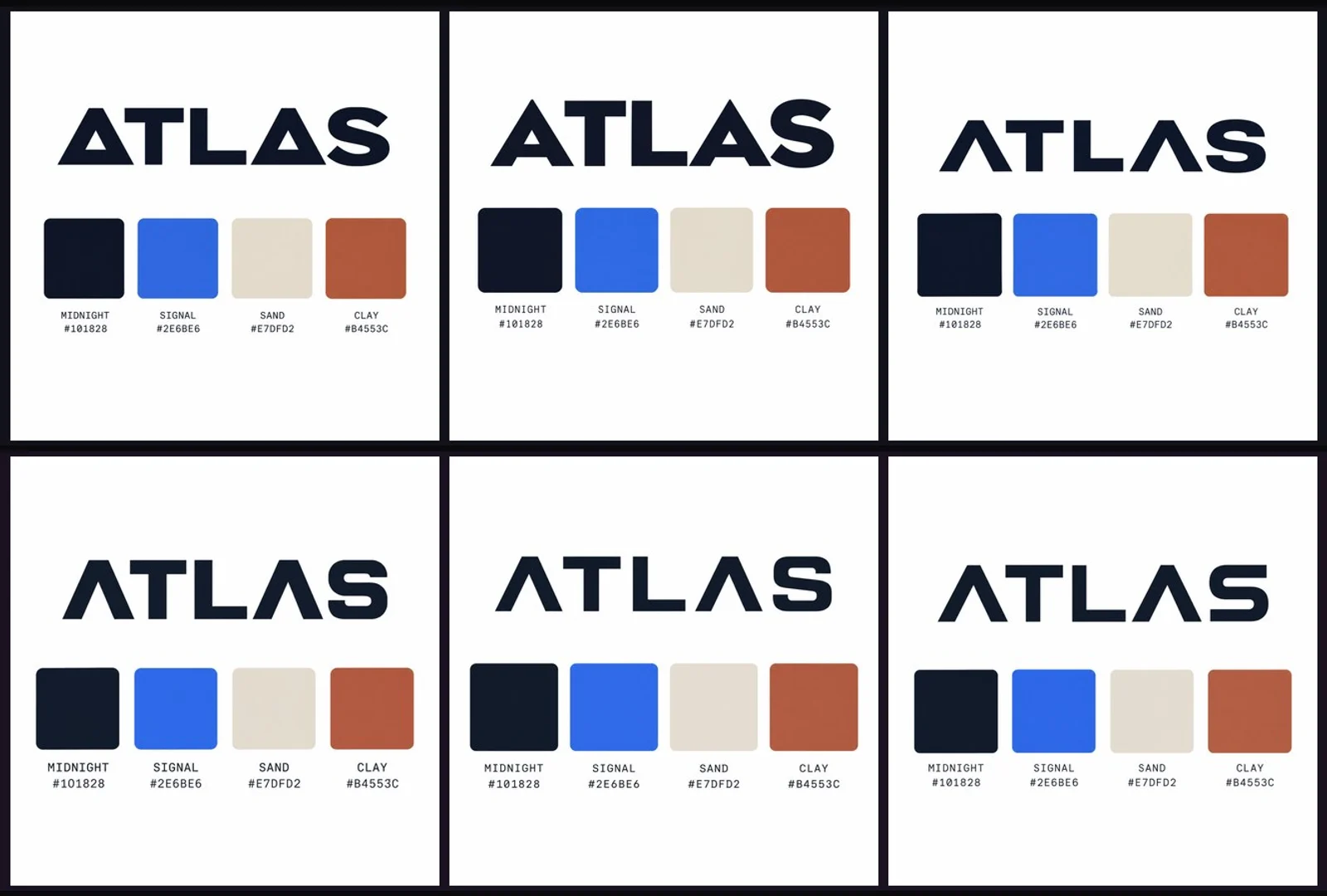
四个十六进制色值两版都写对,而且色块真的是那个颜色。
#101828 / #2E6BE6 / #E7DFD2 / #B4553C 逐字正确,色名 MIDNIGHT / SIGNAL / SAND / CLAY 也对。这类「文字和像素必须互相印证」的活,以前基本要靠后期改,现在两档都能一次出对。
A brand colour specification card on a white background. Across the top, the wordmark "ATLAS" in a bold geometric sans. Beneath it, a row of four equal square colour swatches with rounded corners. Under each swatch, two lines of small monospace text: the colour name on the first line and its hex code on the second, reading exactly "MIDNIGHT / #101828", "SIGNAL / #2E6BE6", "SAND / #E7DFD2" and "CLAY / #B4553C". Each swatch must actually be the colour its hex code names. Clean editorial layout, generous white space, no other text.
「云茶」两版笔形都对;而在「两种文字等重」这条上,Flare 更贴题。
中日字形一向是弱项,这一组两版都写对了。差别在配重:Flare 的中文与英文视觉重量接近,符合提示词要求;Sunburst 的中文笔画更重,压过了旁边的英文。预览图是压到浅底上的,原图是真透明 PNG。
A bilingual logo lockup for a tea house, on a fully transparent background. On the left, two Chinese characters "云茶" in a refined modern Song typeface, deep ink black, correctly formed with balanced stroke weights. To their right, separated by a thin vertical rule, the English name "CLOUD TEA" set in two lines of small wide-tracked sans capitals, aligned to the cap height and baseline of the Chinese characters. The two scripts must share one optical weight so neither dominates. No other elements.
两版都正确拼出 NORTHBOUND 并按要求改造了两个 O。
字距均匀、笔画粗细一致、没有容器形状也没有多余文字,两版都符合。Flare 的炭灰偏冷,Sunburst 偏暖偏深。预览图压到了浅底上,原图是真透明 PNG,可以直接进设计稿。
A minimal wordmark logo for a specialty coffee roaster. Set the single word "NORTHBOUND" in a wide-tracked geometric sans-serif, all capitals, deep charcoal, perfectly horizontal and optically centred. Replace the counter of each letter O with a small solid circle so the two O's read as compass points. Even letter spacing, consistent stroke weight, no gradients, no drop shadow, no container shape, no extra words. Fully transparent background.
「等宽」这条精确排版指令两版都做到了,连 ® 的位置都对。
FOLD 用重量级无衬线、下面一条通栏细线、STRUCTURE & LIGHT 用宽字距灰色小字并与上方字标同宽,右上角一个上标注册商标符号 —— 四条要求两版全中,结果几乎一致。这类精确排版活,选 Flare 省一半时间。
A stacked logo lockup for a design studio. Top line: the word "FOLD" in a heavy grotesque, all caps, near-black. Directly beneath it, separated by a thin full-width rule, the tagline "STRUCTURE & LIGHT" in a much smaller wide-tracked sans, mid grey, exactly the same width as the word above it. A small superscript registered trademark symbol sits at the top right of "FOLD". Nothing else in the frame. Fully transparent background.
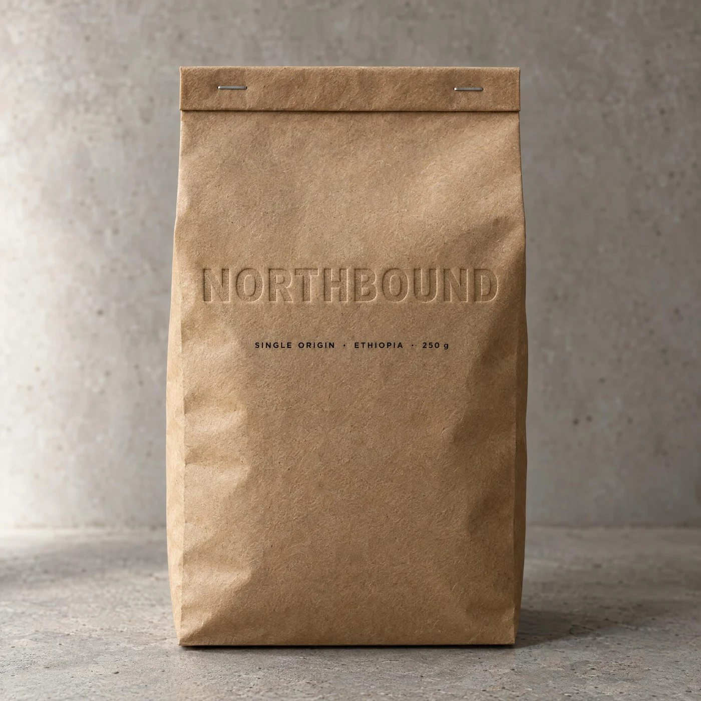
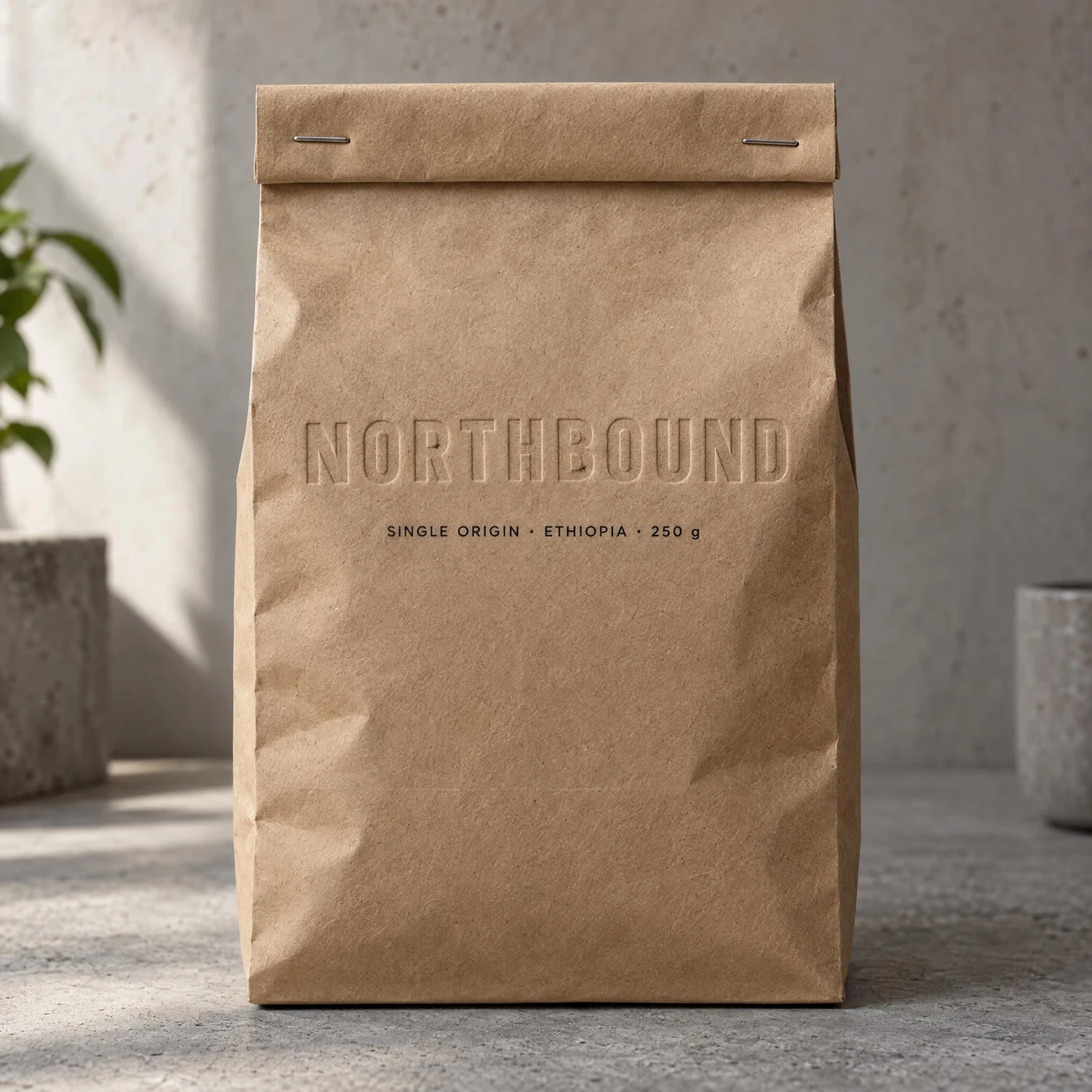
两版都做出了「没有墨、只有纸的高低」的压凹,牛皮纸纤维在字里可见。
这条考的是「标志要服从材质」,不是把 logo 平贴上去。两版都对,连「SINGLE ORIGIN · ETHIOPIA · 250 g」和两枚订书钉都在。Flare 的压凹更深一点,Sunburst 的场景光更柔、加了绿植。
Product photograph of a kraft paper coffee bag standing upright on a concrete surface, shot straight on with soft side light. The wordmark "NORTHBOUND" is blind-embossed into the kraft paper across the upper third: no ink, only the raised and recessed paper catching the light, with the fibre texture of the kraft visible inside the letterforms. Below it, a small printed line reads "SINGLE ORIGIN · ETHIOPIA · 250 g". The bag has a folded top with two metal staples. Keep the embossing subtle and physically plausible, not a flat printed logo.
文字渲染是 2.5 相对上一代最大的进步,所以这四组把它推到极限:三种语言同一版式、报纸头版、包装背板的过敏原小字、以及一张字号递减的名单海报。
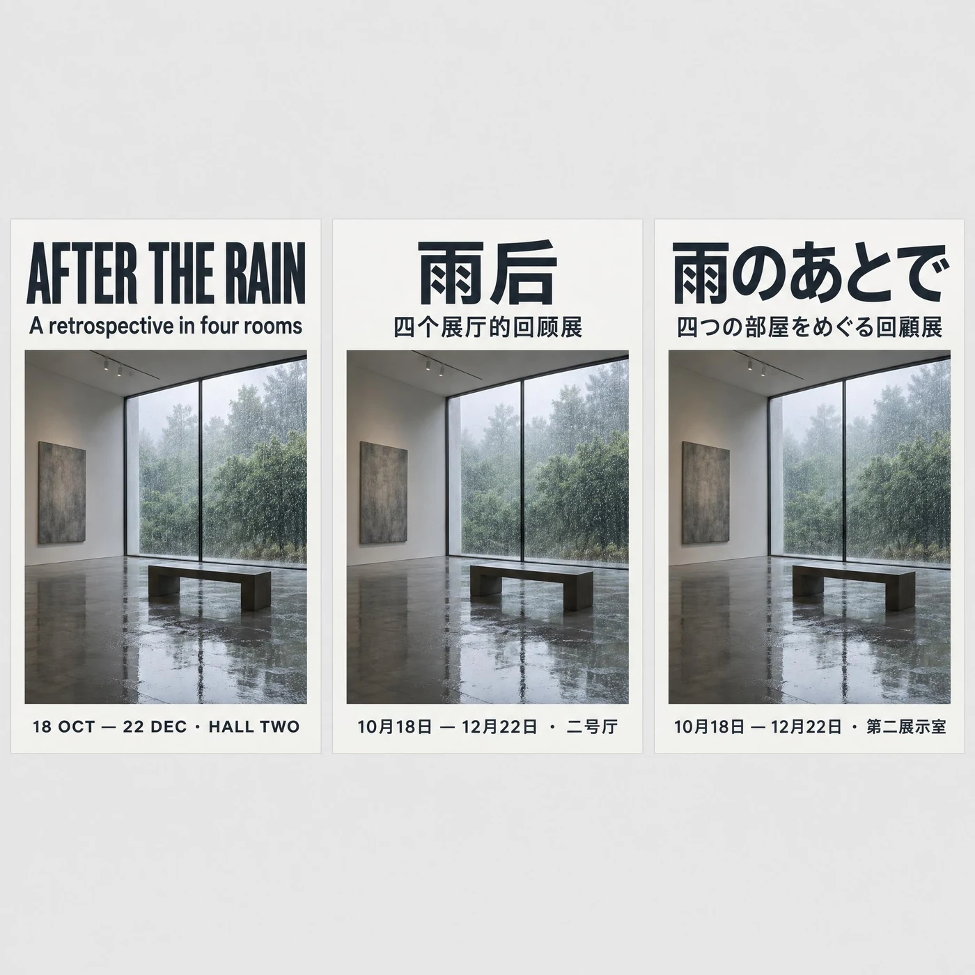
三种文字全对,而且中文用「回顾展」、日文用「回顧展」—— 简繁分得清。
英文「AFTER THE RAIN」、中文「雨后 / 四个展厅的回顾展」、日文「雨のあとで / 四つの部屋をめぐる回顧展」逐字正确,三张海报共用同一套网格与字号。能按语言选对字形,是这一组里最值钱的细节。
Three identical poster layouts side by side on a light grey background, one in each language, sharing the exact same grid, type sizes, image placement and colour. Each poster has a big top headline, a one-line subhead, and a bottom line with a date and venue. Left poster in English: headline "AFTER THE RAIN", subhead "A retrospective in four rooms", bottom "18 OCT — 22 DEC · HALL TWO". Middle poster in Simplified Chinese: headline "雨后", subhead "四个展厅的回顾展", bottom "10月18日 — 12月22日 · 二号厅". Right poster in Japanese: headline "雨のあとで", subhead "四つの部屋をめぐる回顧展", bottom "10月18日 — 12月22日 · 第二展示室". Every character in all three scripts must be correctly formed and legible.
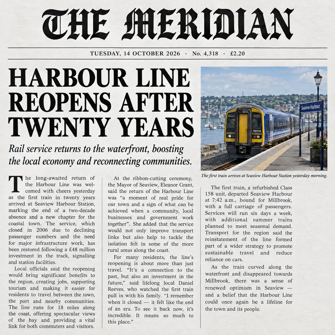
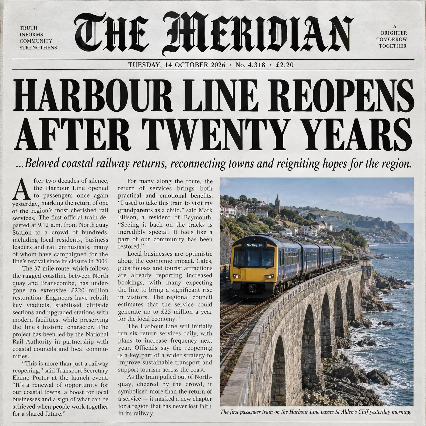
日期行「TUESDAY, 14 OCTOBER 2026 · No. 4,318 · £2.20」两版逐字复现。
哥特体报头、首字下沉、三栏齐行、图片配斜体图注,两版都齐;正文都是读得通的英文而不是假字。Sunburst 多加了报耳标语和做旧纸色,正文里还带了引语和数字。
The front page of a broadsheet newspaper, photographed flat. A masthead reading "THE MERIDIAN" in a blackletter face across the top, with a thin rule beneath carrying a dateline that reads "TUESDAY, 14 OCTOBER 2026 · No. 4,318 · £2.20". Below that a single large headline "HARBOUR LINE REOPENS AFTER TWENTY YEARS", a smaller italic deck of one sentence, then three justified columns of small body text with a drop cap on the first column. A photograph occupies the upper right with a one-line italic caption under it. All text must be real, legible English, correctly spelled, with even column gutters.
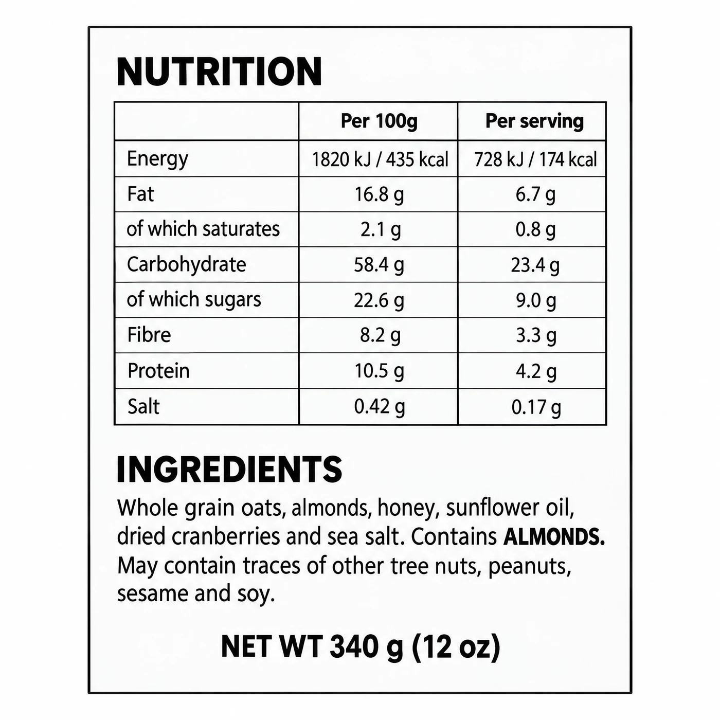
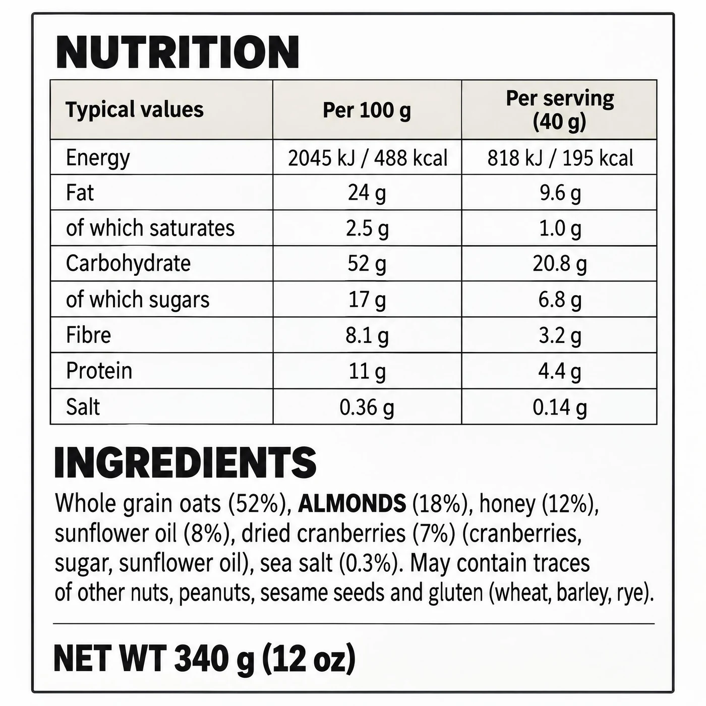
八行营养表、两列数值、ALMONDS 加粗、净含量行 —— 两版全中。
两版的每份数值都约为每 100 克的四成,内部自洽。Sunburst 更接近能直接送印的标签:成分带百分比声明,表头写明了 40 克的份量。
A flat, straight-on view of a rectangular food packaging back panel on a white background. It contains, in order: a bold heading "NUTRITION", a two-column nutrition table with rows for Energy, Fat, of which saturates, Carbohydrate, of which sugars, Fibre, Protein and Salt, each with a per-100g and a per-serving value; below it a heading "INGREDIENTS" followed by a dense paragraph of small type listing oats, almonds, honey, sunflower oil, dried cranberries and sea salt, with the words ALMONDS printed in bold to mark the allergen; and a bottom line reading "NET WT 340 g (12 oz)". Every character must be crisp and legible, correctly spelled, with no invented glyphs.
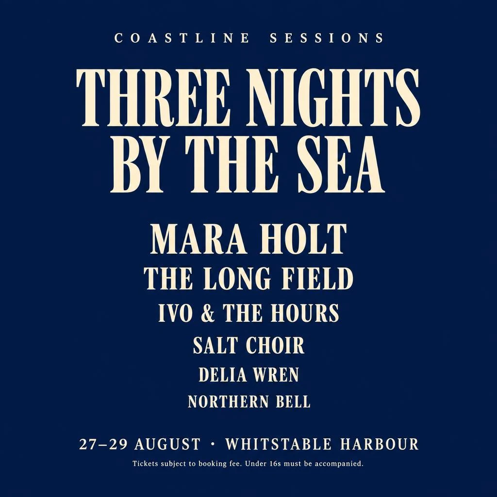
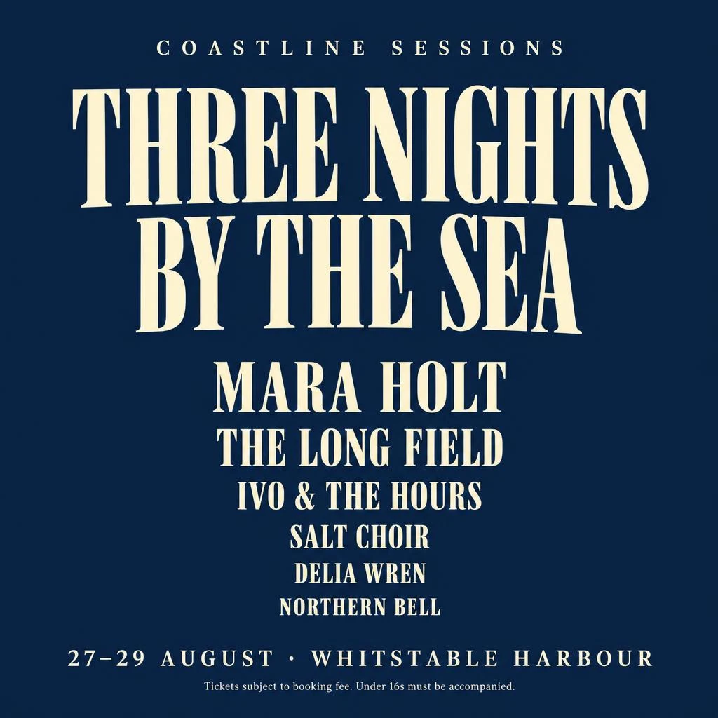
六个名字、顺序、递减字号、日期场地、法务小字,两版完全一致地全对。
这一组两版差别小到可以忽略。海报排版这类活,没有理由花两倍时间。
A minimal music festival poster, portrait format, deep navy background with warm cream type. Top: a small wide-tracked line reading "COASTLINE SESSIONS". Centre: the headline "THREE NIGHTS BY THE SEA" set in a large condensed serif across two lines. Beneath it, a centred line-up in decreasing type sizes listing exactly six names: "MARA HOLT", "THE LONG FIELD", "IVO & THE HOURS", "SALT CHOIR", "DELIA WREN", "NORTHERN BELL". At the bottom, one line reading "27–29 AUGUST · WHITSTABLE HARBOUR" and under it a very small legal line reading "Tickets subject to booking fee. Under 16s must be accompanied." All text correctly spelled and legible, nothing else in the frame.
这一组是「精度档到底把时间花在哪」的正面测试:金属刻痕、玻璃折射、织物纱线、毛发抠图。
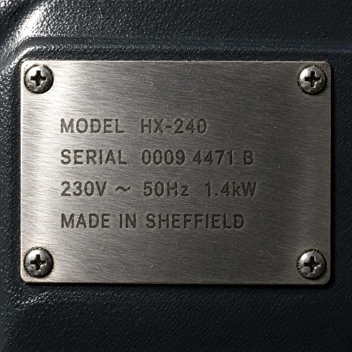
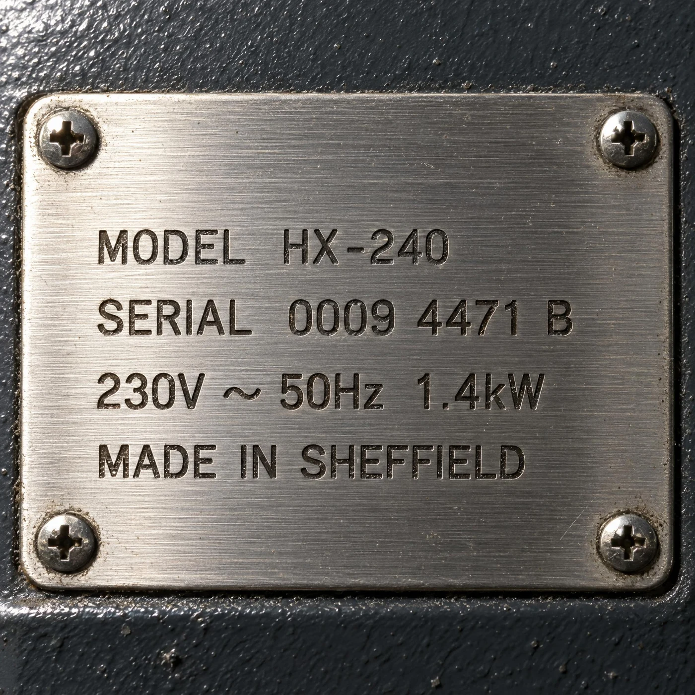
四行技术参数两版逐字正确;Sunburst 的刻痕更有物理深度。
「MODEL HX-240 / SERIAL 0009 4471 B / 230V ~ 50Hz 1.4kW / MADE IN SHEFFIELD」两版都对,四枚十字螺丝也在。Sunburst 的笔画内部有真实的阴影,板边做旧和积灰更足;Flare 的拉丝纹更明显但刻痕偏平。
Extreme close-up of a brushed stainless steel equipment plate riveted to a dark painted machine housing, lit by a raking light from the upper left so the brush grain runs visibly across the surface. The plate is laser-etched with four lines of small industrial sans type reading exactly "MODEL HX-240", "SERIAL 0009 4471 B", "230V ~ 50Hz 1.4kW" and "MADE IN SHEFFIELD". The etching sits slightly below the surface and catches light differently from the brushed finish. Four cross-head screws, one at each corner. Fine dust in the brush grain. No other text.
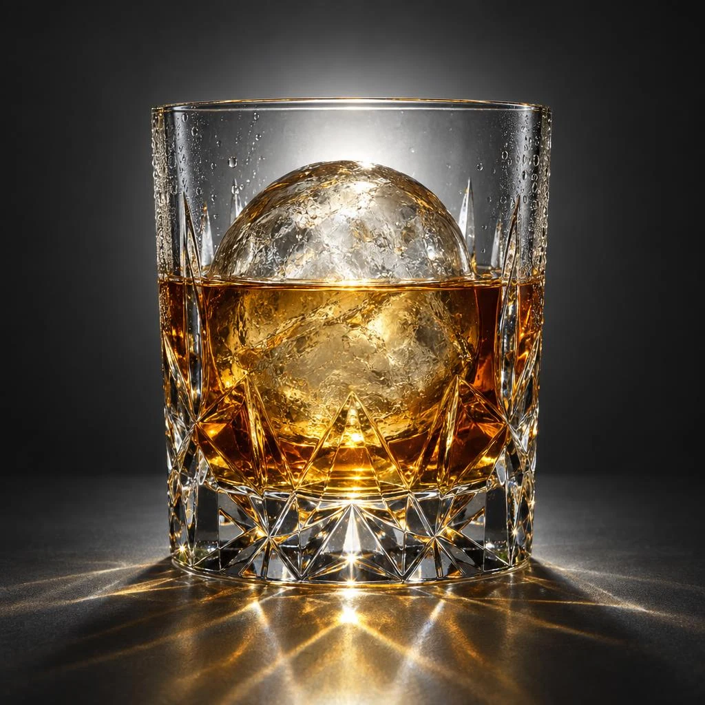
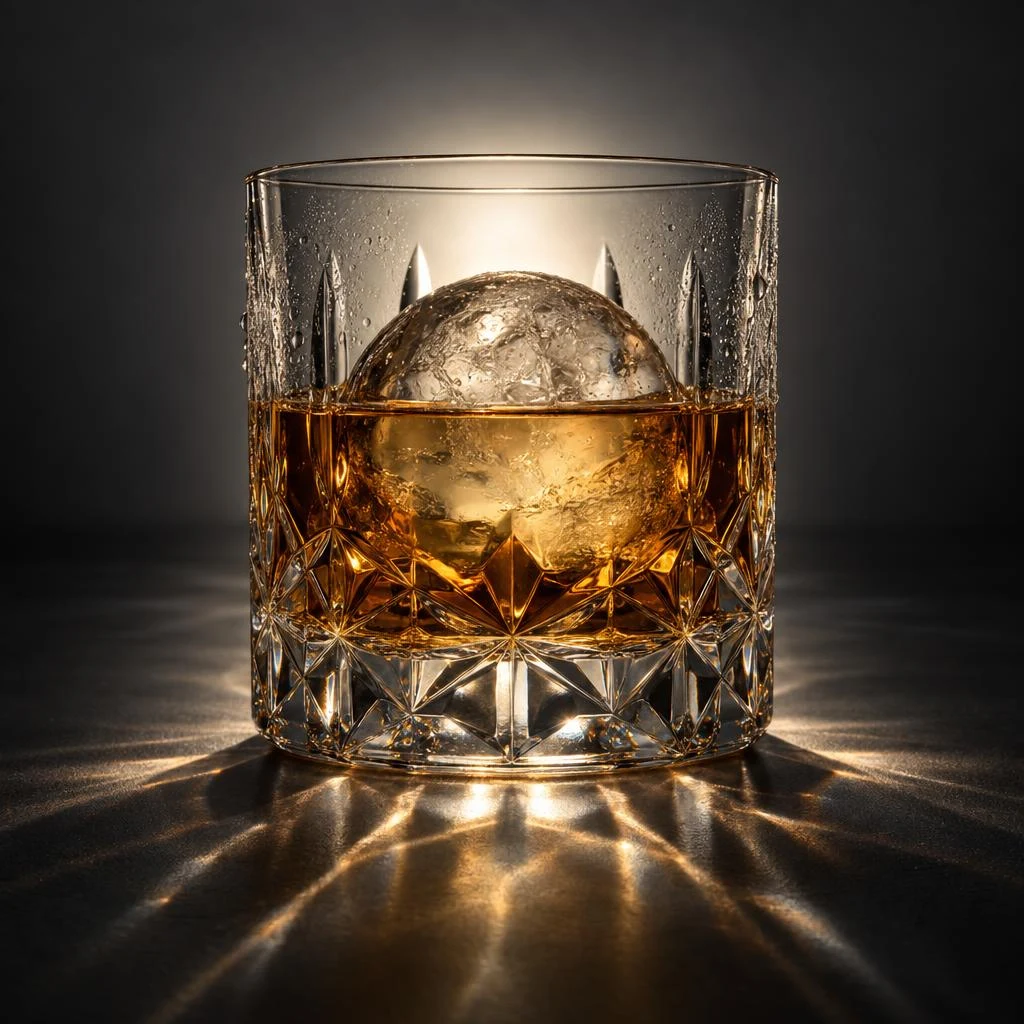
弯月面、冷凝水珠、冰球透过酒液的畸变,两版都到位。
切面把逆光折成桌面上的焦散,两版都做出来了。Sunburst 的焦散更复杂、刻花更细密;Flare 的更干净利落。这一组两版都能直接用。
A studio photograph of a heavy cut-crystal tumbler holding whisky and one large clear ice sphere, backlit against a dark grey seamless background. The cut facets refract the backlight into sharp caustics on the surface below. Show the meniscus where the whisky meets the glass, a few condensation droplets on the outside, and the slight optical distortion of the ice seen through the liquid. Single light source from behind, no reflections of studio equipment, no text.
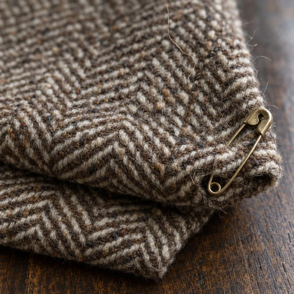
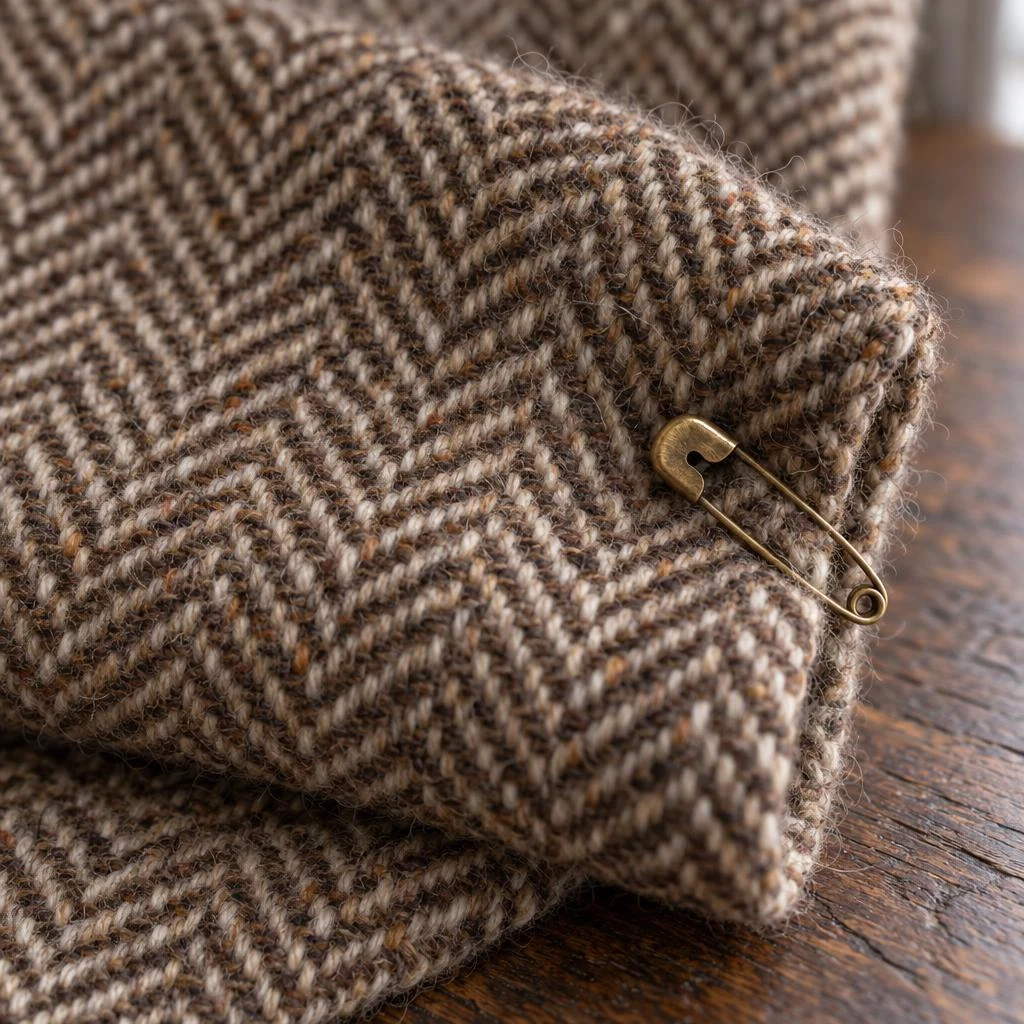
两版都分辨到单根纱线,连羊毛的结粒都在。
Flare 的表面有更多竖起的散纤维(提示词要的就是这个),景深更浅;Sunburst 的织纹在更大范围内保持清晰。两版都是能用的面料图。
Macro photograph of a folded length of brown and cream herringbone tweed lying on a dark oak surface, with a single brass safety pin fastened through one corner. The weave must resolve to individual yarns, with the slubby irregularity of the wool visible and a few loose fibres standing up from the surface. Soft directional window light from the right, shallow depth of field falling off across the fold. Natural colour, no colour cast, no text.
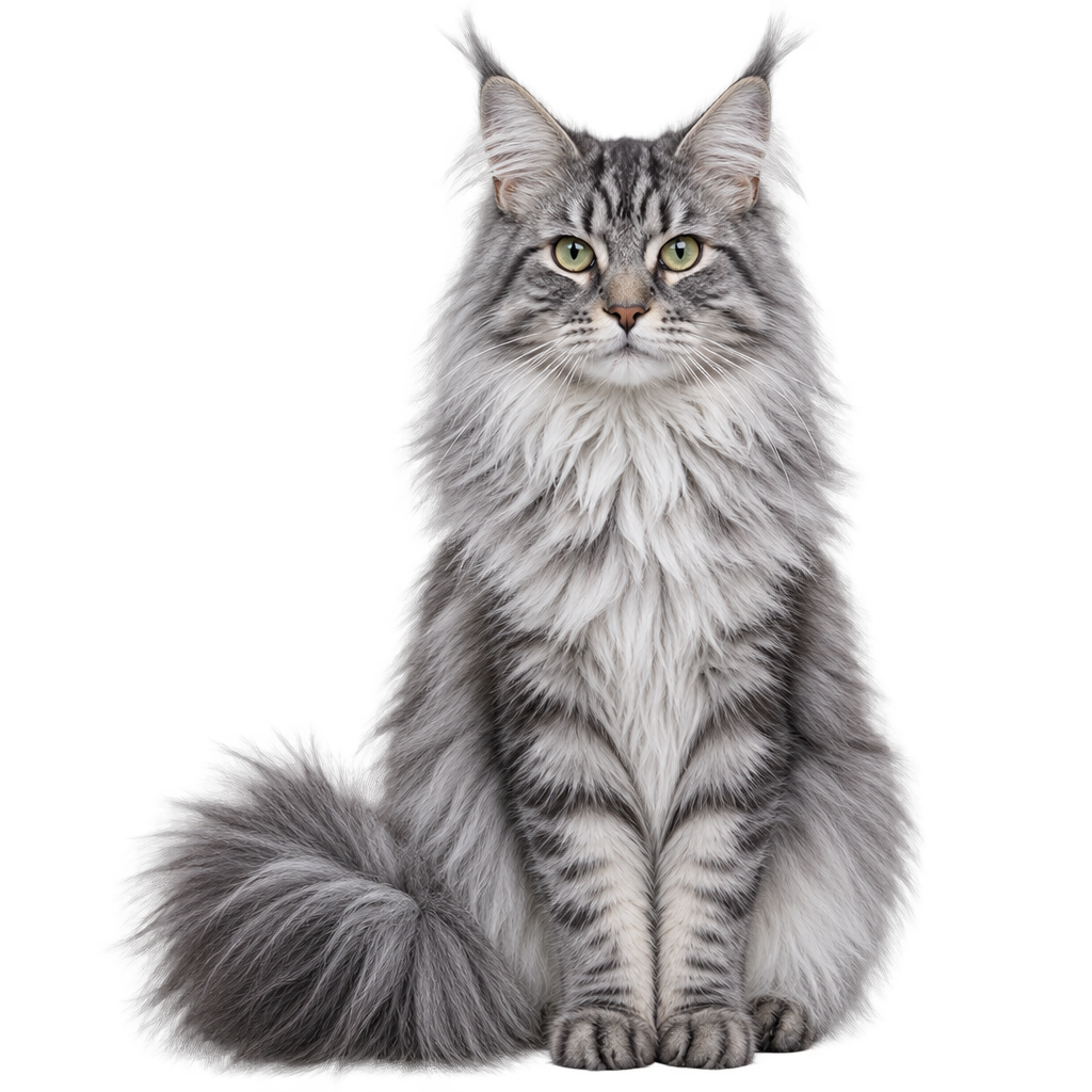
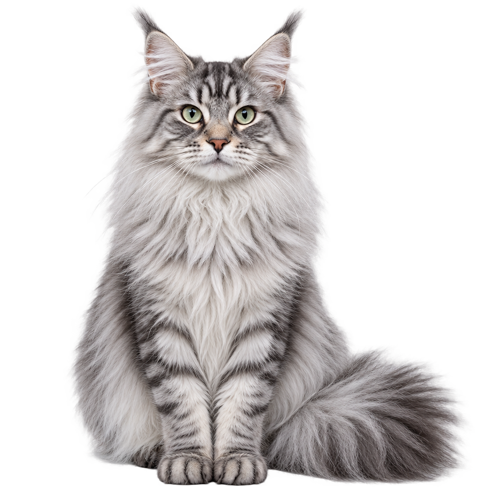
耳簇、颈毛、尾巴都没有被硬边切掉,两版都能直接合成。
这是抠图里最难的一类。两版都保住了轮廓上的单根毛,Sunburst 的胡须和耳簇分离度略高。预览图压在浅底上,链接过去的是真透明 PNG。
A long-haired silver tabby cat sitting upright, facing the camera, isolated on a fully transparent background as a catalogue cut-out. The fur must keep its individual strands at the silhouette edge — especially the ear tufts, the ruff around the neck and the tail — rather than being cut off along a hard outline. Even studio lighting, no cast shadow, no floor, no backdrop, no props.
手、镜面反射里的文字、等距爆炸图、必须数值全对的图表、三十张脸的人群、要按网格切的精灵图 —— 这六类是生成模型的传统失败点。结果里有两组是 Flare 更好,一组是 Sunburst 明显更好。
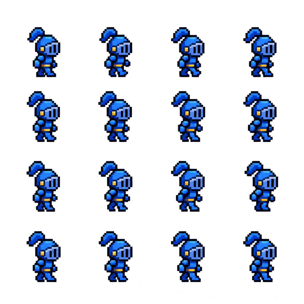
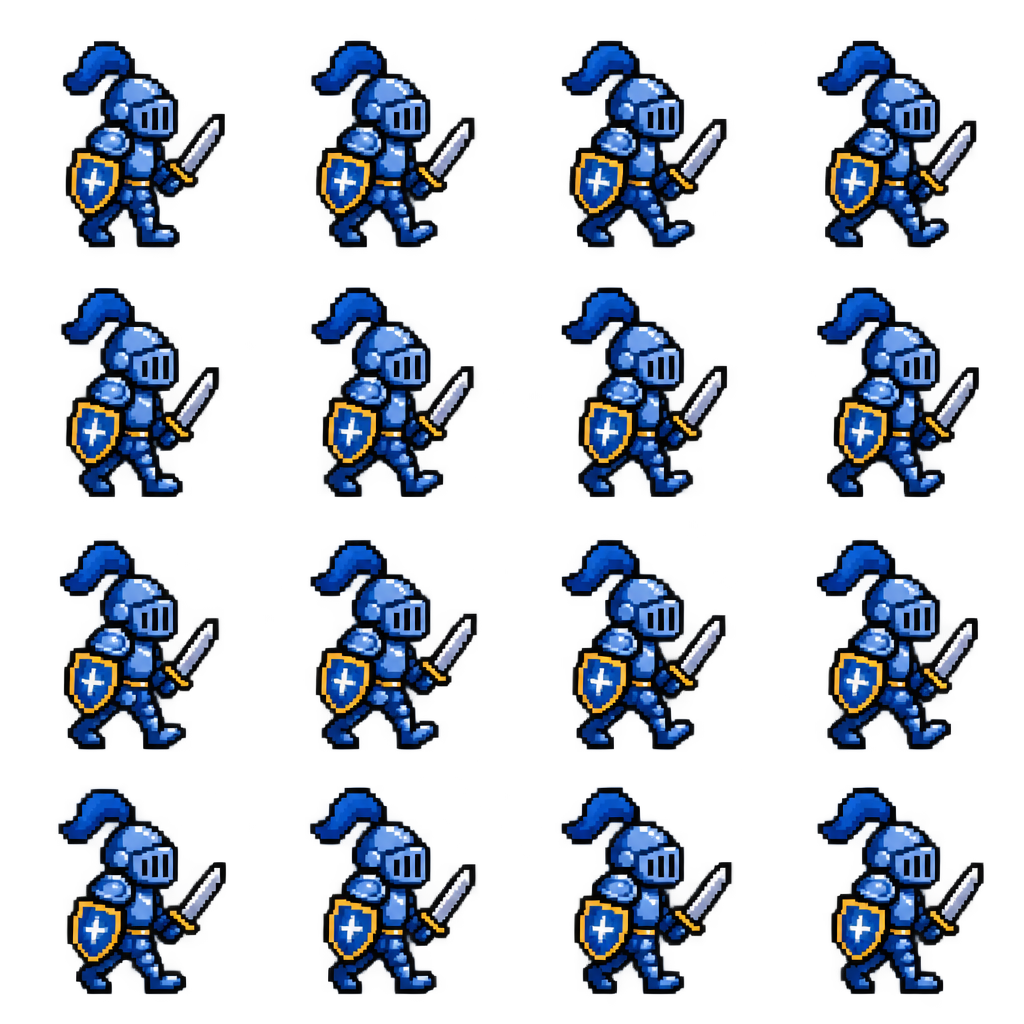
这一组 Sunburst 明显更稳 —— Flare 的帧在格与格之间有大小漂移。
两版都出了 4×4、透明底、无网格线无编号。但精灵图是要按固定网格切开的,Flare 有几格里的角色明显偏小,切出来对不齐;Sunburst 的单元格比例和脚底基线更一致。要做游戏素材,这一组值得多花那一倍时间。
A 2D pixel-art sprite sheet on a fully transparent background: sixteen frames of one walk cycle arranged in a strict four by four grid, read left to right and top to bottom. Every cell is exactly the same size, the character is centred identically in each cell with the same fixed ground line, and there is clear empty padding on all four sides of every cell so the frames can be sliced apart cleanly. The character is a small knight in blue armour, about three heads tall, drawn with clean square pixels, a limited palette and a thick dark outline. No grid lines, no frame numbers, no background, no drop shadow.
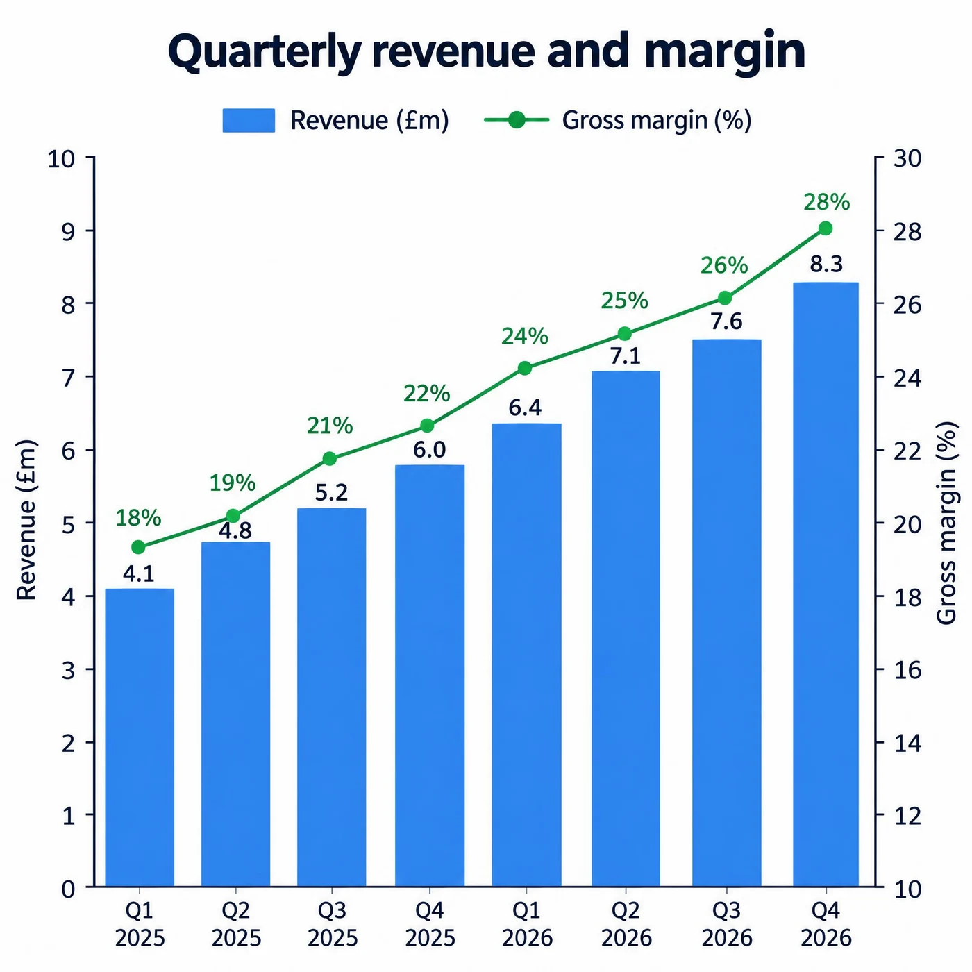
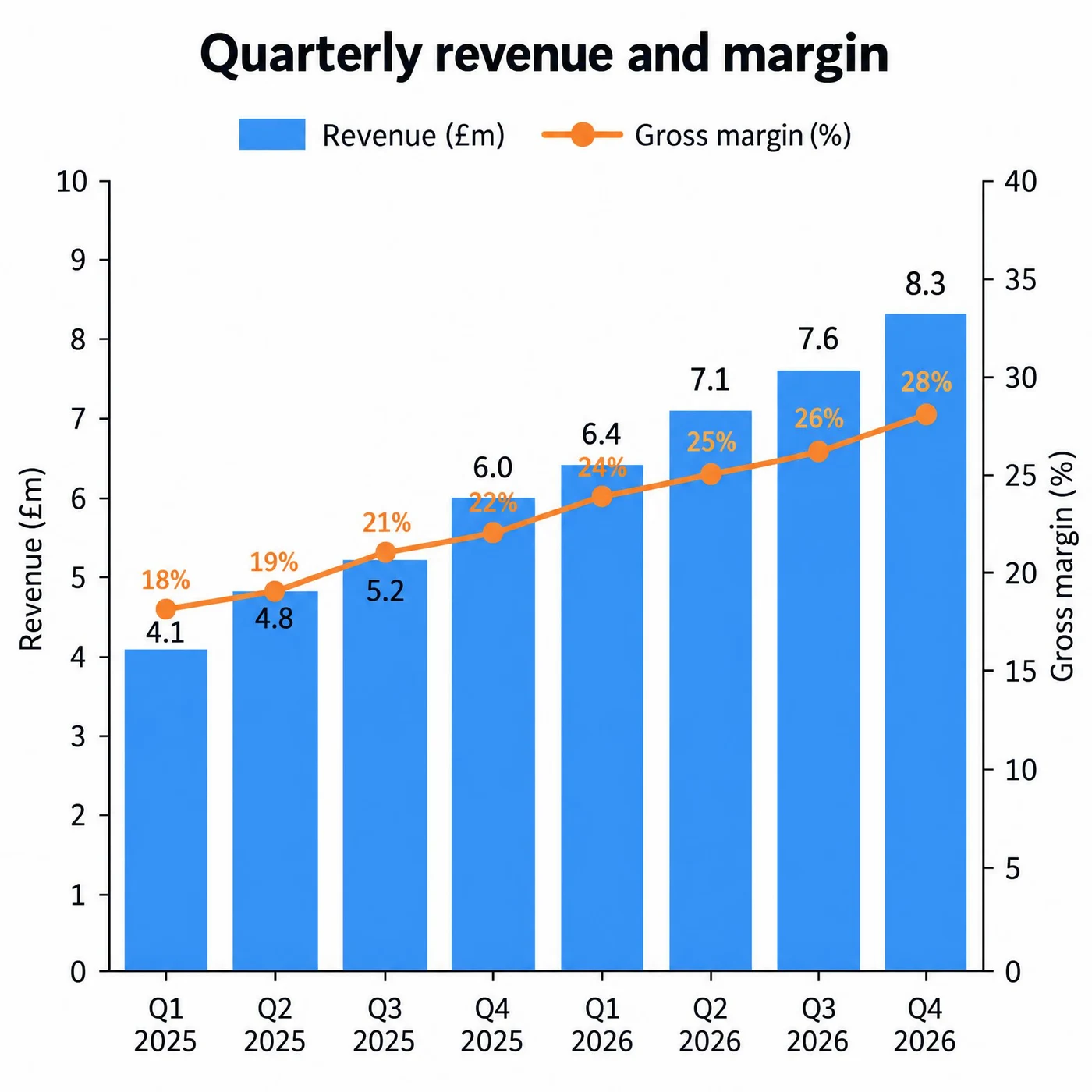
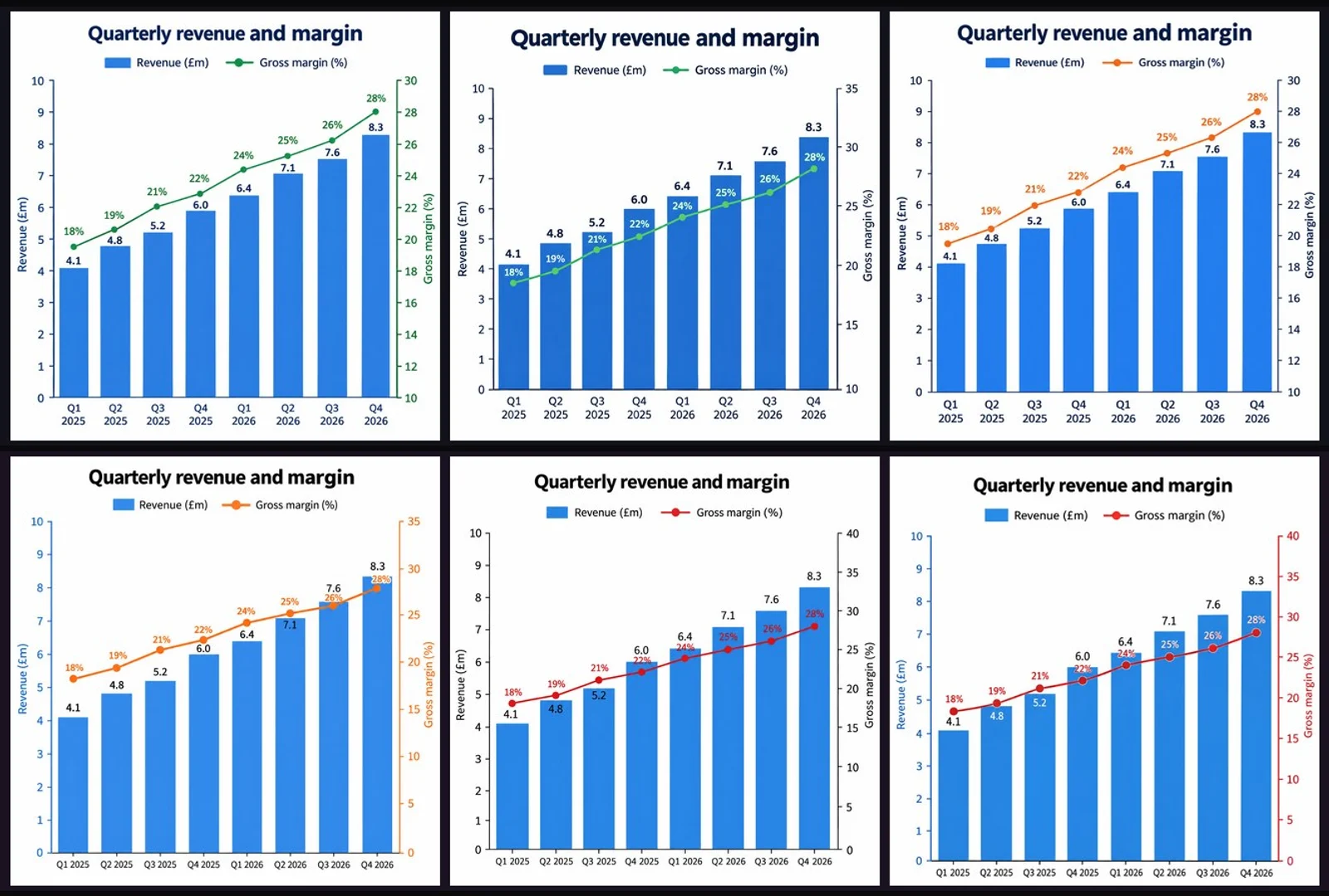
十六个数值两版全对;而标签排布反而是 Flare 更干净。
八个营收值(4.1 到 8.3)和八个毛利率(18% 到 28%)、双纵轴标注、季度标签,两版都对。但 Sunburst 的百分比标签与柱值标签有轻微重叠,Flare 的分得开。
A single clean data chart on a white background, titled "Quarterly revenue and margin". A combined chart: eight vertical bars for the quarters Q1 2025 through Q4 2026 with the values 4.1, 4.8, 5.2, 6.0, 6.4, 7.1, 7.6 and 8.3 in millions, each labelled above its bar; and a line overlaid on a secondary right-hand axis showing margin percentages of 18, 19, 21, 22, 24, 25, 26 and 28. The left axis is labelled "Revenue (£m)" and the right axis "Gross margin (%)", both with tick labels. A two-item legend sits below the title. Every number must match exactly and every label must be legible.
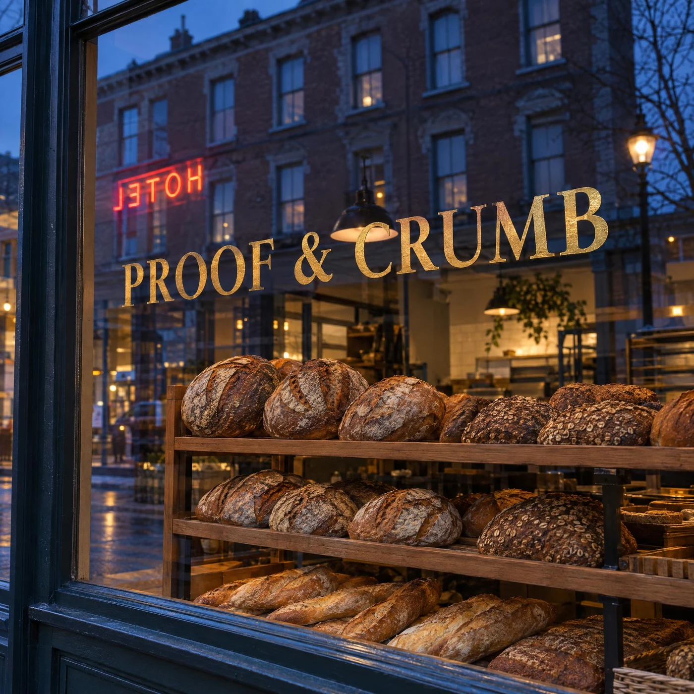
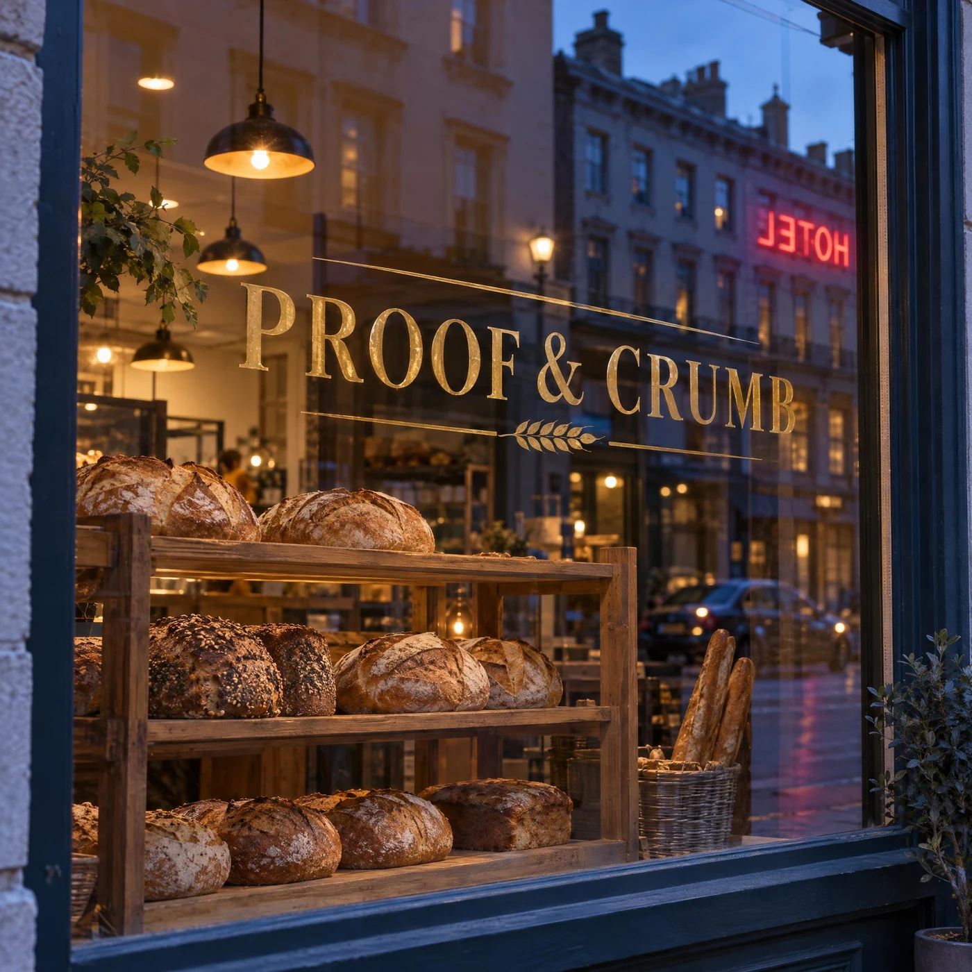
招牌正读、倒影里的霓虹是镜像反的 —— 两版都做对了这条物理。
橱窗上的金箔字「PROOF & CRUMB」从街面正读,而玻璃里映出的霓虹「HOTEL」是反的,真实反射就该如此。同时面包架透过玻璃仍然清晰、没有被反射盖住。两版都过,这是整组测试里最难的一条之一。
A street-level photograph of a bakery shop window at dusk. The window glass carries the shop name "PROOF & CRUMB" painted in gold leaf, reading correctly from the street. In the glass, the reflection of the building opposite is visible, and within that reflection a neon sign appears mirror-reversed, as real reflected text would. Through the glass, loaves on a wooden rack are sharply visible and are not washed out by the reflection. Warm interior light against cool blue exterior light, no other text.
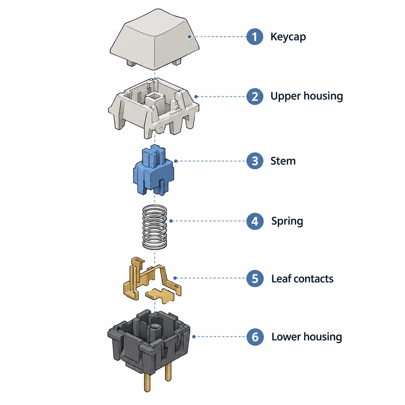
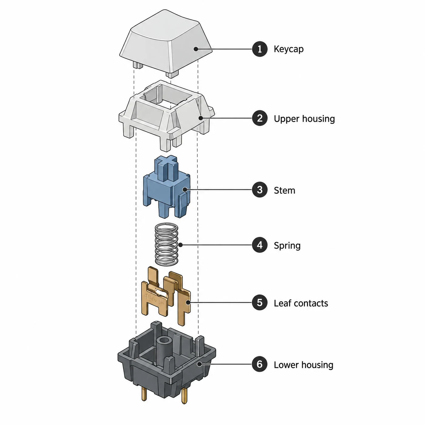
六个部件顺序、六条标签文字两版全对。
1 Keycap 到 6 Lower housing 逐字正确,线条干净、等距角度准确、没有透视错误。Sunburst 多画了一条贯穿所有部件的竖直虚线装配轴,更接近工程手册的画法。
A technical illustration on a white background: an isometric exploded view of a mechanical keyboard switch, its parts separated vertically along one axis and connected by thin dashed leader lines. From top to bottom the parts are the keycap, the upper housing, the stem, the coil spring, the metal leaf contacts and the lower housing with two pins. Each part carries a numbered callout dot connected to a label on the right, reading in order "1 Keycap", "2 Upper housing", "3 Stem", "4 Spring", "5 Leaf contacts", "6 Lower housing". Clean line work, flat muted colours, accurate isometric angles, no perspective, no other text.
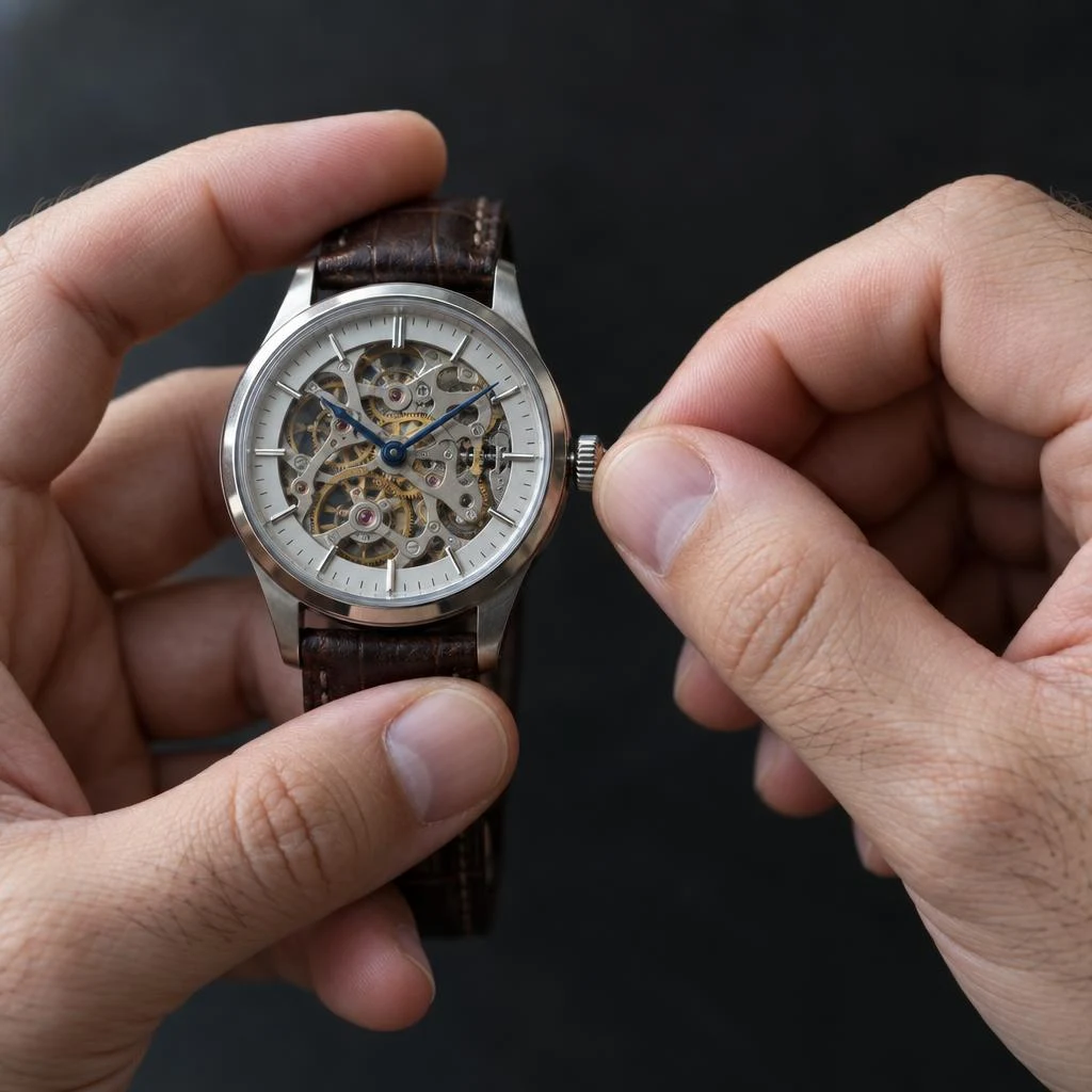
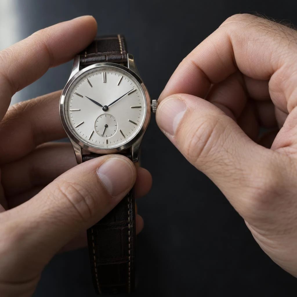
指数正确、关节自然、捏表冠的动作两版都可信。
手一直是生成模型的老问题。这一组两版都过:左手夹持表壳、右手拇指与食指捏住表冠,指甲形状和手背细毛都在。Sunburst 的捏合处解剖更服人,皮肤毛孔更细。
A close-up photograph of two adult hands winding the crown of a mechanical wristwatch. The left hand holds the watch case steady between thumb and forefinger; the right hand pinches the small crown between thumb and index fingertip. Five fingers on each hand, correct joint articulation, natural nail shape, visible skin texture and a few fine hairs on the back of the hand. Soft daylight from the left, dark neutral background, shallow depth of field on the fingertips. No text.
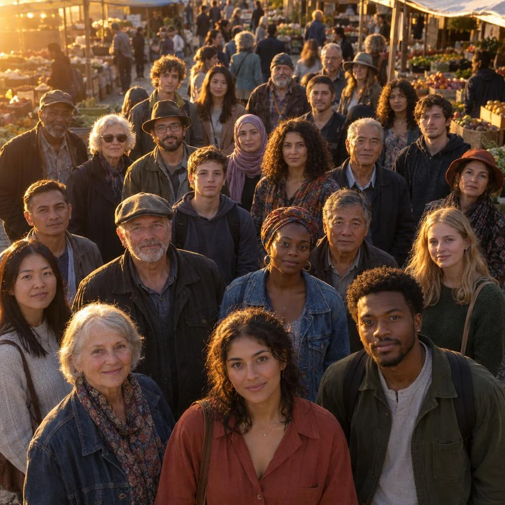
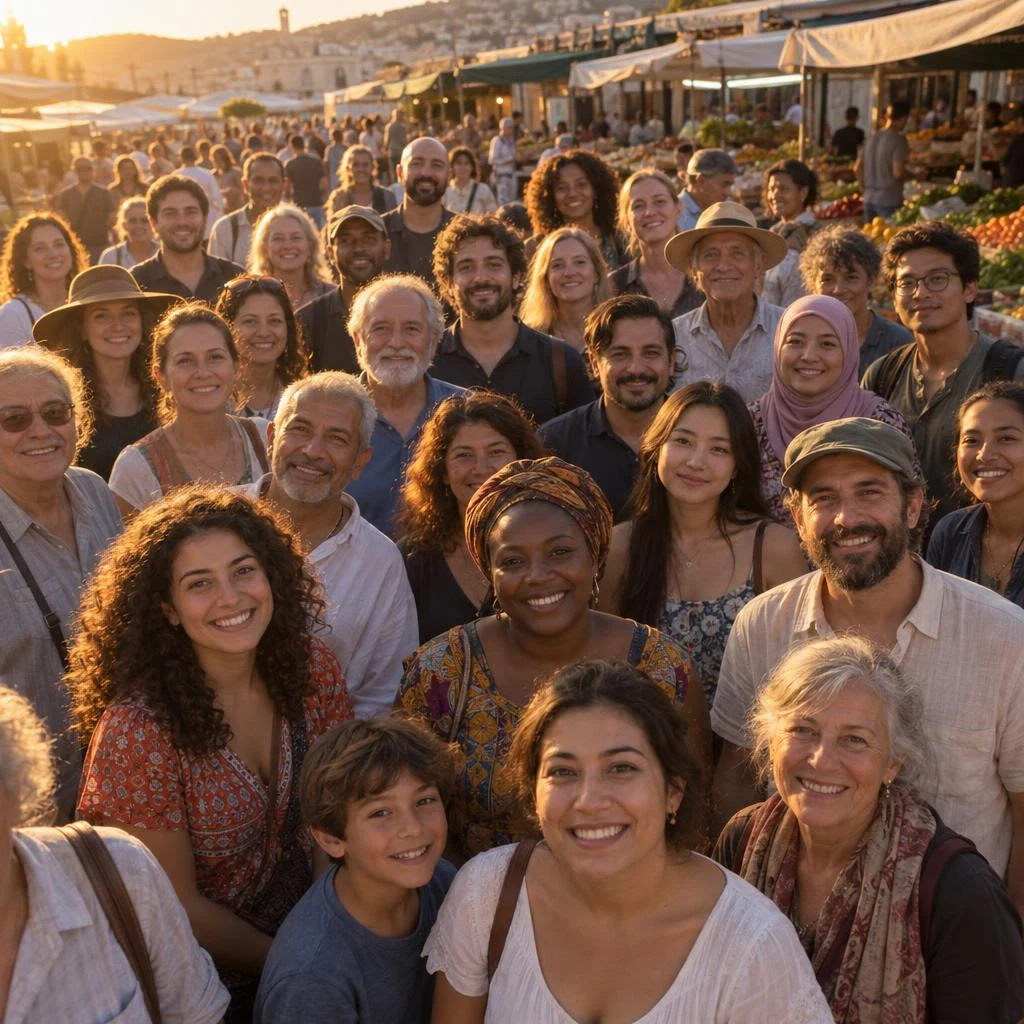
三十张脸没有重复、没有崩坏,而且都被同一侧的低角度阳光照着。
提示词要求「每个人左颊都有同样的暖色轮廓光、右侧同样的阴影」,两版都守住了这条一致性,纵深也自然衰减。Sunburst 更暖、后排解析出的脸更多;Flare 前排更锐。
A photograph of about thirty people standing shoulder to shoulder in an open-air market at golden hour, seen from slightly above. Every face is lit by the same low sun from the left, so every person carries the same warm rim light on their left cheek and the same shadow on their right. Faces are varied in age and appearance, all anatomically correct, none duplicated. Depth falls off naturally toward the back of the crowd. No text, no signage.
下面的数字来自同一批 20 条提示词、两档【同尺寸同画质】各跑一张,共 40 次真实调用,全部走 apimodels.app 自己的接口。不是引用别人的评测。
中位数是 Flare 24.8 秒对 Sunburst 40.0 秒,约 1.6 倍 —— 而不是通行说法里的 2 倍。更有用的是分布:Flare 的区间是 19.0 到 42.5 秒(2.2 倍),Sunburst 是 31.2 到 53.3 秒(1.7 倍)。也就是说 Sunburst 虽然整体慢,但它的波动更小;到了最慢那一端,两档只差 1.25 倍。做排队系统时,最慢值比中位数更能决定你的超时该设多少。
| 次数 | 最快 | p50 | p90 | 最慢 | 平均 | |
|---|---|---|---|---|---|---|
| gpt-image-2.5-flare | 20 | 19.0 秒 | 24.8 秒 | 35.3 秒 | 42.5 秒 | 25.9 秒 |
| gpt-image-2.5-sunburst | 20 | 31.2 秒 | 40.0 秒 | 52.9 秒 | 53.3 秒 | 40.8 秒 |
| flare 1K / 2K | 10 / 10 | — | 22.9 / 27.3 秒 | — | 42.5 / 35.3 秒 | — |
| sunburst 1K / 2K | 10 / 10 | — | 36.7 / 42.6 秒 | — | 53.3 / 49.8 秒 | — |
单次对照只能说明「这一次谁更好」,决定实际成本的却是「一次出对的概率」—— 要重跑两次,便宜那一档就不便宜了。所以挑了两条对错可以客观判定的提示词,每档各跑三次:色值卡要四个十六进制码逐字正确且色块吻合,数据图要十六个数字全对。
结果:内容正确率两档都是 6/6。四个色值 #101828 / #2E6BE6 / #E7DFD2 / #B4553C 每一次都写对、色块每一次都对得上;十六个数值(营收 4.1 到 8.3、毛利率 18% 到 28%)也是每一次全对。这类「文字与像素必须互相印证」的活,两档现在都能一次过。
分歧出现在排版细节上,而且重复三次之后能看出这不是偶然:数据图的百分比标签与柱值标签重叠,Flare 三次里出现一次,Sunburst 三次全部出现。单次对照时我们已经注意到这一点,重跑之后它从「这一张碰巧」变成了一个可预期的差别。
还有一次真实失败要如实记下来:十二次里有一次 Sunburst 返回 502,重试即过。样本太小不足以算成功率,但足以说明这两档都不是 100%,生产里该有重试。
六次全部把四个十六进制码写对,色块也全部吻合 —— 两档 3/3。
版式在六次之间几乎不变,只有 ATLAS 字标的造型略有出入。这类品牌规范活,重跑的必要性很低,选快的那档即可。
Brand colour specification card: wordmark ATLAS, four swatches labelled MIDNIGHT / SIGNAL / SAND / CLAY with hex codes #101828, #2E6BE6, #E7DFD2, #B4553C — each swatch must actually be the colour its hex code names.
十六个数值六次全对;标签重叠 Flare 1/3、Sunburst 3/3。
两条纵轴的标注、图例、季度标签在六次里也都正确。会被这条差别影响的是「出图即用」的场景 —— 图表要直接贴进报告时,Flare 少改一次。
Combined bar-and-line chart titled "Quarterly revenue and margin": eight bars 4.1 / 4.8 / 5.2 / 6.0 / 6.4 / 7.1 / 7.6 / 8.3 and a margin line 18 / 19 / 21 / 22 / 24 / 25 / 26 / 28 on a secondary axis, both axes labelled.
把上面 26 组逐张看完之后逐组判一次胜负,结果是 Sunburst 赢 10 组、Flare 赢 4 组、平手 12 组。平手占了将近一半 —— 这本身就是结论:大多数活儿两档给的是同一个东西。
更值得注意的是 Flare 赢的那几组的性质。它们全部落在「系统性与精确性」这一类:品牌规范表里四种锁定要用同一个图标、双语锁定要两种文字等重、数据图的标签不能互相压、织物要按提示词长出散纤维。也就是说,把 Sunburst 当成「更高级所以更听话」是错的 —— 它更擅长的是表面与材质,不是照章办事。
| 对照组 | 胜方 | 判据 |
|---|---|---|
| 局部编辑 · 只换椅子 | 平手 | 两版与原图几乎不可分 |
| 信息图 · 十几个编号标注 | 平手 | 都逐字可读,差的是设计取向 |
| 演示稿 · 图表与脚注 | Sunburst | 纵轴带标注、脚注编号、真字标 |
| 界面稿 · 列表与标签栏 | 平手 | 一个更完成,一个更像规范稿 |
| 产品包装 · 卡面与材质 | Sunburst | 卡纸做旧、掉漆、吸塑厚度 |
| 写实人像 · 皮肤与织物 | Sunburst | 针织与网眼分得更开 |
| 品牌规范表 · 四种锁定 | Flare | 四格图标完全一致,精度档反而漂移 |
| 色彩规范卡 · 四个色值 | 平手 | 两档色值与色块都对 |
| 中英双语锁定 · 两文等重 | Flare | 中英视觉重量更贴题 |
| 字标 · O 改实心圆点 | 平手 | 拼写与改造两档都对 |
| 叠放锁定 · 副标题等宽 | 平手 | 四条精确指令全中 |
| 标志印上实体 · 无墨压凹 | 平手 | 都做出纸的高低而非平贴 |
| 三语同版式海报 | 平手 | 简繁字形都分得清 |
| 报纸头版 · 日期行与三栏 | Sunburst | 正文更像真新闻,报耳齐全 |
| 包装背板 · 过敏原小字 | Sunburst | 带百分比声明,更接近能送印 |
| 活动海报 · 六名字递减 | 平手 | 两版几乎可互换 |
| 铭牌 · 拉丝金属蚀刻 | Sunburst | 刻痕有真实深度与做旧 |
| 玻璃与液体 · 逆光折射 | 平手 | 焦散与弯月面都到位 |
| 织物微距 · 纱线级 | Flare | 散纤维更多,正是提示词要的 |
| 毛发抠图 · 边缘单根毛 | Sunburst | 胡须与耳簇分离度更高 |
| 精灵图 · 4×4 固定网格 | Sunburst | 单元格比例与基线更稳,能切齐 |
| 数据图 · 16 个数值 | Flare | 数值都对,但标签排布更干净 |
| 反射中的文字 · 镜像倒影 | 平手 | 招牌正读、倒影反写,都对 |
| 等距爆炸图 · 六件带引线 | Sunburst | 多一条贯穿装配轴,更像工程图 |
| 手 · 双手操作小物件 | Sunburst | 捏合处解剖更服人 |
| 人群 · 三十张脸同一光源 | 平手 | 一致性与纵深两档都守住 |
26 组看下来,结论比「精度档更好」要具体得多:大部分活儿两档给的是同一个结果,少数活儿各有胜负,而且赢的一方不总是 Sunburst。下表按活儿分,理由都来自上面的实测。
把模型名放进配置,不要写死在代码里。因为同一分辨率下两档价格相同(而且五档画质也同价),把某一张从 Flare 升级到 Sunburst 花的是时间不是预算,这个切换应该是改一行配置。
还有一种情况是两档都不用挑:只要验版式或出缩略图,该做的是把 quality 降到 low,而不是换模型 —— low 出得最快,而且价钱和 max 一模一样。要省钱只有一个办法:降分辨率,1K 每张 $0.02。
| 活儿 | 该用哪档 | 为什么 |
|---|---|---|
| 社交与信息流图 | Flare | 决定成败的是周转速度;信息流尺寸下看不出画质差 |
| 电商商品列表图 | Flare | 量大;而且抠图两档一样好 |
| 在已有图上做局部编辑 | Flare | 换椅子那一组实测两版几乎一模一样 |
| Logo、字标、品牌规范表 | Flare | 四种锁定形式里它把图标保持得比精度档还一致 |
| 精确排版稿 | Flare | 海报和锁定测试两版可互换 |
| 数据图表 | Flare | 数值两档全对,而 Flare 的标签排布更干净 |
| 主视觉、包装 | Sunburst | 多花的时间实实在在落在材质和表面上 |
| 要拿去印刷的东西 | Sunburst | 一臂距离看仍然站得住的细节 |
| 产品微距与材质图 | Sunburst | 刻痕深度、织纹、掉漆、做旧 |
| 精灵图等要按网格切的素材 | Sunburst | 它守住了单元格比例和脚底基线,Flare 有漂移 |
| 验版式、出缩略图 | 两档都行,用 low | 1K 一律 $0.02,与画质无关 —— 降档是为了快,不是为了省 |
这一页剩下的部分都在讲 API,但用 GPT Image 2.5 并不需要 API。SparkPix 是我们的浏览器版编辑器:传张图或者写句提示词就能生成,不用 key、不用配置 —— 跑的是 Flare 档,支持 1K / 2K / 4K 和八种画幅,每张 10 积分,生成失败退还积分。如果你已经有 APIMODELS 账号,控制台里也有试跑入口,两档和各个画质都能在写代码之前先点着试。
cURL
# Same prompt, same quality, both tiers — the bill is identical.
# The only difference you will notice is how long it takes.
curl https://api.apimodels.app/v1/images/generations \
  -H "Authorization: Bearer $APIMODELS_API_KEY" \
  -H "Content-Type: application/json" \
  -d '{
    "model": "gpt-image-2.5-flare",
    "prompt": "Editorial still life: a brushed-steel watch on grey linen, raking window light",
    "size": "2048x2048",
    "quality": "high"
  }'
# -> $0.035 (2K — quality does not change the price)

# swap the model name, keep quality explicit, and the price does not move
#   "model": "gpt-image-2.5-sunburst"   -> still $0.035 (2K, any quality)
#
# Leave quality out and only the render diverges, never the bill:
#   flare    -> medium -> still $0.035 at 2K
#   sunburst -> high   -> still $0.035 at 2K
Python
import requests

BASE = "https://api.apimodels.app/v1"
H = {"Authorization": "Bearer YOUR_API_KEY"}

PROMPT = "Editorial still life: a brushed-steel watch on grey linen, raking window light"

# Run the same job through both tiers at the SAME quality and compare.
# Cost is identical, so this test only spends time.
for model in ("gpt-image-2.5-flare", "gpt-image-2.5-sunburst"):
    r = requests.post(f"{BASE}/images/generations", headers=H, json={
        "model": model,
        "prompt": PROMPT,
        "aspect_ratio": "1:1",
        "resolution": "2K",
        "quality": "high",   # explicit: without it flare bills medium, sunburst bills high
    }).json()
    print(model, r["data"]["images"][0]["url"])

# Rule of thumb: keep flare in the pipeline, promote a shot to sunburst
# only when someone is going to zoom in on it.两点,而且都不是「能力差别」。第一是时间:40 次同尺寸同画质的实测里,Flare 中位 24.8 秒、Sunburst 40.0 秒,约 1.6 倍。第二是这些时间花在哪:Sunburst 在材质与表面上更稳(金属刻痕、织物纹理、掉漆、毛发边缘),在固定网格上也更稳(精灵图这类要按格切的素材)。其余完全一样:局部编辑、多轮一致性、蒙版、原生透明底 PNG、原生 1K / 2K / 4K、同样六种画幅,以及完全相同的价格(同一分辨率同价,五档画质也同价)。26 组对照里 Sunburst 赢 10 组、Flare 赢 4 组、平手 12 组。
按分辨率一口价:1K $0.02、2K $0.035、4K $0.07 —— 一个分辨率一个价,两档相同,而且 low / medium / high / xhigh / max 五档画质也是同一个数。仅成功扣费,参考图、蒙版、透明底都不额外收费。因为画质不影响价格,传不传 quality 两档都是同一个数:Flare 和 Sunburst 的差别在时间和细节上,不在钱上。官方 OpenAI API 正相反 —— 它按输出图片 token 收费,同一张 4K 图 low 档约 $0.011、max 档约 $0.40。
可以。SparkPix(sparkpix.ai/gpt-image-2-5)是网页版编辑器,不需要 key、不需要配置:传图或者写提示词就能生成。它跑的是 Flare 档,支持 1K / 2K / 4K 和八种画幅,每张 10 积分,失败退还积分;积分包 $9.99 起 350 积分、约 35 张,不是订阅制。需要 Sunburst、需要显式控制 quality、需要蒙版或者要批量跑的时候,再用 API。
不会,而且试错成本很低。两档能力相同、价目表相同,所以切换就是换个模型名,同一分辨率下计费没有任何变化(画质档也不影响);真正会变的是耗时,大约翻倍。唯一要注意的是它们毕竟是两个模型:换一档重跑是一次新的生成,不是把同一张图重新渲染一遍,已经定稿的一组图不会像素级一致。如果整组的一致性重要,就在开始那一档上把这组做完,并用参考图锁住身份。
不贵,每张就是一样的钱。OpenAI 对两个模型用的是同一套 token 单价;我们这边两档共用同一张表:1K $0.02、2K $0.035、4K $0.07,五档画质同价。最后这半句是两页容易被误读的地方 —— 在官方 API 上默认画质档确实会改变账单(Flare 缺省 medium、Sunburst 缺省 high,两者差约四倍),但在我们这里它什么都不改变。传不传 quality,两边算出来都是同一个数。
同一条提示词下大约是 Sunburst 的两倍速,也大约是 GPT Image 2 的两倍速——「延迟砍半」是 OpenAI 发布时的说法。绝对耗时随尺寸和画质变化:我们自己的探针上,low 约 30-45 秒、medium 约 40-70 秒,high 档 1K 约 50 秒、2K 约 100 秒、4K 约 70 秒。这些数字看数量级即可,不是服务承诺;同步调用两档都建议把客户端超时设到 180 秒以上。
没有。两档的能力集合相同:局部编辑、多轮一致性、蒙版输入、带真实 alpha 的原生透明底 PNG、1K / 2K / 4K 原生输出,以及六种标准画幅。OpenAI 文档对两者列出的尺寸与画质选项也是同一套。如果你觉得某个能力只有一档有,那多半是画质档差异造成的错觉——先用同一个 quality 各跑一次再下结论。
放 Flare,把 Sunburst 当成「升级通道」。大多数流水线卡在吞吐上,而 Flare 在不放弃任何 2.5 能力的前提下把等待时间减半。把模型名放进配置而不是写死在代码里,这样某一张后来被选为主视觉时,不改代码就能用 Sunburst 重跑一遍。因为同画质下价格相同,这次升级花的是时间,不是预算。
写法不变,回报不同。两档都吃 2.5 那个共同的习惯:先写不许变的,再写要变的。锁住姿势、光线、机位和背景,然后只说你要改的那一件事,最后点名你反复遇到的那个毛病。Sunburst 对材质、织法、表面处理、字体处理这类细节指令的回报更高,因为它有余量把这些真的画出来。我们整理的 238 条 GPT Image 2.5 提示词(每条附对应成图)在两档上都能直接跑。