OpenAI shipped GPT Image 2.5 on 9 September 2026 as two API models, gpt-image-2.5-flare and gpt-image-2.5-sunburst. They are not a cheap tier and an expensive tier, and they do not differ in features — at a given resolution they cost exactly the same, and so does every quality tier within it. The only thing you are choosing is how long each image takes. Below: the spec side by side, 26 pairs generated from the identical prompt on both tiers, and a table that sorts the choice by job.
gpt-image-2.5-flare
The fast tier · defaults to medium
gpt-image-2.5-sunburst
The precision tier · defaults to high
The rule in one line: start on Flare and switch to Sunburst only for images someone will look at closely. At a given resolution the two cost exactly the same — and so does every quality tier — so you are choosing speed against precision, not budget.
Start with what is identical, because that is most of the list. Both do region-scoped editing, hold a character or product across many rounds, take a mask, return native transparent PNG with real alpha, generate natively at 1K, 2K and 4K, and cover the same six aspect ratios. OpenAI documents the same size and quality options for both.
Price is identical too, and this is the part almost every comparison gets wrong. OpenAI bills both at one token rate — $5 per million text input tokens, $8 for image input, $30 for image output — the same rate as GPT Image 2. The gap you see quoted is the default quality tier, not a rate: Flare defaults to medium, Sunburst to high, and high runs about four times medium at any size. Send quality explicitly and the two bill the same number.
So the difference is time. We ran 20 prompts through both tiers at identical size and quality: the median was 24.8s for Flare and 40.0s for Sunburst, about 1.6× rather than the 2× that gets quoted. The 26 pairs below come from those runs and from OpenAI’s own guide, and every judgement under them was written after actually looking at the pair.
| gpt-image-2.5-flare | gpt-image-2.5-sunburst | |
|---|---|---|
| Positioning | fast tier, the default | precision tier |
| Default quality | medium | high |
| Median time (our run, 20 prompts) | 24.8s | 40.0s |
| Region-scoped editing | yes | yes |
| Multi-turn consistency | yes | yes |
| Mask input | yes | yes |
| Native transparent PNG | yes | yes |
| Native 1K / 2K / 4K | yes | yes |
| Aspect ratios | 1:1 3:4 4:3 9:16 16:9 21:9 | same |
| Price at 1K | $0.02 | $0.02 |
| Price at 2K | $0.035 | $0.035 |
| Price at 4K | $0.07 | $0.07 |
| Does quality change the price? | no — low to max all cost the same | no — same |
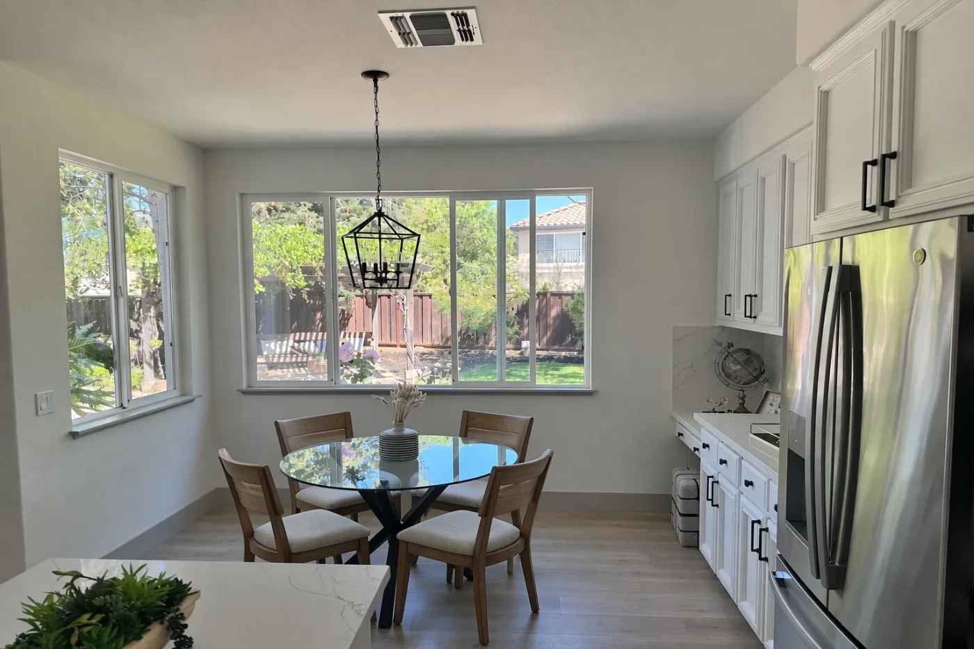
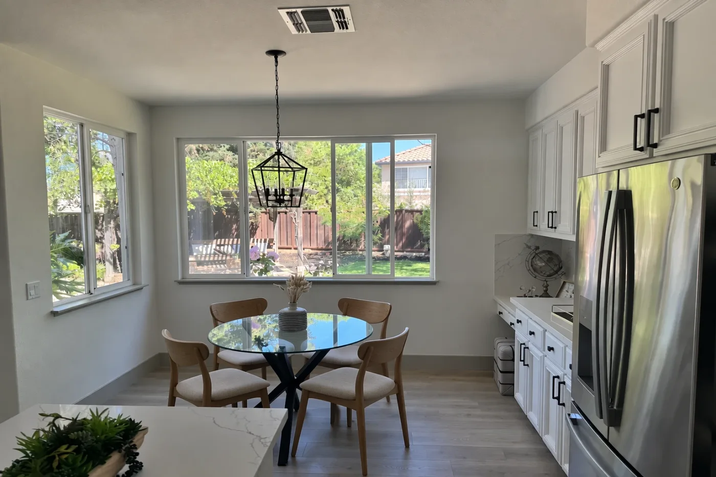
These six come from OpenAI’s own image prompting guide: one prompt, run on both tiers, both images published by OpenAI. Left is Flare, right is Sunburst. Click either image for the full size, or expand for the verbatim prompt.
Near-identical to each other and to the input. For scoped edits, Flare is enough.
Camera, light, cabinets, fridge, pendant and the view through the window all held; only the chairs became wood. The chair designs differ slightly, but neither is more correct. The extra time buys a different chair, not a better one.
In this room photo, replace ONLY the white chairs with chairs made of wood. Preserve camera angle, room lighting, floor shadows, and surrounding objects. Keep all other aspects of the image unchanged. Photorealistic contact shadows and fabric texture.
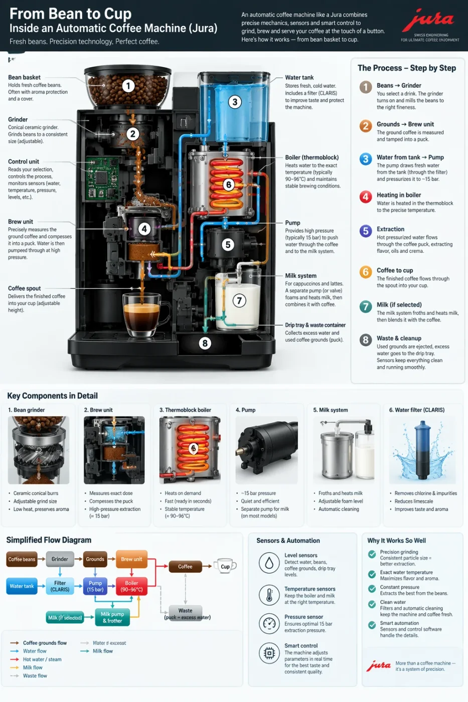
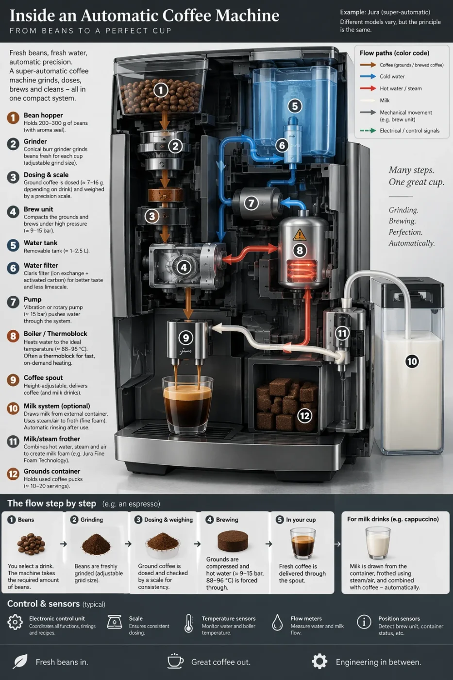
Both legible to the character. What differs is the design decision, not the clarity.
Flare laid out more panels — cutaway, step list, component strip, flow diagram. Sunburst produced a photoreal machine render and a cleaner colour-coded legend. Legible dense typography is the biggest jump over the previous generation, and both tiers clear it.
Create a detailed Infographic of the functioning and flow of an automatic coffee machine like a Jura. From bean basket, to grinding, to scale, water tank, boiler, etc. I'd like to understand technically and visually the flow.
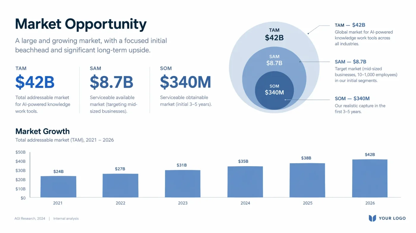
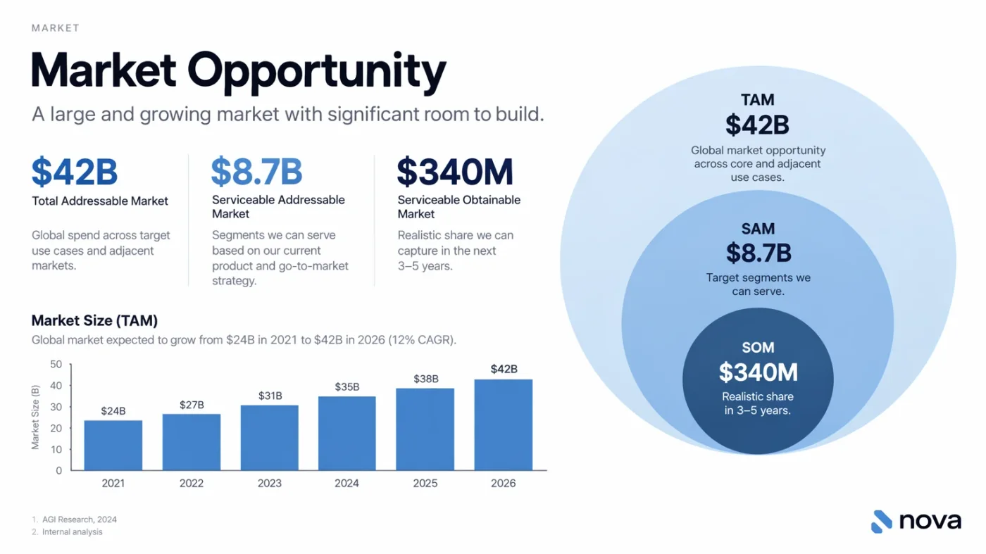
Both got every figure right; Sunburst’s layout is the more finished one.
TAM $42B / SAM $8.7B / SOM $340M and bars running 24 → 42 — both correct. Sunburst added a labelled y-axis, numbered footnotes and an actual wordmark instead of a YOUR LOGO placeholder.
Create one pitch-deck slide titled **"Market Opportunity"** that feels like a real Series A fundraising slide from a YC-backed startup. Use a clean white background, modern sans-serif typography like Inter, and a crisp, minimal layout. The slide should include: * A TAM/SAM/SOM concentric-circle diagram in muted blues and grays * Specific, believable market sizing numbers: * **TAM:** $42B * **SAM:** $8.7B * **SOM:** $340M * A clean bar chart below showing market growth from **2021 to 2026**, with a subtle upward trend * Small footnotes: **"AGI Research, 2024"** and **"Internal analysis"** * A company logo placeholder in the bottom-right corner The design should look like it belongs in a deck that actually raised money: highly readable text, clear data hierarchy, polished spacing, and professional startup-style visual language. Avoid clip art, stock photography, gradients, shadows, decorative elements, or anything that feels generic or overdesigned.
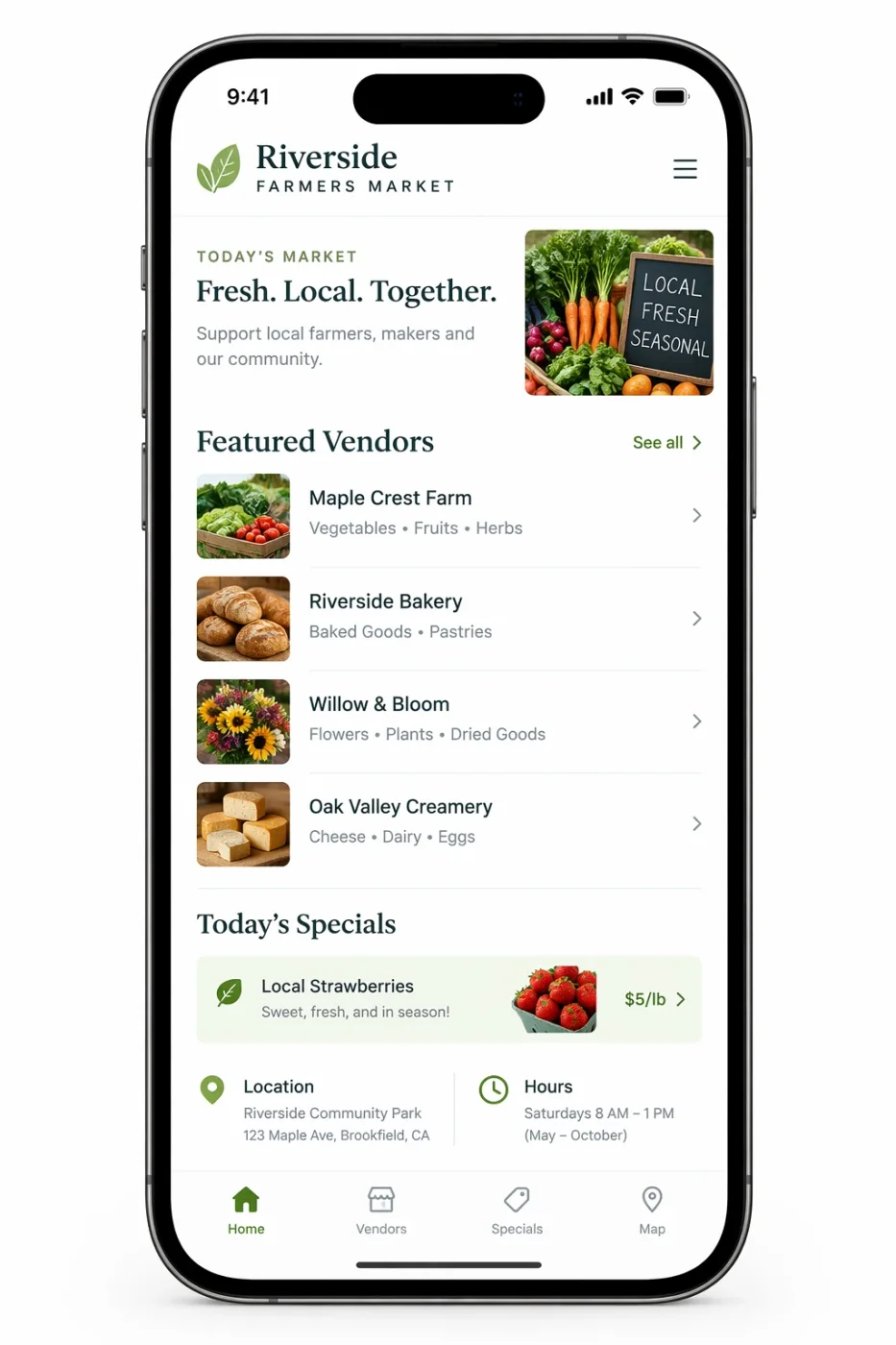
Both deliverable. Sunburst is denser; Flare reads more like a spec.
Status bar, list structure and tab bar are correct in both. Sunburst added a hero image, a priced specials row and a map thumbnail; Flare stayed restrained. Which you want depends on whether you are selling the idea or documenting it.
Create a realistic mobile app UI mockup for a local farmers market. Show today’s market with a simple header, a short list of vendors with small photos and categories, a small “Today’s specials” section, and basic information for location and hours. Design it to be practical, and easy to use. White background, subtle natural accent colors, clear typography, and minimal decoration. It should look like a real, well-designed, beautiful app for a small local market. Place the UI mockup in an iPhone frame.
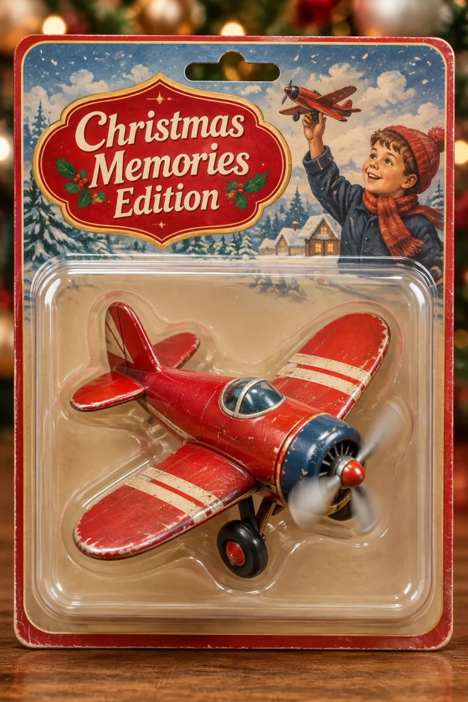
Text correct in both. Flare drew the busier card; Sunburst pushed the materials.
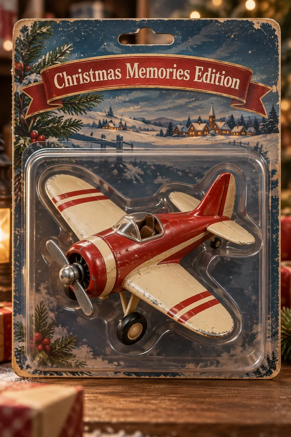
Both spelled “Christmas Memories Edition” correctly. Flare’s card has a child, a shaped emblem and a motion-blurred propeller; Sunburst pushed aged card stock, chipped paint and the thickness of the blister edge. If the packaging gets looked at closely, Sunburst holds up better.
Create a collectible action figure of a vintage-style toy propeller airplane with rounded wings, a front-mounted spinning propeller, slightly worn paint edges, classic childhood proportions, designed as a nostalgic holiday collectible, in blister packaging. Concept: A nostalgic holiday collectible inspired by the simple toy airplanes children used to play with during winter holidays. Evokes warmth, imagination, and childhood wonder. Style: Premium toy photography, realistic plastic and painted metal textures, studio lighting, shallow depth of field, sharp label printing, high-end retail presentation. Constraints: - Original design only - No trademarks - No watermarks - No logos Include ONLY this packaging text (verbatim): "Christmas Memories Edition"
Indistinguishable on a phone; separable at 100% — which is exactly the test.
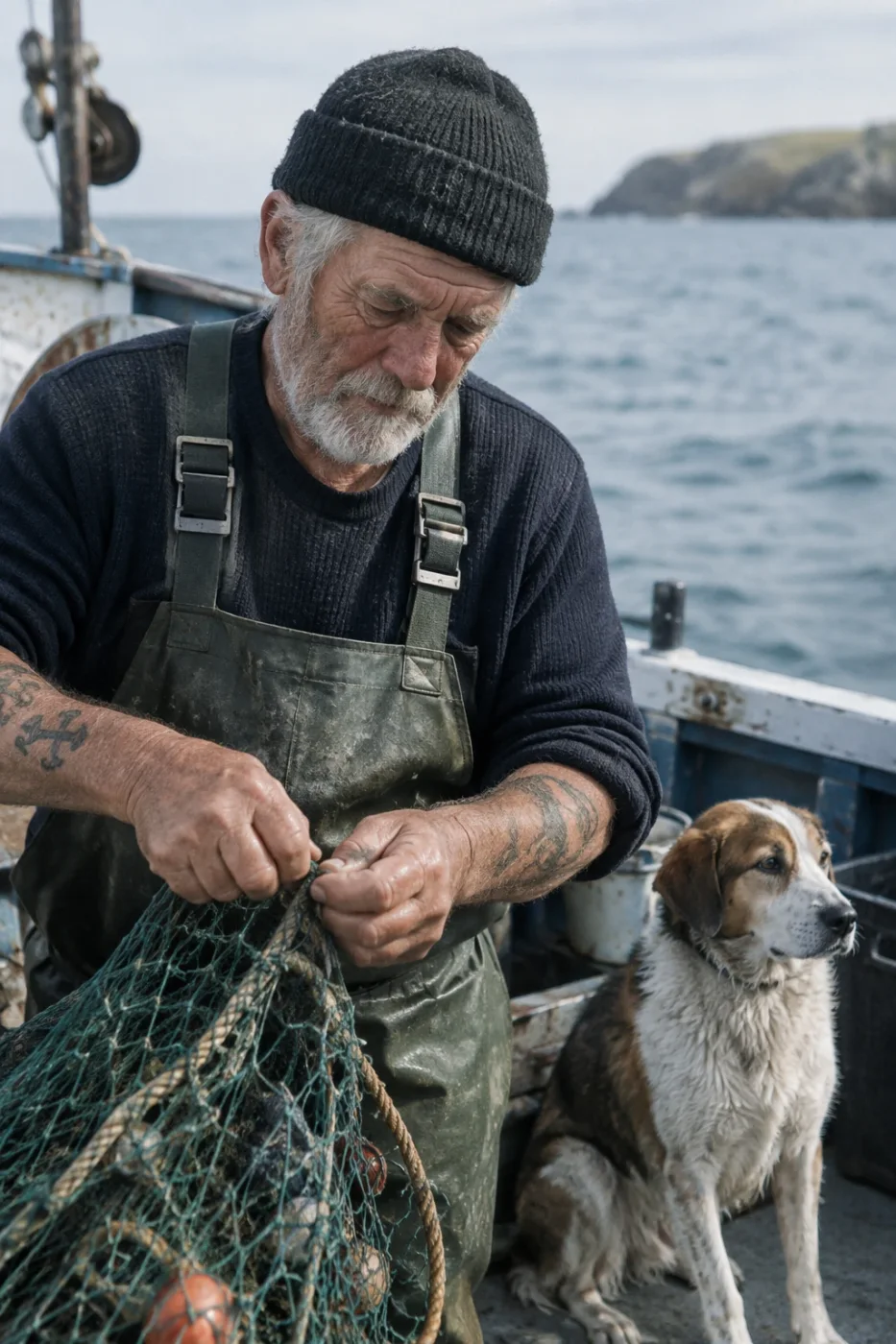
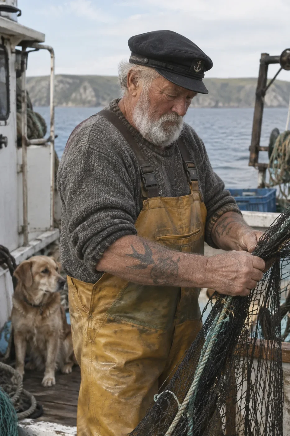
Sunburst separates the knit of the sweater and the mesh of the net further and renders small hardware like the cap badge. Flare framed wider and the face is just as clean. Both are usable.
Create a photorealistic candid photograph of an elderly sailor standing on a small fishing boat. He has weathered skin with visible wrinkles, pores, and sun texture, and a few faded traditional sailor tattoos on his arms. He is calmly adjusting a net while his dog sits nearby on the deck. Shot like a 35mm film photograph, medium close-up at eye level, using a 50mm lens. Soft coastal daylight, shallow depth of field, subtle film grain, natural color balance. The image should feel honest and unposed, with real skin texture, worn materials, and everyday detail. No glamorization, no heavy retouching.
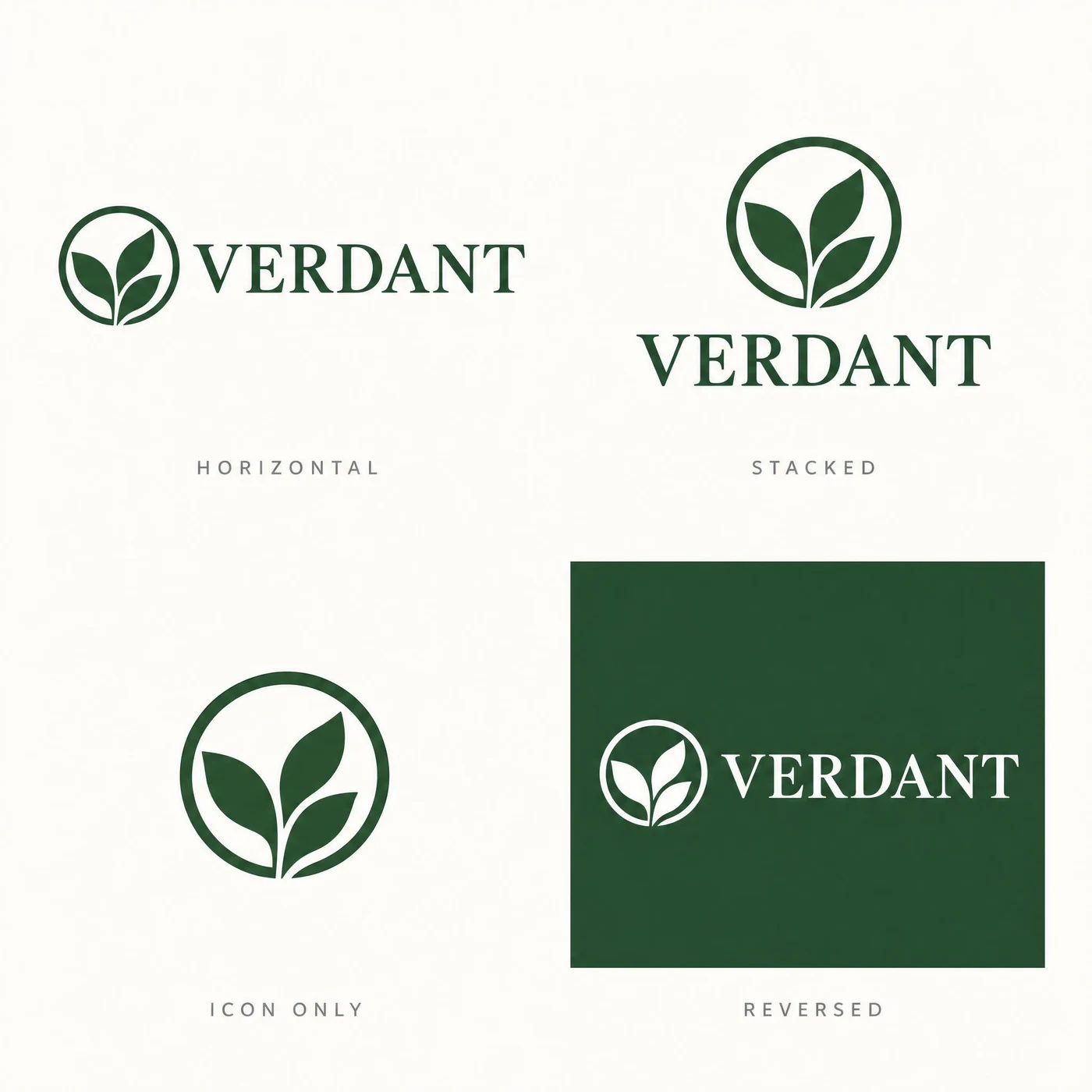
Brand work fails in two ways: the wordmark comes out misspelled, or the same mark looks different from one lockup to the next. These six press on exactly that — wordmark, lockup, identity sheet, colour spec, bilingual lockup, and the mark applied to a real surface. Both tiers, same size, same quality.
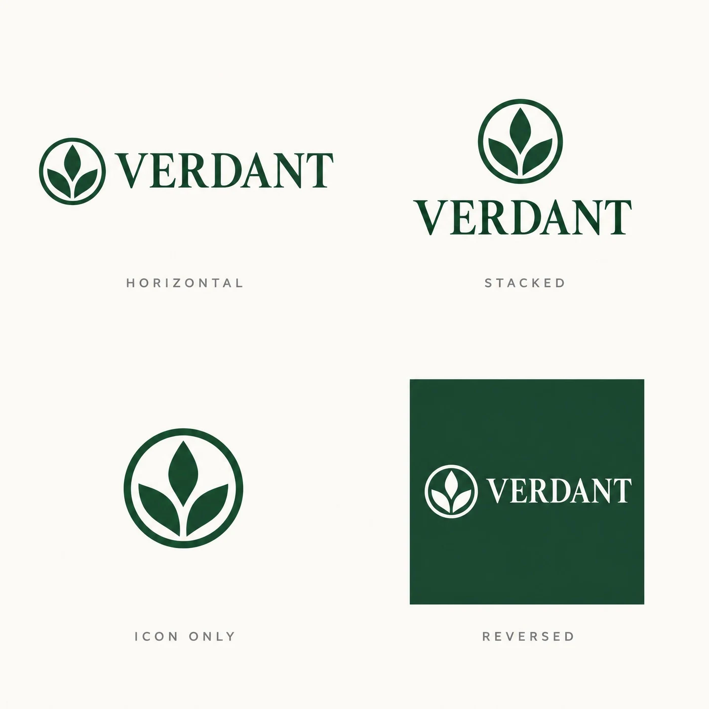
Counterintuitive: Flare held the mark identical across all four cells; Sunburst drifted.
Both got all four labels — HORIZONTAL, STACKED, ICON ONLY, REVERSED — and the VERDANT wordmark. But Sunburst’s circle weight and leaf arrangement shift between cells, and consistency is the entire point of an identity sheet. Do not assume the precision tier is the safer pick for systems work.
A brand identity sheet on a clean off-white background, four labelled lockups arranged in a two by two grid with generous even margins. Top left, labelled "HORIZONTAL": a circular leaf mark followed by the word "VERDANT" in a serif. Top right, labelled "STACKED": the same mark centred above the same word. Bottom left, labelled "ICON ONLY": the mark alone. Bottom right, labelled "REVERSED": the horizontal lockup in white on a dark green square. Every label is set in small wide-tracked grey caps directly under its lockup. The mark and the wordmark must be identical in all four cells. No other text.
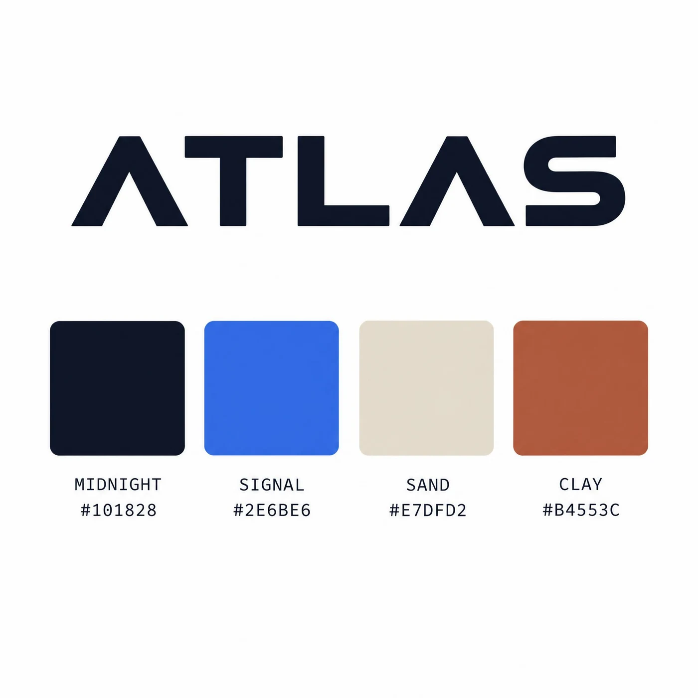
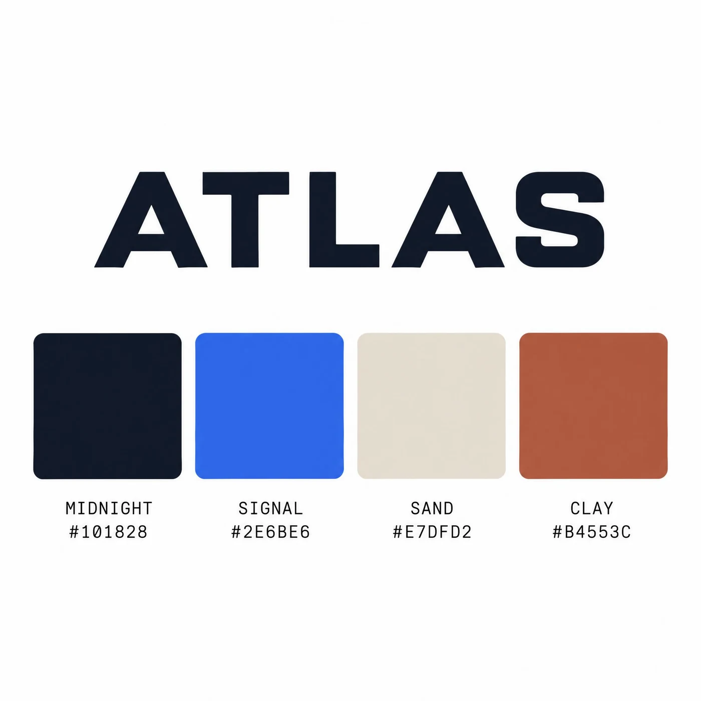
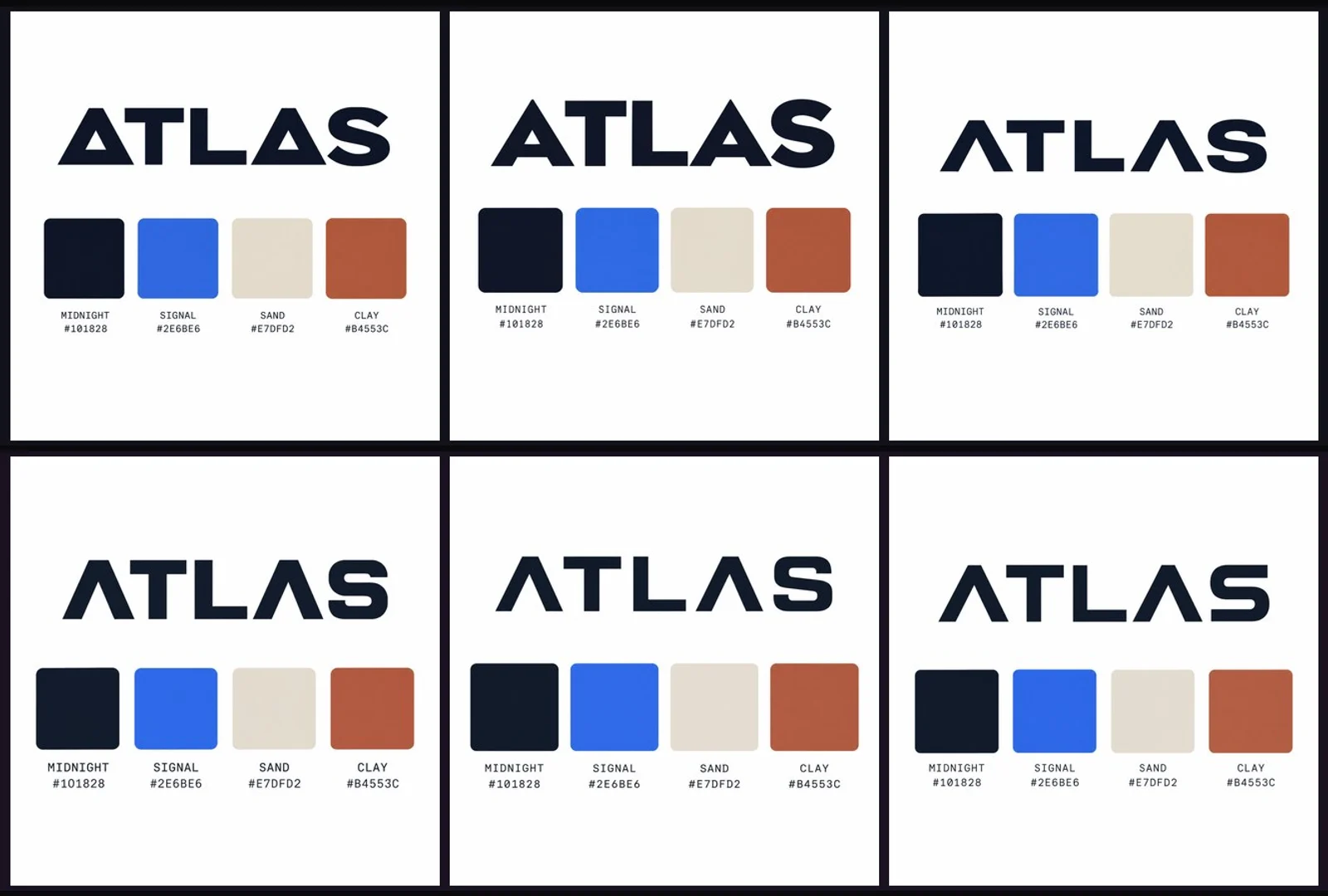
Both wrote all four hex codes correctly, and the swatches really are those colours.
#101828, #2E6BE6, #E7DFD2 and #B4553C are all correct, as are the names MIDNIGHT, SIGNAL, SAND and CLAY. This kind of brief — where the text and the pixels have to agree — used to need a manual fix afterwards; both tiers now get it right in one pass.
A brand colour specification card on a white background. Across the top, the wordmark "ATLAS" in a bold geometric sans. Beneath it, a row of four equal square colour swatches with rounded corners. Under each swatch, two lines of small monospace text: the colour name on the first line and its hex code on the second, reading exactly "MIDNIGHT / #101828", "SIGNAL / #2E6BE6", "SAND / #E7DFD2" and "CLAY / #B4553C". Each swatch must actually be the colour its hex code names. Clean editorial layout, generous white space, no other text.
Both formed 云茶 correctly; on the “equal optical weight” instruction, Flare followed the brief better.
CJK glyphs are usually a weak spot; both got these right. The difference is balance: Flare’s Chinese and English carry a similar optical weight, which is what the prompt asked for, while Sunburst’s heavier Chinese strokes dominate the English beside them. The preview is flattened onto a light ground; the full file is a real transparent PNG.
A bilingual logo lockup for a tea house, on a fully transparent background. On the left, two Chinese characters "云茶" in a refined modern Song typeface, deep ink black, correctly formed with balanced stroke weights. To their right, separated by a thin vertical rule, the English name "CLOUD TEA" set in two lines of small wide-tracked sans capitals, aligned to the cap height and baseline of the Chinese characters. The two scripts must share one optical weight so neither dominates. No other elements.
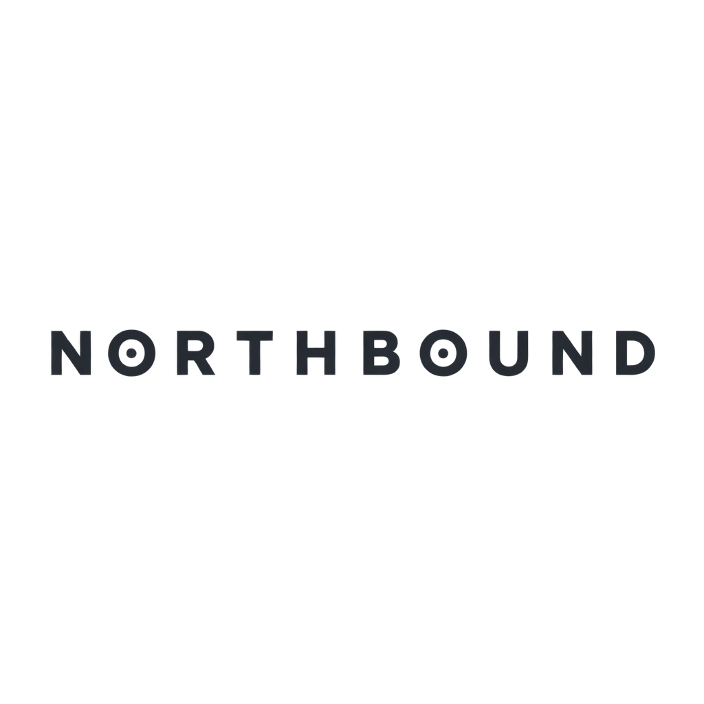
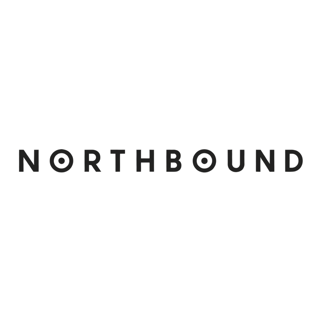
Both spelled NORTHBOUND correctly and reworked both O’s as asked.
Even tracking, consistent stroke weight, no container shape and no stray words — both comply. Flare’s charcoal is cooler, Sunburst’s warmer and darker. The preview is flattened onto a light ground; the file itself is a real transparent PNG you can drop into a layout.
A minimal wordmark logo for a specialty coffee roaster. Set the single word "NORTHBOUND" in a wide-tracked geometric sans-serif, all capitals, deep charcoal, perfectly horizontal and optically centred. Replace the counter of each letter O with a small solid circle so the two O's read as compass points. Even letter spacing, consistent stroke weight, no gradients, no drop shadow, no container shape, no extra words. Fully transparent background.
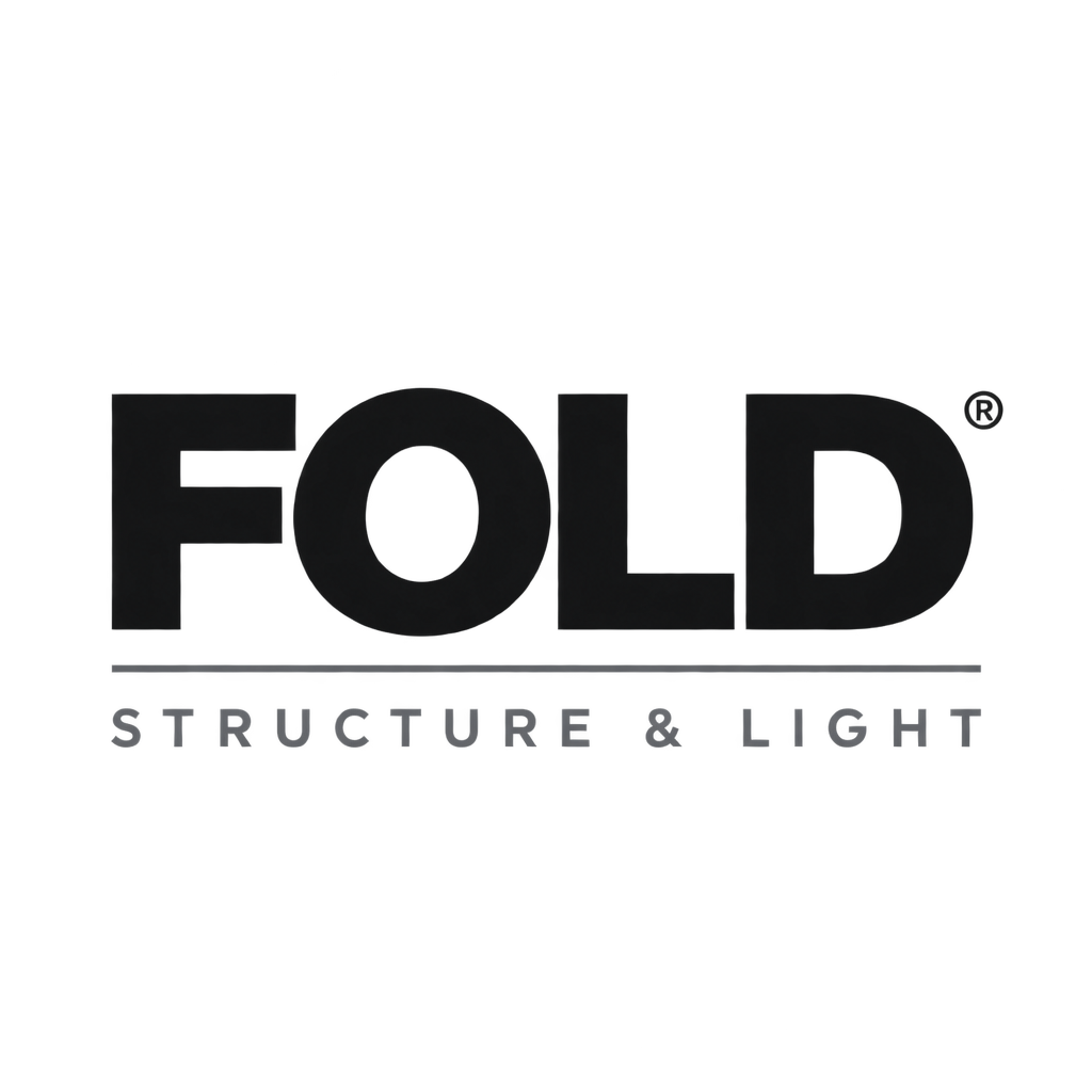
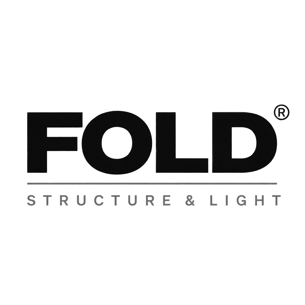
Both hit the exact-width instruction, and both placed the ® correctly.
FOLD in a heavy grotesque, a full-width hairline beneath it, STRUCTURE & LIGHT in wide-tracked grey caps matching the width above, and a superscript registered mark at the top right — four instructions, both tiers hit all four, and the results are near-identical. On precise typographic work like this, Flare saves you half the time.
A stacked logo lockup for a design studio. Top line: the word "FOLD" in a heavy grotesque, all caps, near-black. Directly beneath it, separated by a thin full-width rule, the tagline "STRUCTURE & LIGHT" in a much smaller wide-tracked sans, mid grey, exactly the same width as the word above it. A small superscript registered trademark symbol sits at the top right of "FOLD". Nothing else in the frame. Fully transparent background.
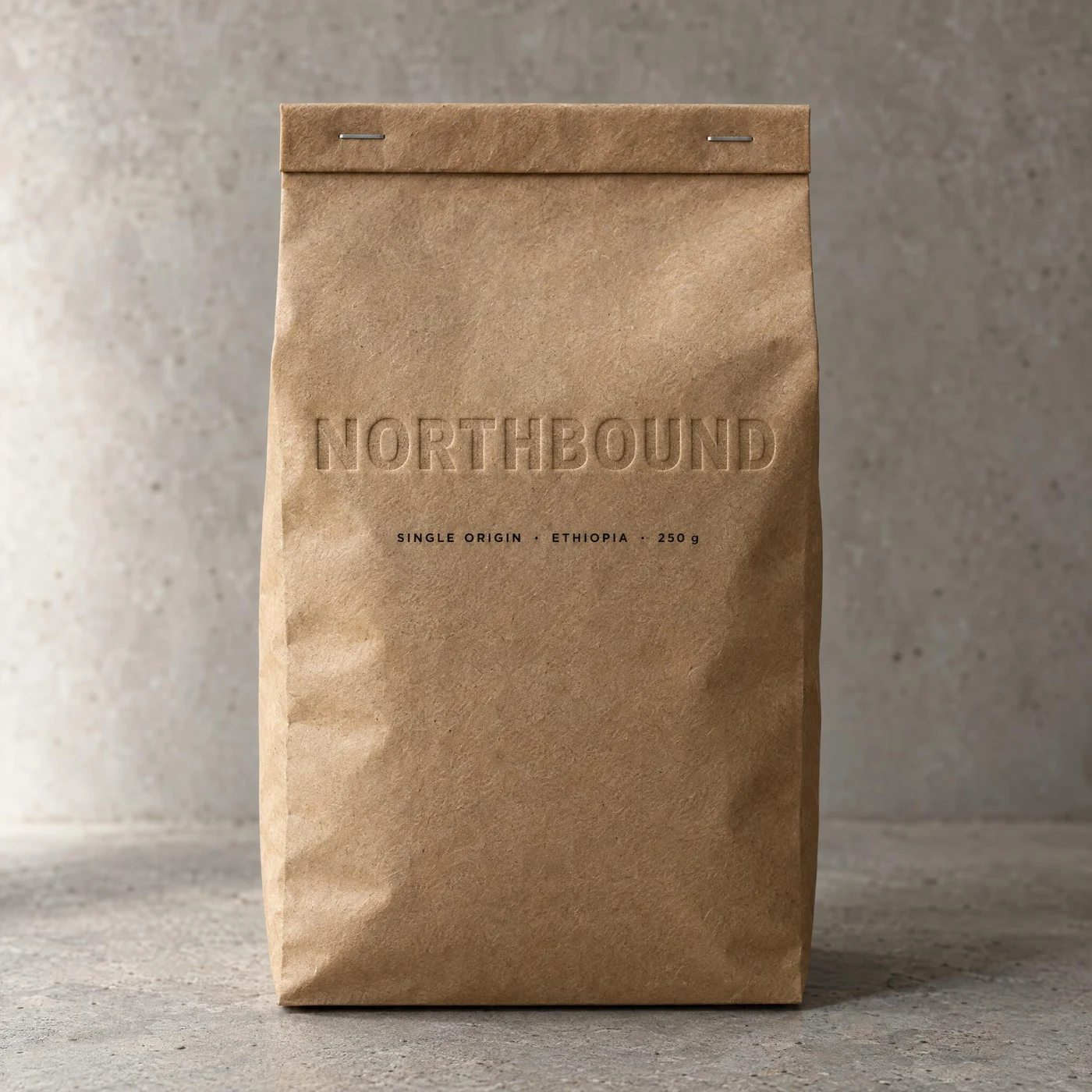
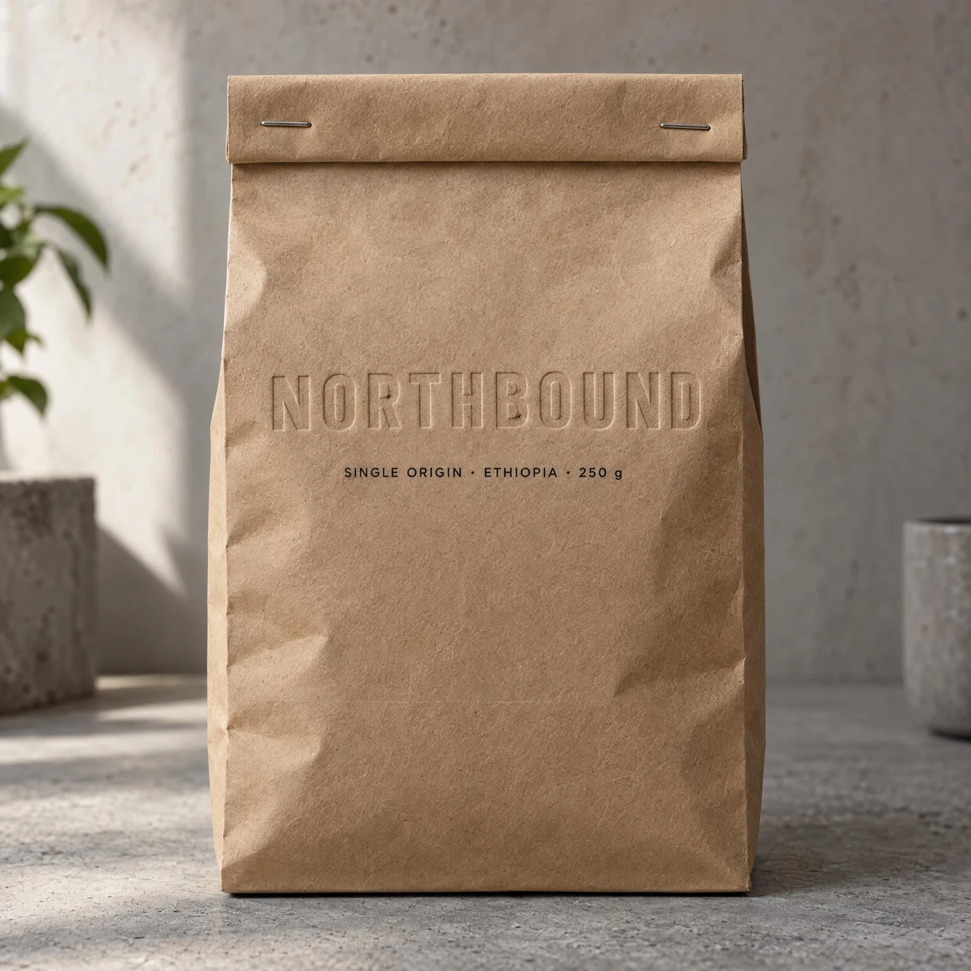
Both produced real blind embossing — no ink, only paper relief, with kraft fibre visible inside the letters.
The test here is whether the logo obeys the material rather than sitting flat on it. Both passed, down to “SINGLE ORIGIN · ETHIOPIA · 250 g” and the two staples. Flare’s embossing is a little deeper; Sunburst’s scene light is softer and it added a plant.
Product photograph of a kraft paper coffee bag standing upright on a concrete surface, shot straight on with soft side light. The wordmark "NORTHBOUND" is blind-embossed into the kraft paper across the upper third: no ink, only the raised and recessed paper catching the light, with the fibre texture of the kraft visible inside the letterforms. Below it, a small printed line reads "SINGLE ORIGIN · ETHIOPIA · 250 g". The bag has a folded top with two metal staples. Keep the embossing subtle and physically plausible, not a flat printed logo.
Text rendering is the biggest jump over the previous generation, so these four push it: one layout in three languages, a newspaper front page, an allergen panel in small print, and a poster line-up in decreasing type sizes.
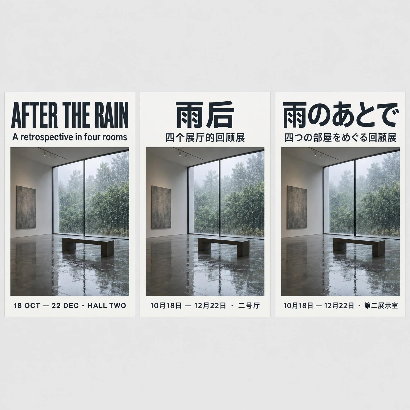
All three scripts correct — and it used 回顾展 for Chinese and 回顧展 for Japanese.
“AFTER THE RAIN”, the Chinese 雨后 / 四个展厅的回顾展 and the Japanese 雨のあとで / 四つの部屋をめぐる回顧展 are all correct, and the three posters share one grid and type scale. Picking the right glyph variant per language is the most valuable detail here.
Three identical poster layouts side by side on a light grey background, one in each language, sharing the exact same grid, type sizes, image placement and colour. Each poster has a big top headline, a one-line subhead, and a bottom line with a date and venue. Left poster in English: headline "AFTER THE RAIN", subhead "A retrospective in four rooms", bottom "18 OCT — 22 DEC · HALL TWO". Middle poster in Simplified Chinese: headline "雨后", subhead "四个展厅的回顾展", bottom "10月18日 — 12月22日 · 二号厅". Right poster in Japanese: headline "雨のあとで", subhead "四つの部屋をめぐる回顧展", bottom "10月18日 — 12月22日 · 第二展示室". Every character in all three scripts must be correctly formed and legible.
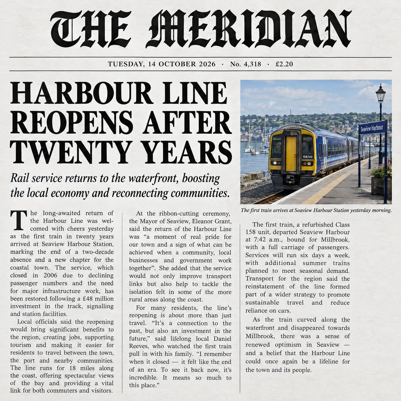
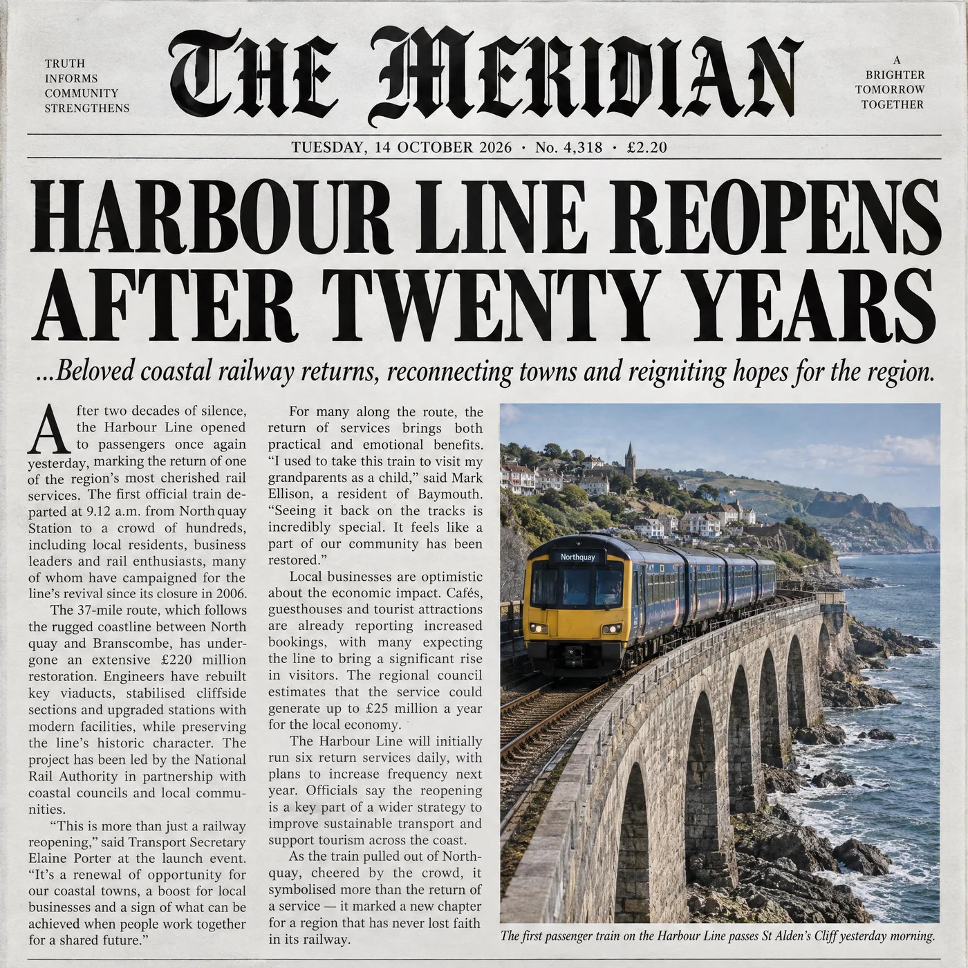
Both reproduced the dateline verbatim: “TUESDAY, 14 OCTOBER 2026 · No. 4,318 · £2.20”.
Blackletter masthead, drop cap, three justified columns and an italic photo caption — both delivered, and the body copy is real readable English rather than filler glyphs. Sunburst added ear panels and an aged paper tone, and its body text carries quotes and figures.
The front page of a broadsheet newspaper, photographed flat. A masthead reading "THE MERIDIAN" in a blackletter face across the top, with a thin rule beneath carrying a dateline that reads "TUESDAY, 14 OCTOBER 2026 · No. 4,318 · £2.20". Below that a single large headline "HARBOUR LINE REOPENS AFTER TWENTY YEARS", a smaller italic deck of one sentence, then three justified columns of small body text with a drop cap on the first column. A photograph occupies the upper right with a one-line italic caption under it. All text must be real, legible English, correctly spelled, with even column gutters.
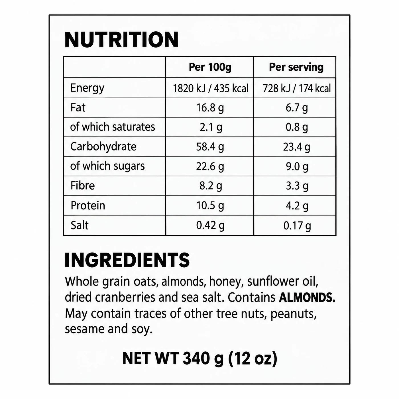
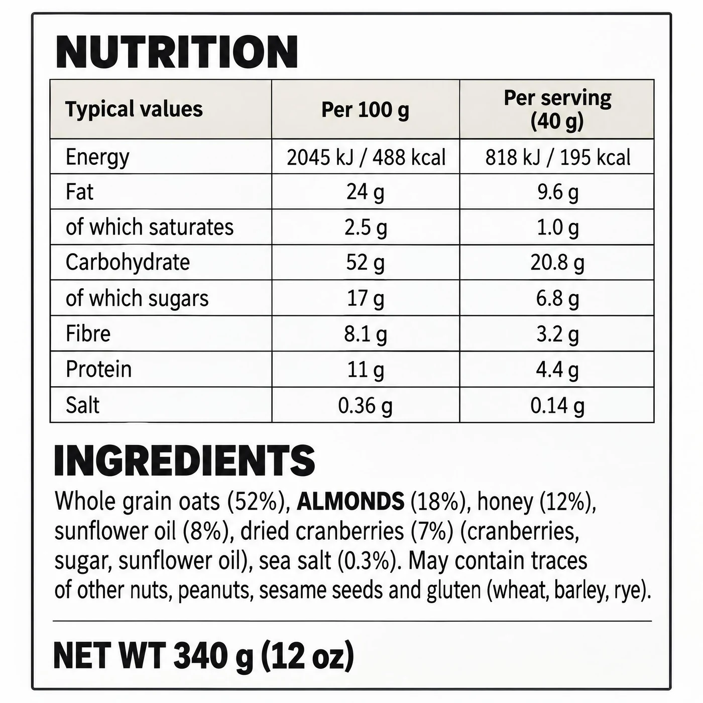
Eight nutrition rows, two value columns, ALMONDS in bold and the net weight line — both complete.
In both, the per-serving column is consistently about 40% of the per-100g column. Sunburst is closer to a shippable label: it added percentage declarations to the ingredients and stated the 40 g serving in the header.
A flat, straight-on view of a rectangular food packaging back panel on a white background. It contains, in order: a bold heading "NUTRITION", a two-column nutrition table with rows for Energy, Fat, of which saturates, Carbohydrate, of which sugars, Fibre, Protein and Salt, each with a per-100g and a per-serving value; below it a heading "INGREDIENTS" followed by a dense paragraph of small type listing oats, almonds, honey, sunflower oil, dried cranberries and sea salt, with the words ALMONDS printed in bold to mark the allergen; and a bottom line reading "NET WT 340 g (12 oz)". Every character must be crisp and legible, correctly spelled, with no invented glyphs.
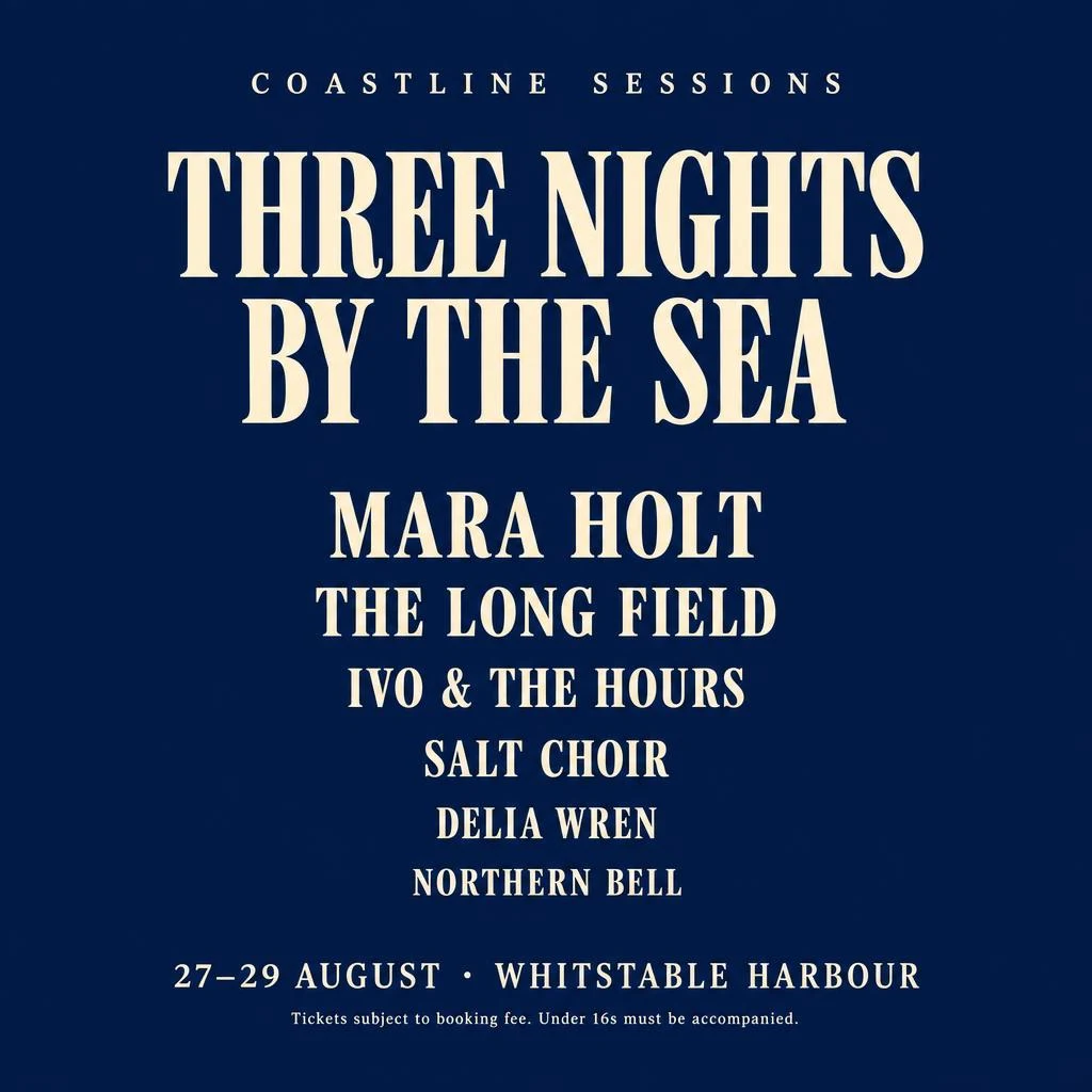
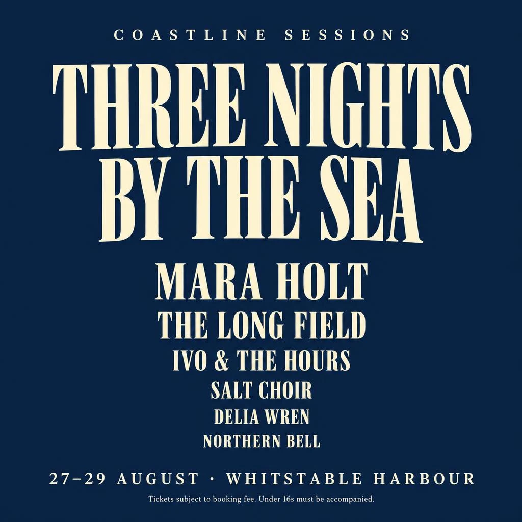
Six names, the right order, decreasing sizes, the date and venue line and the legal line — both correct, and near-identical.
The two are close enough to be interchangeable here. For poster typography there is no reason to spend the extra time.
A minimal music festival poster, portrait format, deep navy background with warm cream type. Top: a small wide-tracked line reading "COASTLINE SESSIONS". Centre: the headline "THREE NIGHTS BY THE SEA" set in a large condensed serif across two lines. Beneath it, a centred line-up in decreasing type sizes listing exactly six names: "MARA HOLT", "THE LONG FIELD", "IVO & THE HOURS", "SALT CHOIR", "DELIA WREN", "NORTHERN BELL". At the bottom, one line reading "27–29 AUGUST · WHITSTABLE HARBOUR" and under it a very small legal line reading "Tickets subject to booking fee. Under 16s must be accompanied." All text correctly spelled and legible, nothing else in the frame.
This group is the direct test of where the precision tier actually spends its time: etched metal, refracting glass, yarn-level fabric and a fur cut-out.
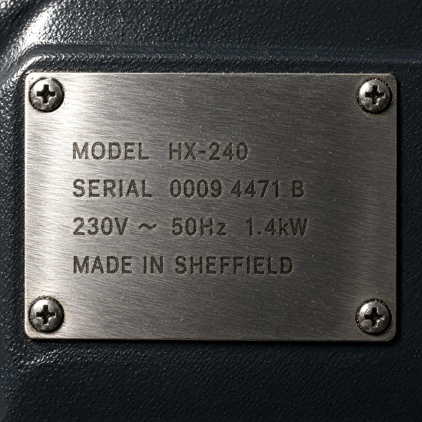
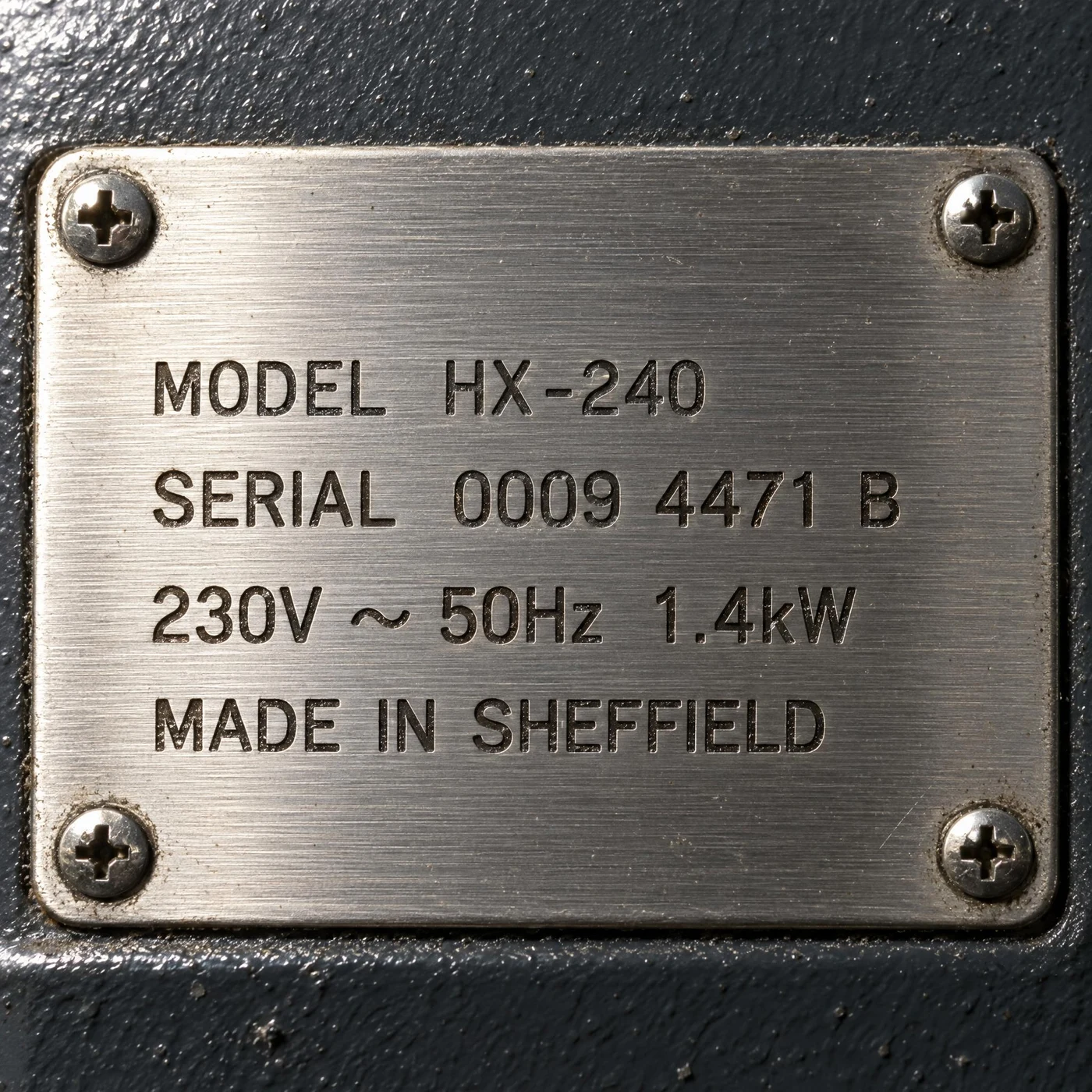
All four technical lines are verbatim correct in both; Sunburst’s etching reads deeper.
Both got “MODEL HX-240 / SERIAL 0009 4471 B / 230V ~ 50Hz 1.4kW / MADE IN SHEFFIELD” and the four cross-head screws. Sunburst puts real shadow inside the strokes and adds wear and grime at the plate edge; Flare’s brush grain is more pronounced but the etching sits flatter.
Extreme close-up of a brushed stainless steel equipment plate riveted to a dark painted machine housing, lit by a raking light from the upper left so the brush grain runs visibly across the surface. The plate is laser-etched with four lines of small industrial sans type reading exactly "MODEL HX-240", "SERIAL 0009 4471 B", "230V ~ 50Hz 1.4kW" and "MADE IN SHEFFIELD". The etching sits slightly below the surface and catches light differently from the brushed finish. Four cross-head screws, one at each corner. Fine dust in the brush grain. No other text.
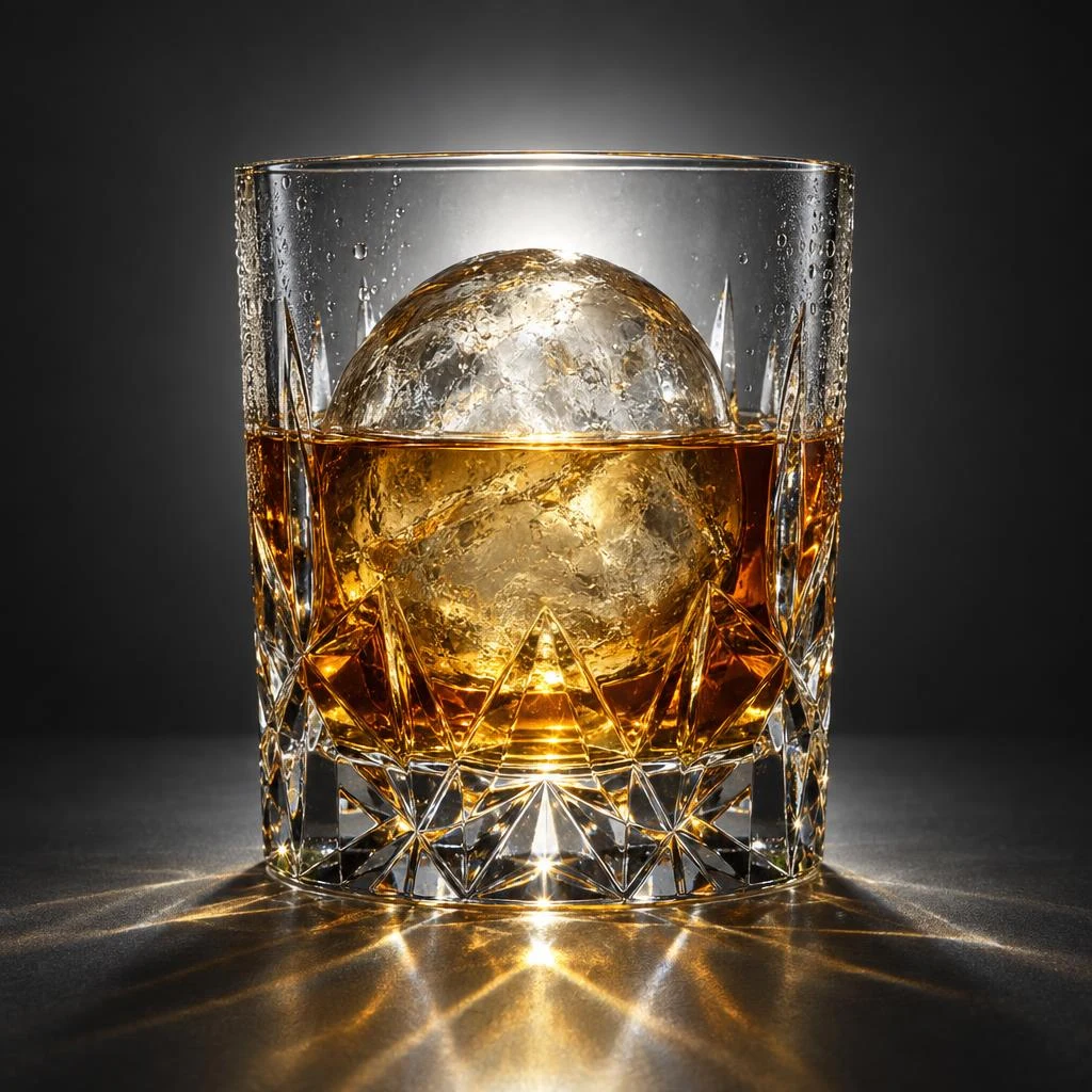
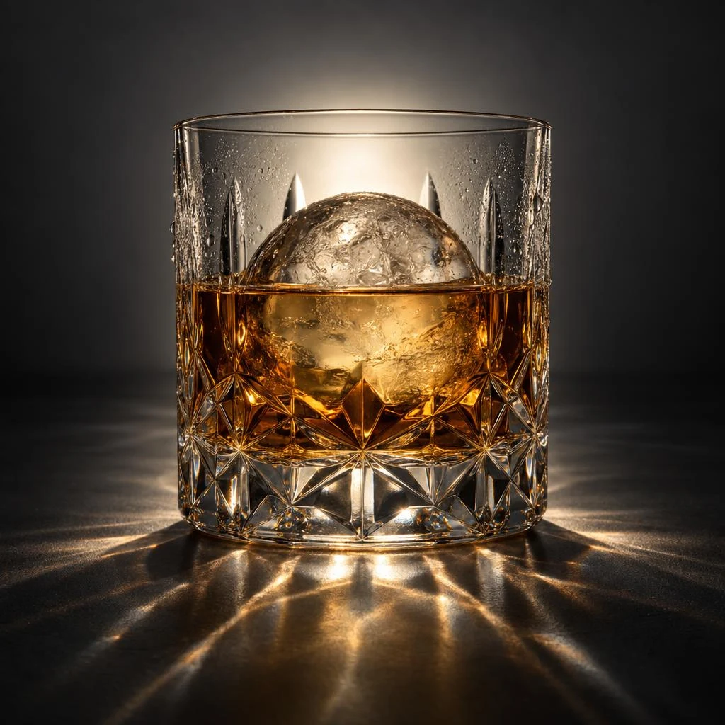
Meniscus, condensation and the distortion of the ice seen through the whisky — both delivered.
Both threw the backlight through the cut facets into caustics on the surface. Sunburst’s caustics are more elaborate and its cut pattern finer; Flare’s is cleaner. Either is usable as-is.
A studio photograph of a heavy cut-crystal tumbler holding whisky and one large clear ice sphere, backlit against a dark grey seamless background. The cut facets refract the backlight into sharp caustics on the surface below. Show the meniscus where the whisky meets the glass, a few condensation droplets on the outside, and the slight optical distortion of the ice seen through the liquid. Single light source from behind, no reflections of studio equipment, no text.
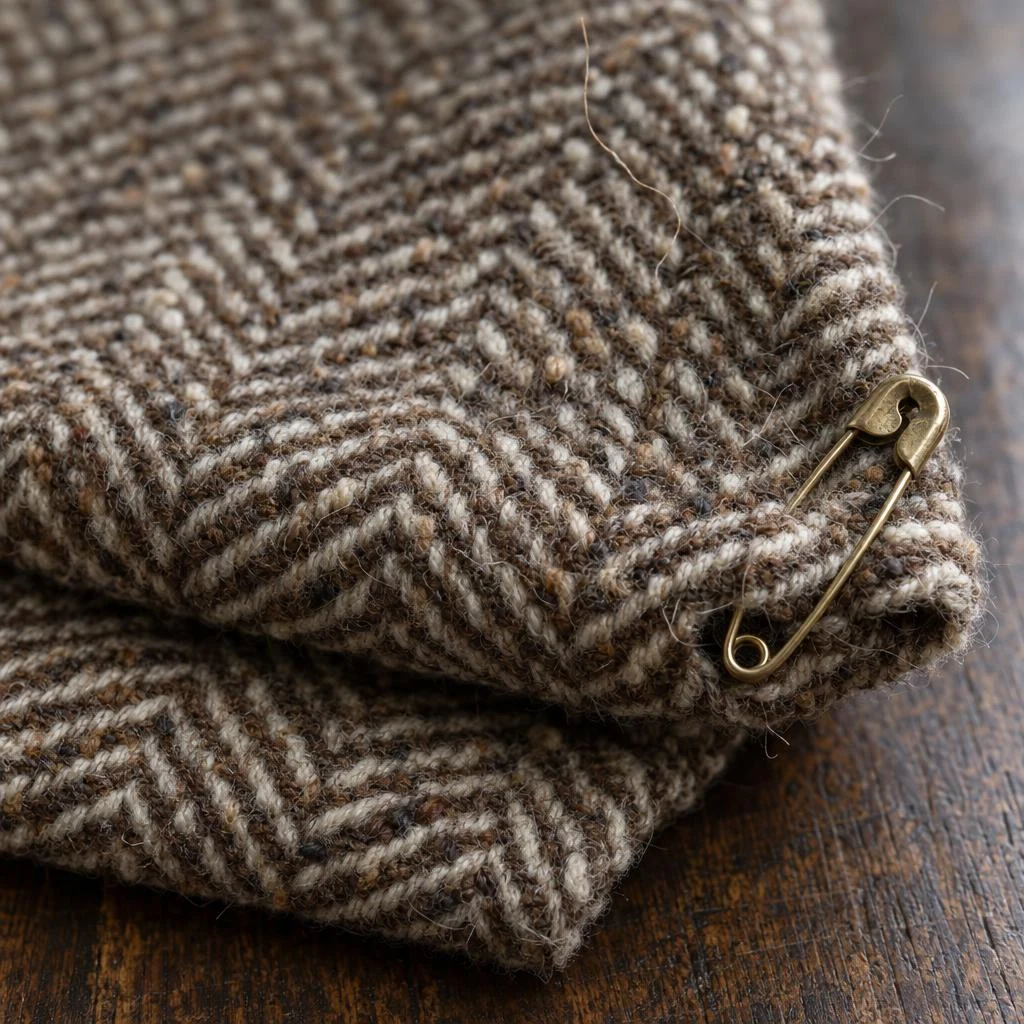
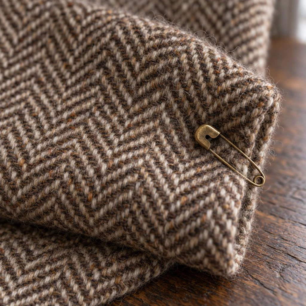
Both resolve individual yarns, down to the neps in the wool.
Flare has more loose fibres standing up from the surface, which is what the prompt asked for, and a shallower depth of field. Sunburst keeps the weave crisp across more of the frame. Both are usable fabric shots.
Macro photograph of a folded length of brown and cream herringbone tweed lying on a dark oak surface, with a single brass safety pin fastened through one corner. The weave must resolve to individual yarns, with the slubby irregularity of the wool visible and a few loose fibres standing up from the surface. Soft directional window light from the right, shallow depth of field falling off across the fold. Natural colour, no colour cast, no text.
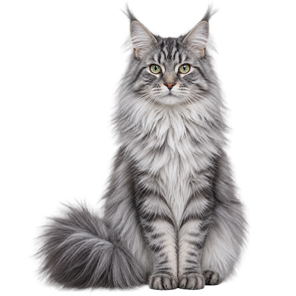
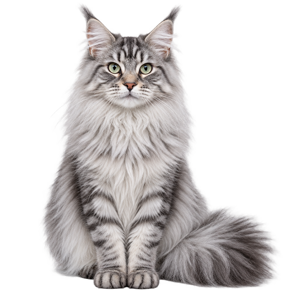
Ear tufts, ruff and tail all keep their strands — neither got cut along a hard outline.
This is the hardest kind of cut-out. Both kept individual strands at the edge, with Sunburst separating whiskers and ear tufts slightly further. The preview is flattened onto a light ground; the linked file is a real transparent PNG.
A long-haired silver tabby cat sitting upright, facing the camera, isolated on a fully transparent background as a catalogue cut-out. The fur must keep its individual strands at the silhouette edge — especially the ear tufts, the ruff around the neck and the tail — rather than being cut off along a hard outline. Even studio lighting, no cast shadow, no floor, no backdrop, no props.
Hands, text inside a reflection, an isometric exploded view, a chart whose every figure must be right, a thirty-face crowd, and a sprite sheet that has to slice on a grid — the traditional failure cases. Two of these went to Flare and one clearly to Sunburst.
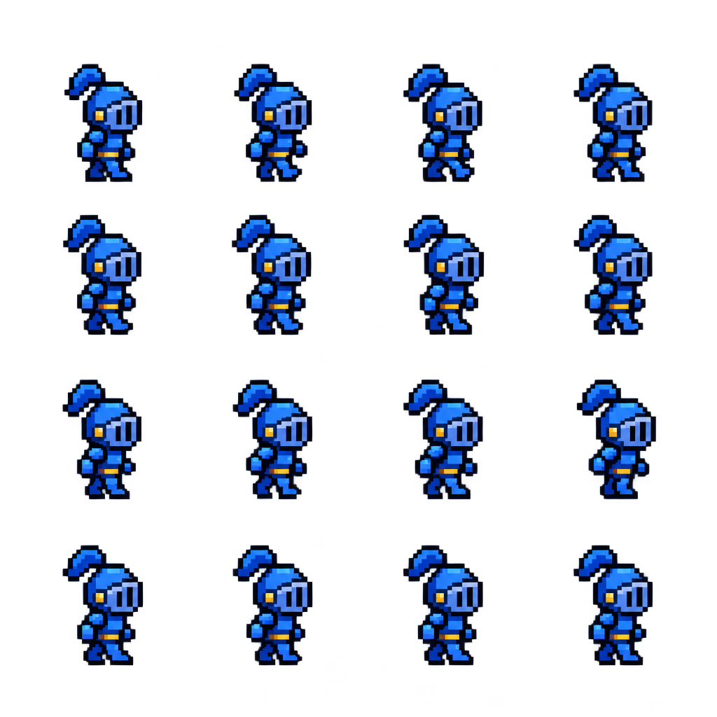
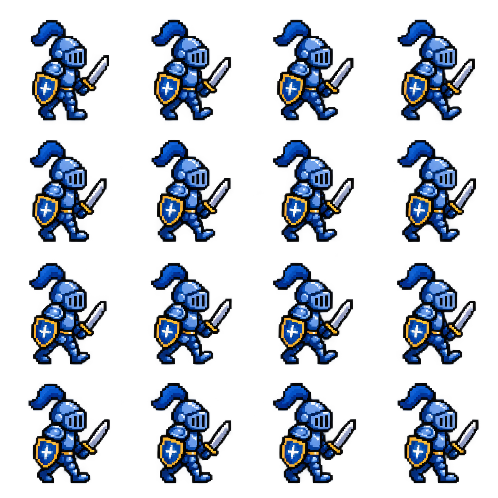
Sunburst is clearly steadier here; Flare’s frames drift in scale between cells.
Both produced a 4×4 transparent sheet with no grid lines and no frame numbers. But a sprite sheet gets sliced on a fixed grid, and several of Flare’s cells hold a noticeably smaller character, so the slices will not line up. Sunburst held cell scale and the ground line more consistently. For game assets this is a case worth the extra time.
A 2D pixel-art sprite sheet on a fully transparent background: sixteen frames of one walk cycle arranged in a strict four by four grid, read left to right and top to bottom. Every cell is exactly the same size, the character is centred identically in each cell with the same fixed ground line, and there is clear empty padding on all four sides of every cell so the frames can be sliced apart cleanly. The character is a small knight in blue armour, about three heads tall, drawn with clean square pixels, a limited palette and a thick dark outline. No grid lines, no frame numbers, no background, no drop shadow.
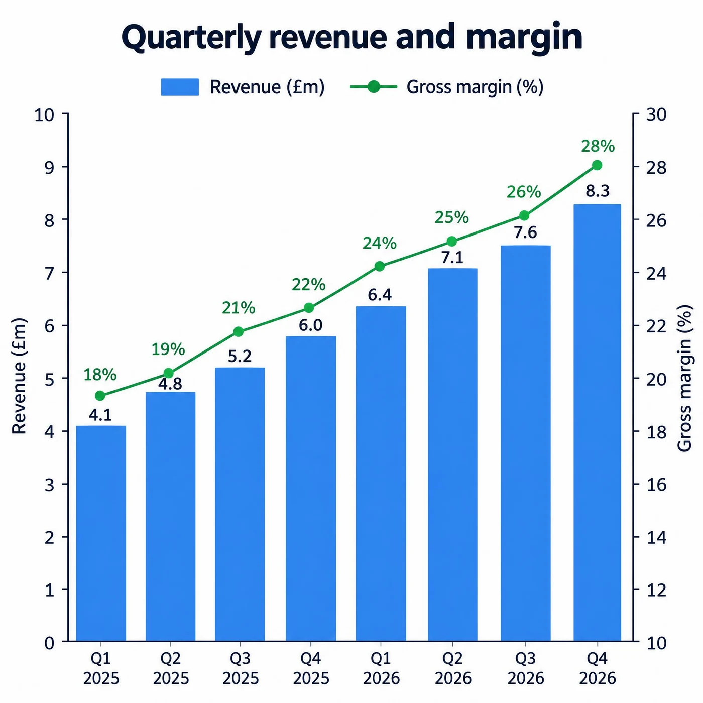
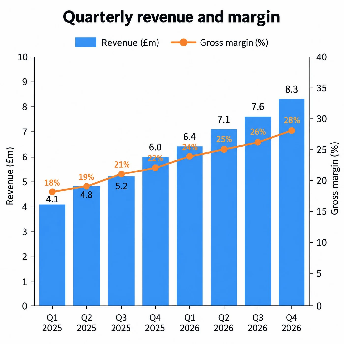
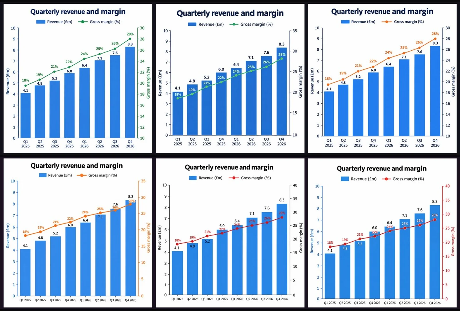
All sixteen values correct in both — and it is Flare that laid the labels out more cleanly.
Eight revenue values from 4.1 to 8.3, eight margin percentages from 18% to 28%, both axis labels and the quarter labels — all correct in both. But Sunburst’s percentage labels collide slightly with the bar value labels, while Flare’s stay clear of each other.
A single clean data chart on a white background, titled "Quarterly revenue and margin". A combined chart: eight vertical bars for the quarters Q1 2025 through Q4 2026 with the values 4.1, 4.8, 5.2, 6.0, 6.4, 7.1, 7.6 and 8.3 in millions, each labelled above its bar; and a line overlaid on a secondary right-hand axis showing margin percentages of 18, 19, 21, 22, 24, 25, 26 and 28. The left axis is labelled "Revenue (£m)" and the right axis "Gross margin (%)", both with tick labels. A two-item legend sits below the title. Every number must match exactly and every label must be legible.
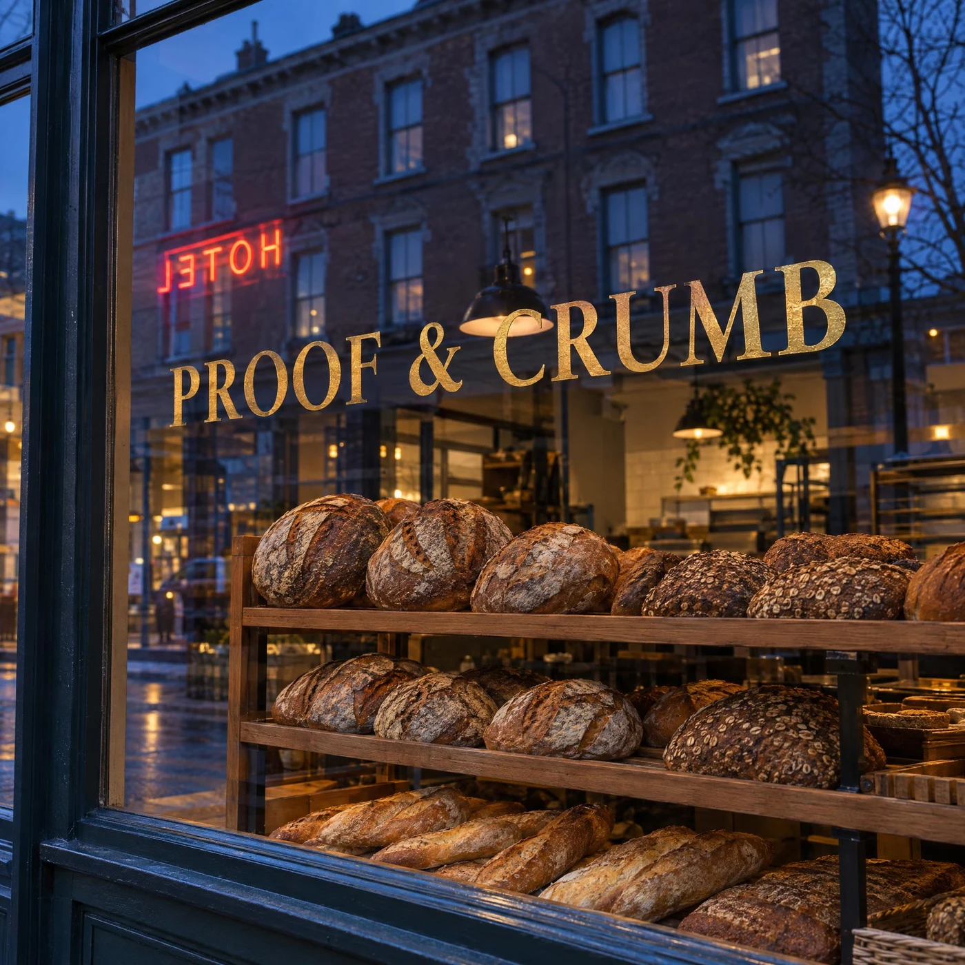
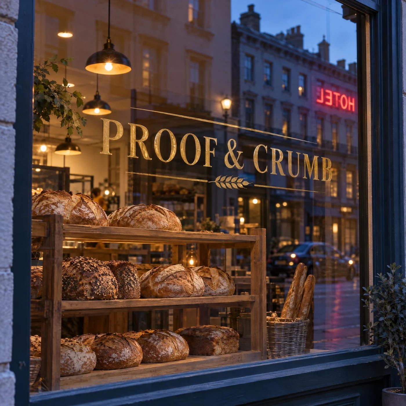
The sign reads correctly and the reflected neon is mirror-reversed — both got the physics right.
The gold-leaf “PROOF & CRUMB” reads correctly from the street while the neon HOTEL reflected in the glass appears reversed, as real reflected text would — and the bread rack behind the glass stays sharp instead of being washed out by the reflection. Both passed one of the harder tests in this set.
A street-level photograph of a bakery shop window at dusk. The window glass carries the shop name "PROOF & CRUMB" painted in gold leaf, reading correctly from the street. In the glass, the reflection of the building opposite is visible, and within that reflection a neon sign appears mirror-reversed, as real reflected text would. Through the glass, loaves on a wooden rack are sharply visible and are not washed out by the reflection. Warm interior light against cool blue exterior light, no other text.
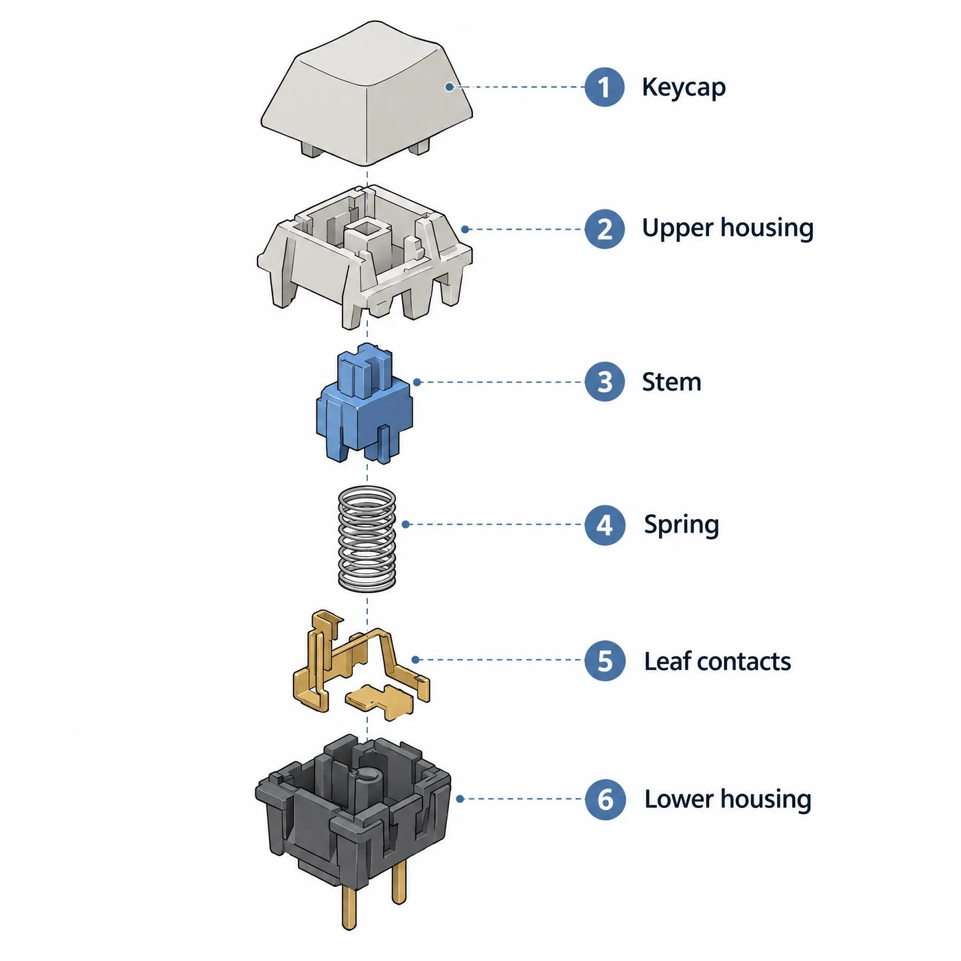
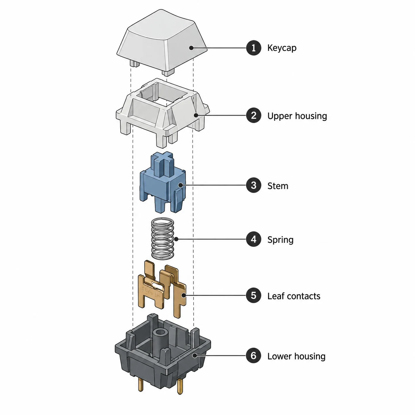
Both got the order of all six parts and all six label strings right.
From “1 Keycap” to “6 Lower housing” the labels are verbatim correct, the line work is clean and the isometric angles hold with no perspective error. Sunburst added a vertical dashed assembly axis running through every part, which is closer to how an engineering manual draws it.
A technical illustration on a white background: an isometric exploded view of a mechanical keyboard switch, its parts separated vertically along one axis and connected by thin dashed leader lines. From top to bottom the parts are the keycap, the upper housing, the stem, the coil spring, the metal leaf contacts and the lower housing with two pins. Each part carries a numbered callout dot connected to a label on the right, reading in order "1 Keycap", "2 Upper housing", "3 Stem", "4 Spring", "5 Leaf contacts", "6 Lower housing". Clean line work, flat muted colours, accurate isometric angles, no perspective, no other text.
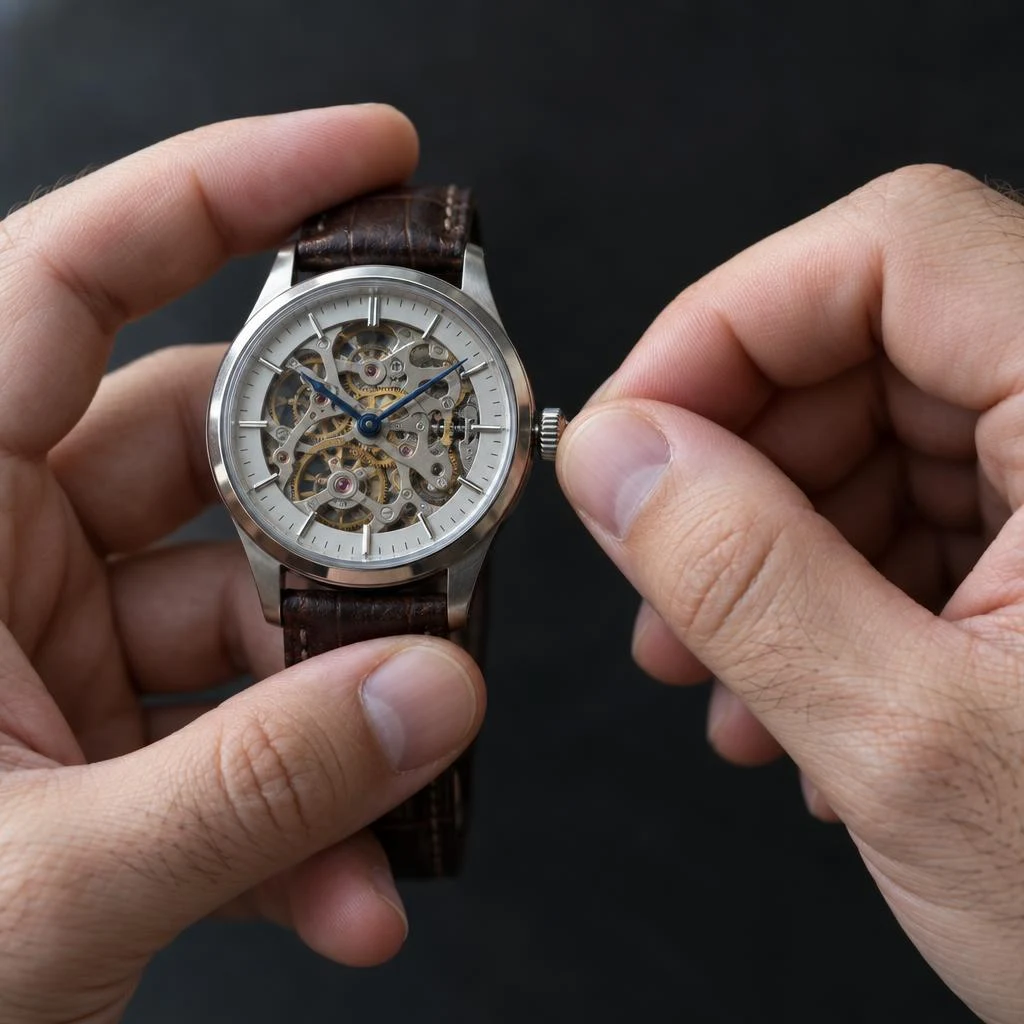
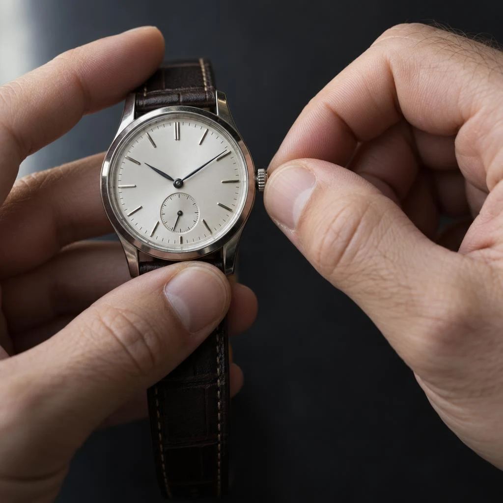
Correct finger counts, natural joints, and a believable pinch on the crown in both.
Hands have always been the classic failure case. Both passed here: the left hand steadies the case while the right pinches the crown between thumb and index finger, with plausible nail shapes and fine hairs on the back of the hand. Sunburst’s anatomy at the pinch is the more convincing of the two.
A close-up photograph of two adult hands winding the crown of a mechanical wristwatch. The left hand holds the watch case steady between thumb and forefinger; the right hand pinches the small crown between thumb and index fingertip. Five fingers on each hand, correct joint articulation, natural nail shape, visible skin texture and a few fine hairs on the back of the hand. Soft daylight from the left, dark neutral background, shallow depth of field on the fingertips. No text.
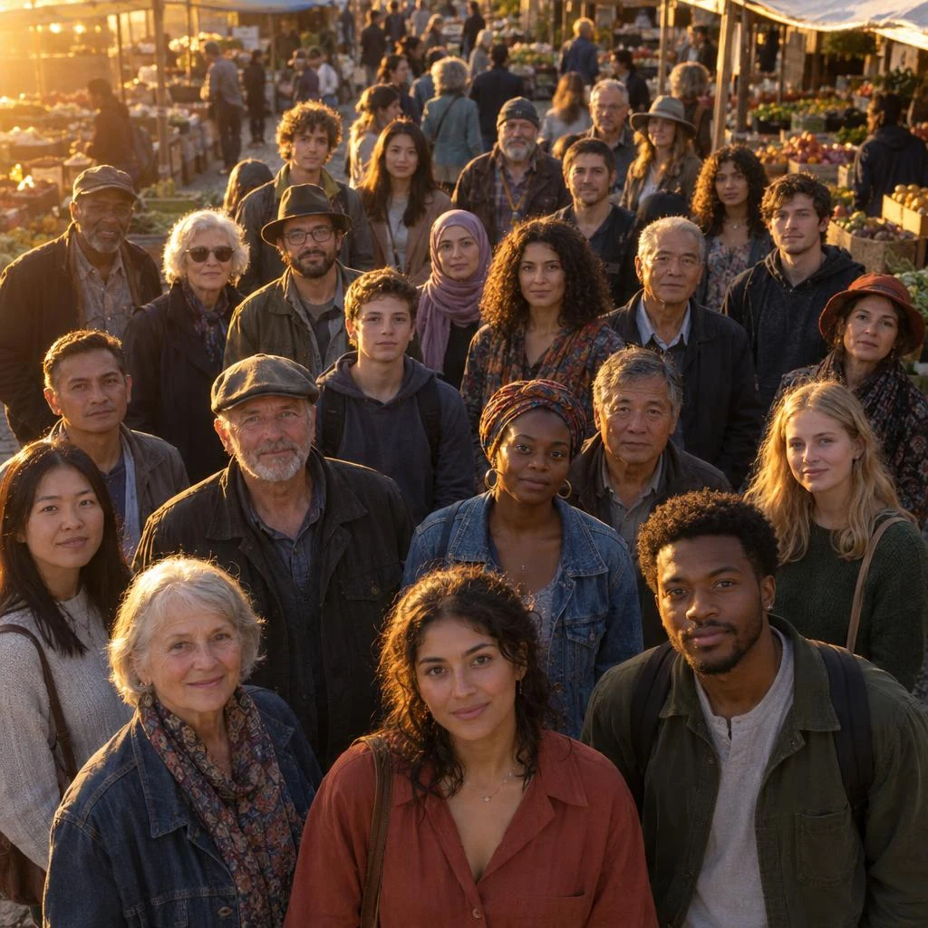
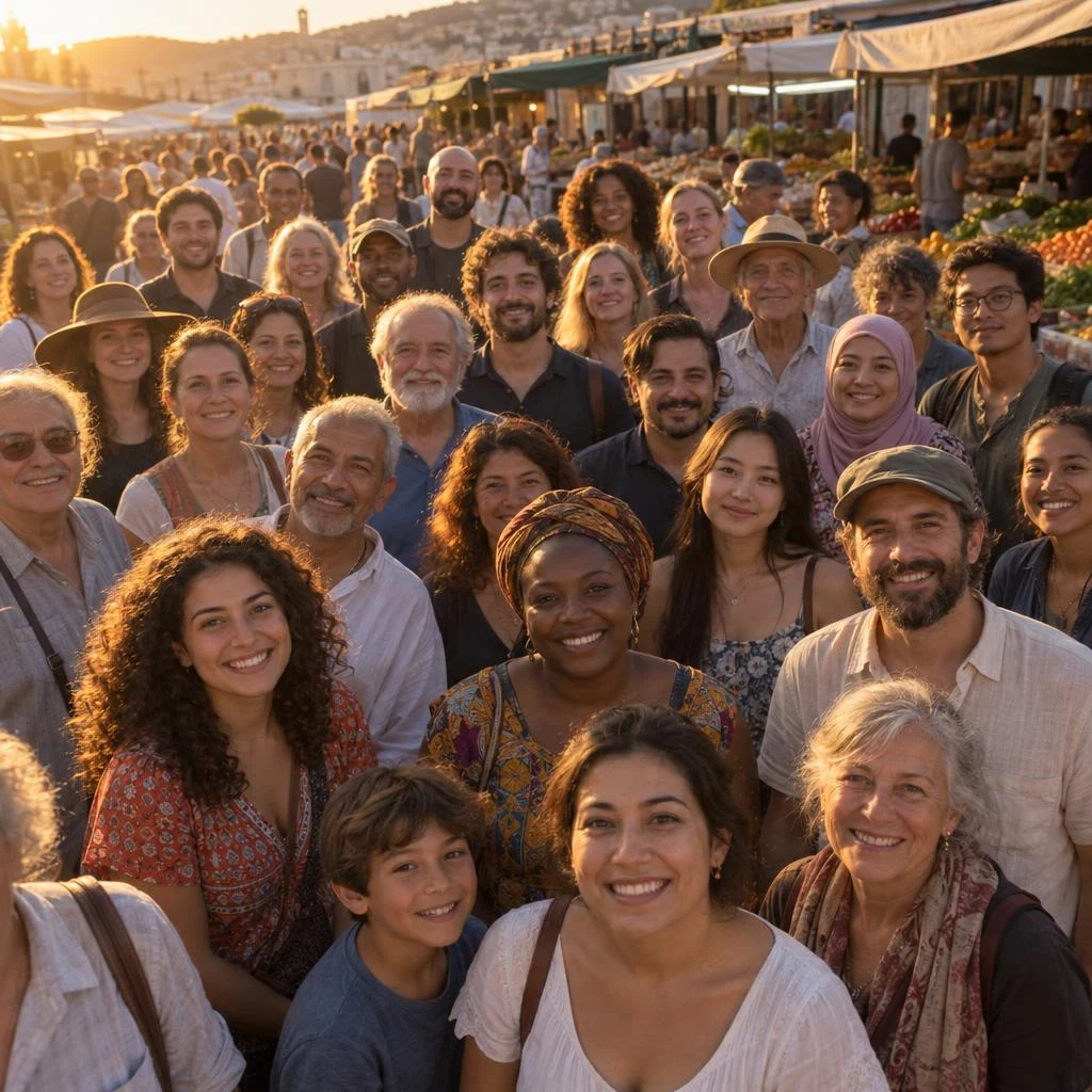
About thirty faces, none duplicated or broken, all lit by the same low sun from one side.
The prompt demanded that every person carry the same warm rim light on the left cheek and the same shadow on the right; both held that consistency, and depth falls off naturally toward the back. Sunburst is warmer and resolves more faces in the back rows; Flare’s front row is sharper.
A photograph of about thirty people standing shoulder to shoulder in an open-air market at golden hour, seen from slightly above. Every face is lit by the same low sun from the left, so every person carries the same warm rim light on their left cheek and the same shadow on their right. Faces are varied in age and appearance, all anatomically correct, none duplicated. Depth falls off naturally toward the back of the crowd. No text, no signage.
These come from the same 20 prompts run once on each tier at identical size and quality — 40 real calls, all through the apimodels.app API. Not quoted from anyone else’s benchmark.
The median is 24.8s for Flare against 40.0s for Sunburst — about 1.6x, not the 2x that gets quoted. The distribution is the more useful part: Flare spans 19.0 to 42.5s (a 2.2x range), Sunburst 31.2 to 53.3s (1.7x). Sunburst is slower overall but swings less, and at the slow end the two are only 1.25x apart. If you are sizing timeouts for a queue, the slowest figure matters more than the median.
| n | Fastest | p50 | p90 | Slowest | Mean | |
|---|---|---|---|---|---|---|
| gpt-image-2.5-flare | 20 | 19.0s | 24.8s | 35.3s | 42.5s | 25.9s |
| gpt-image-2.5-sunburst | 20 | 31.2s | 40.0s | 52.9s | 53.3s | 40.8s |
| flare @ 1K / 2K | 10 / 10 | — | 22.9s / 27.3s | — | 42.5s / 35.3s | — |
| sunburst @ 1K / 2K | 10 / 10 | — | 36.7s / 42.6s | — | 53.3s / 49.8s | — |
A single pair only tells you who did better that time. What actually drives cost is how often a tier gets it right first — re-roll twice and the cheaper tier stops being cheaper. So we took two prompts where correctness is objectively checkable and ran each three times per tier: the colour card needs four hex codes verbatim with matching swatches, the chart needs sixteen figures exactly right.
Content accuracy came out 6/6 on both tiers. All four hex codes — #101828, #2E6BE6, #E7DFD2, #B4553C — were verbatim every time with swatches that matched, and all sixteen chart figures (revenue 4.1 to 8.3, margin 18% to 28%) were right every time. On briefs where the text and the pixels have to agree, both tiers now land it in one pass.
The divergence is in layout detail, and three runs show it is not a fluke: the chart’s percentage labels collide with the bar-value labels once in three runs on Flare and in all three on Sunburst. We noticed it on the single pair; repeating it turned “that one happened to” into a difference you can expect.
One real failure is worth recording: one of the twelve runs came back 502 on Sunburst and passed on retry. Twelve runs is far too small to quote a success rate, but it is enough to say neither tier is 100% and production code should retry.
All six runs got every hex code verbatim with matching swatches — 3/3 on both tiers.
The layout barely moves across the six; only the ATLAS wordmark styling shifts. For brand-spec work like this the re-roll rate is low, so take the faster tier.
Brand colour specification card: wordmark ATLAS, four swatches labelled MIDNIGHT / SIGNAL / SAND / CLAY with hex codes #101828, #2E6BE6, #E7DFD2, #B4553C — each swatch must actually be the colour its hex code names.
All sixteen figures right in all six runs; label collisions in 1 of 3 Flare runs and 3 of 3 Sunburst runs.
Both axis labels, the legend and the quarter labels were correct in all six as well. The collision only matters when the chart goes straight into a deck: there, Flare needs one fewer fix.
Combined bar-and-line chart titled "Quarterly revenue and margin": eight bars 4.1 / 4.8 / 5.2 / 6.0 / 6.4 / 7.1 / 7.6 / 8.3 and a margin line 18 / 19 / 21 / 22 / 24 / 25 / 26 / 28 on a secondary axis, both axes labelled.
After looking at all 26 pairs one by one and calling each: Sunburst took 10, Flare took 4, and 12 were ties. Ties are nearly half the board, and that is itself the finding: on most jobs the two return the same thing.
What matters more is the character of Flare’s wins. All of them are in the systematic-and-exact category: one identical mark across four lockups, two scripts at equal optical weight, chart labels that do not collide, fabric that grows the loose fibres the prompt asked for. Treating the precision tier as “higher grade, therefore more obedient” is simply wrong — what it is better at is surface and material, not following instructions.
| Case | Winner | Why |
|---|---|---|
| Scoped edit: chairs only | Tie | Near-indistinguishable from each other and the input |
| Infographic: numbered callouts | Tie | Both legible; the difference is design choice |
| Slide: chart and footnotes | Sunburst | Labelled axis, numbered footnotes, real wordmark |
| UI mockup | Tie | One more finished, one more like a spec |
| Packaging: card and material | Sunburst | Aged stock, chipped paint, blister thickness |
| Photoreal portrait | Sunburst | Knit and mesh separate further |
| Identity sheet: four lockups | Flare | Held the mark identical; the precision tier drifted |
| Colour spec card | Tie | Both got every hex code and swatch right |
| Bilingual lockup | Flare | Balanced the two scripts as the brief asked |
| Wordmark: modified O | Tie | Both spelled and reworked it correctly |
| Stacked lockup: matched width | Tie | All four precise instructions hit |
| Blind embossing | Tie | Both produced real paper relief |
| One layout, three languages | Tie | Both picked the right glyph variant per language |
| Newspaper front page | Sunburst | Body reads as real journalism |
| Packaging back panel | Sunburst | Percentage declarations, closer to print-ready |
| Event poster: six names | Tie | Effectively interchangeable |
| Etched equipment plate | Sunburst | Real depth inside the strokes, plus wear |
| Glass and refraction | Tie | Caustics and meniscus in both |
| Fabric macro | Flare | More loose fibres, which the prompt asked for |
| Fur cut-out | Sunburst | Whiskers and ear tufts separate further |
| Sprite sheet on a fixed grid | Sunburst | Held cell scale and ground line; slices align |
| Data chart: sixteen values | Flare | Both correct; Flare placed labels more cleanly |
| Text inside a reflection | Tie | Sign reads, reflection mirrors — both correct |
| Isometric exploded view | Sunburst | Added the assembly axis, closer to a manual |
| Hands on a small object | Sunburst | More convincing anatomy at the pinch |
| Crowd: thirty faces, one light | Tie | Both held the lighting consistency and depth |
Across 26 pairs the conclusion is more specific than “the precision tier is better”: on most jobs the two return the same result, on a few there is a winner, and the winner is not always Sunburst. The table below sorts by job, and every reason traces back to a pair above.
Put the model name in configuration rather than hard-coding it. Because the price at a given resolution is the same — and does not move with quality either — promoting a shot from Flare to Sunburst costs time, not budget. It should be a config change.
One case needs neither tier: if you only want a layout check or a thumbnail, drop the quality tier to low rather than switching models — low returns fastest and costs exactly what max costs. The only lever that lowers the bill is resolution: 1K is $0.02 per image.
| Job | Tier | Why |
|---|---|---|
| Social and feed creative | Flare | Turnaround decides it; the quality gap is invisible at feed size |
| E-commerce catalogue tiles | Flare | Volume; and cut-outs work equally well on both |
| Scoped edits on an existing image | Flare | Our chairs pair: the two results were near-identical |
| Logos, wordmarks, identity sheets | Flare | It held the mark more consistently across four lockups than the precision tier did |
| Precise typographic layouts | Flare | Poster and lockup tests came out interchangeable |
| Charts and data graphics | Flare | Both got every figure right; Flare’s label placement was cleaner |
| Campaign hero shots, packaging | Sunburst | Material and surface is where the extra time actually lands |
| Anything going to print | Sunburst | Detail that survives being looked at from arm’s length |
| Macro product and material shots | Sunburst | Etching depth, weave, chipped paint, wear |
| Sprite sheets and grid-sliced assets | Sunburst | It held cell scale and the ground line; Flare drifted |
| Layout checks and thumbnails | Either, at low | Same $0.02 at 1K whatever the quality — drop the tier for speed, not for cost |
The rest of this page is about the API, but you do not need one to use GPT Image 2.5. SparkPix is our browser editor: upload a photo or type a prompt, no API key, no setup — it runs Flare at 1K, 2K or 4K across eight aspect ratios, ten credits an image, with credits refunded when a generation fails. If you already have an APIMODELS account, the console has a playground where you can pick either tier and any quality before you write a line of code.
cURL
# Same prompt, same quality, both tiers — the bill is identical.
# The only difference you will notice is how long it takes.
curl https://api.apimodels.app/v1/images/generations \
  -H "Authorization: Bearer $APIMODELS_API_KEY" \
  -H "Content-Type: application/json" \
  -d '{
    "model": "gpt-image-2.5-flare",
    "prompt": "Editorial still life: a brushed-steel watch on grey linen, raking window light",
    "size": "2048x2048",
    "quality": "high"
  }'
# -> $0.035 (2K — quality does not change the price)

# swap the model name, keep quality explicit, and the price does not move
#   "model": "gpt-image-2.5-sunburst"   -> still $0.035 (2K, any quality)
#
# Leave quality out and only the render diverges, never the bill:
#   flare    -> medium -> still $0.035 at 2K
#   sunburst -> high   -> still $0.035 at 2K
Python
import requests

BASE = "https://api.apimodels.app/v1"
H = {"Authorization": "Bearer YOUR_API_KEY"}

PROMPT = "Editorial still life: a brushed-steel watch on grey linen, raking window light"

# Run the same job through both tiers at the SAME quality and compare.
# Cost is identical, so this test only spends time.
for model in ("gpt-image-2.5-flare", "gpt-image-2.5-sunburst"):
    r = requests.post(f"{BASE}/images/generations", headers=H, json={
        "model": model,
        "prompt": PROMPT,
        "aspect_ratio": "1:1",
        "resolution": "2K",
        "quality": "high",   # explicit: without it flare bills medium, sunburst bills high
    }).json()
    print(model, r["data"]["images"][0]["url"])

# Rule of thumb: keep flare in the pipeline, promote a shot to sunburst
# only when someone is going to zoom in on it.Two, and neither is capability. First, time: across 40 measured calls at identical size and quality, Flare returned in 24.8s median against Sunburst’s 40.0s — about 1.6x. Second, where that time goes: Sunburst holds material and surface better (etched metal, fabric weave, chipped paint, fur edges) and it holds a fixed grid better, which matters for sprite sheets. Everything else is the same: region-scoped editing, multi-turn consistency, masks, native transparent PNG, native 1K / 2K / 4K, the same six aspect ratios, and the same price — identical at a given resolution, and identical across all five quality tiers. In our 26 pairs Sunburst won 10, Flare won 4 and 12 were ties.
A flat $0.02 at 1K, $0.035 at 2K and $0.07 at 4K — one price per resolution, identical for both tiers and identical across all five quality settings, so low, medium, high, xhigh and max all bill the same number. Charged only on success; reference images, masks and transparent backgrounds cost nothing extra. Because quality does not move the price, the two models bill the same whether or not you send it: the difference between Flare and Sunburst is time and detail, not cost. On the official OpenAI API the picture is the opposite — it bills by output image tokens, so the same 4K image runs about $0.011 at low and about $0.40 at max.
Yes. SparkPix (sparkpix.ai/gpt-image-2-5) is a browser editor with no key and no setup: upload an image or type a prompt and generate. It runs the Flare tier at 1K, 2K or 4K across eight aspect ratios, charges ten credits per image, and refunds the credits when a generation fails. Credit packs start at $9.99 for 350 credits, about 35 images, with no subscription. Use the API instead when you need Sunburst, explicit quality control, masks, or volume.
No, and it is cheap to try. The two share a feature set and a price list, so switching is a model-name change with no billing consequence at a given resolution — and quality does not change the bill either. What does change is wall time, roughly double. The one thing to watch is that they are different models: a re-run on the other tier is a new generation, not a re-render of the same image, so a set you already approved will not come back pixel-identical. If consistency across a set matters, finish the set on the tier you started, and use reference images to anchor identity.
No — they cost the same per image, full stop. OpenAI charges one token rate for both models, and our price list is identical for both: $0.02 at 1K, $0.035 at 2K, $0.07 at 4K, unchanged across all five quality tiers. That last part is what makes the two pages easy to misread: on the official API the default quality does move the bill (Flare defaults to medium, Sunburst to high, roughly a 4x gap there), but here it does not move anything. Send quality explicitly and the two bill the same.
About twice as fast as Sunburst on the same prompt, and about twice as fast as GPT Image 2 — the latency halving is the claim OpenAI made at launch. Absolute numbers move with size and quality: on our own probes generation ran roughly 30-45s at low, 40-70s at medium, and about 50s at 1K high, 100s at 2K high, 70s at 4K high. Treat those as order-of-magnitude, not a service level, and set synchronous client timeouts to 180s or more either way.
No. The feature sets are the same: region-scoped editing, multi-turn consistency, mask input, native transparent PNG with real alpha, native 1K / 2K / 4K, and the six standard aspect ratios. OpenAI documents the same size and quality options for both. If you find a capability difference, it is almost certainly a quality-tier difference in disguise — run both at the same quality before concluding otherwise.
Flare, with Sunburst as a promotion path. Most pipelines are throughput-bound, and Flare halves the wait without giving up any 2.5 capability. Keep the model name in configuration rather than hard-coded, so a shot that turns out to be a hero image can be re-run on Sunburst without a code change. Because the price at a given quality is the same, promoting a shot costs you time, not budget.
Not the craft, only the payoff. Both respond to the same habit that defines 2.5: name what must not change before you name what should. Lock the pose, lighting, camera and background, then ask for the one thing you want different, then list the specific artefacts you keep getting. Sunburst rewards detail instructions further — material, weave, finish, type treatment — because it has the headroom to render them. Our library of 238 GPT Image 2.5 prompts, each paired with the image it produced, runs on either tier.